# InfoBanner
The InfoBanner component is used to display an information for the user. It can display a title, description, icon and a number of buttons which can provide different functionalities.
Element tag: cm4ap-info_banner
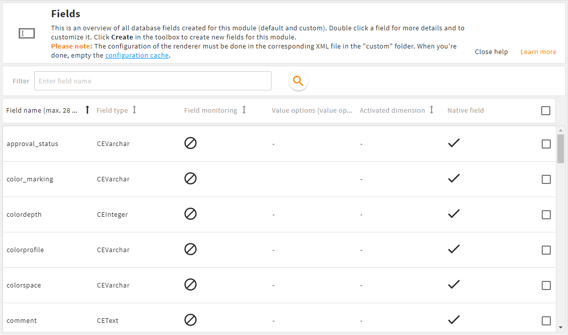
Info banner in admin snap-in Module configurations/Fields
# Properties
icon(optional)- type:
string - attribute:
icon - description: An icon key which should be displayed. If no icon key is provided, the icon is hidden.
- type:
bannerTitle(optional)- type:
string - attribute:
banner-title - description: A label key which will be displayed at the top of the banner. If no label key is provided, the title is hidden.
- type:
description(optional)- type:
string - attribute:
description - description: A label key which will be displayed below the title. The container of the description allows HTML markup. So for example, if the translation is
<b>My text</b>, the textMy textwill be displayed as bold text. If no label key is provided, the description is hidden.
- type:
buttons(optional)- type:
arrayofbutton configurations - attribute: no attribute available
- description: This parameter defines the number and the behavior of buttons in the info banner. The structure of a button configuration is shown below.
- type:
# Button configuration
type(required)- type:
url|close - description: Type
closeis used to close this banner. Typeurlis used to open a specified url in a new browser tab.
- type:
label(required)- type:
string - description: The label key for the button text.
- type:
tooltip(optional)- type:
string - description: The label key for the button tooltip.
- type:
primary(optional)- type:
boolean - description: Indicates if the button is highlighted in the primary color.
- type:
parameter(optional)- type:
map - description: Contains additional type specific parameter
target_url(for typeurl)- type:
string - description: The target url which will be opened in a new tab
- type:
- type:
# Example
In the following example there is an info banner with a set icon, title and description. Additionally, there is one button which hides the info banner and one button to open a new tab with a specific URL.
<layout>
  <!-- other stuff -->

  <elements>
  <!-- other stuff -->

    <component component="cm4ap-info_banner">
      <parameter>
        <entry key="class" class="attribute">split_box_child</entry>

        <entry key="icon">M-USER</entry>
        <entry key="bannerTitle">L-M-USER</entry>
        <entry key="description">L-M-USER-INFO</entry>
        <entry key="buttons" class="array">
          <value class="map">
            <entry key="type">close</entry>
            <entry key="label">L-GLOBAL-CLOSE</entry>
          </value>
          <value class="map">
            <entry key="type">url</entry>
            <entry key="label">L-GLOBAL-MORE_INFORMATION</entry>
            <entry key="tooltip">L-GLOBAL-MORE_INFORMATION-INFO</entry>
            <entry key="primary" class="boolean">true</entry>
            <entry key="parameter" class="map">
              <entry key="target_url">https://docs.4allportal.com</entry>
            </entry>
          </value>
        </entry>
      </parameter>
    </component>

  </elements>

</layout>