# Layouts
Layouts define the logical structure of a certain area, mostly the content area of the 4ALLPORTAL. With layouts, you can define what elements shall be displayed, e.g., in a record's detail view, a subpanel, or a module's main view. Each new view requires an own layout XML in the file system.
# How do Layouts Work?
A layout is a simplified syntax that is interpreted by the frontend and builds the corresponding content of the page. It contains elements, attributes and styles, but (unlike HTML) only data-independent information is transferred - equivalent to templates, which have placeholders for corresponding values.
A layout depends on several parameters and can also be divided and retrieved according to these parameters. These parameters are:
moduleidrole_mappingobject_typeclient_type
These parameters are used to create different ways to display content. For example:
- Role specific layouts: Choose completely different appearances for different user groups (more details).
- Object-type specific layouts: Make the content area of an object look completely different for object-types "image" or "text" (more details).
- Client-type specific layouts: Hide unimportant elements or insert additional elements e.g., for mobile devices (more details).
# Storage, Request & Fallback Logic
# Subfolder Storage and Request
All layouts are stored either globally in directory global/defaults/layouts or module-specific in directory modules/{module}/layouts. Via further subdirectories, the views of a module are covered. Each view requires a separate subdirectory and a default layout file, or, alternatively, a file ID.
A layout's file extension is .4aplayout.
Subfolders example:
- modules/user/layouts/detail
- modules/user/layouts/main
- modules/user/layouts/main/admin
- modules/user/layouts/perssettings
- modules/user/layouts/referencefind
- modules/user/layouts/subpanel
For each view in the GUI, the system checks the corresponding folder path in the file system to get the correct default.4aplayout(_c), respectively the specific layout defined in a layout set.
Example:
A user opens tab Evolution Tree in the Files module. The according default.4aplayout is requested from modules/file/layouts/evolution_tree.
Change Files
If you have changes for a layout, this folder path is used to define the parent layout in tag <changes extends> (changes details)
# File ID Request
A layout may also be requested via its unique file name. In that case, the filename replaces the last subfolder in the folder path, and requires prefix id_ .
Example: A view "main/admin" from module User can be requested via filename id_admin.4aplayout from path modules/user/layouts/main.
Rules:
For a request via file ID, prefix id_ is required, as well as minimum of one subfolder from layouts:
Will not work:
module/layouts, filecustom_layout.4aplayoutmodule/layouts, fileid_custom_layout.4aplayoutmodule/layouts/subfolder, filecustom_layout.4aplayout
Will work:
module/layouts/subfolder, fileid_custom_layout.4aplayout
In this example, the same view could be requested from here: module/layouts/subfolder/custom_layout, file default.4aprenderer
Please note: We recommend using the folder structure and adding new subfolders when creating custom layouts.
# Folder-Based Fallback
Layouts follow a folder-based fallback logic that makes it impossible to not load a default layout on request.
The way layouts are stored in the file system also determines the fallback. It starts from the folder path of the requested layout. It then works its way up, alternately in the corresponding global/defaults folder, then in the next higher module folder.
Example:
The requested layout "main/special_main" for module user results in the following fallback steps:
modules/user/layouts/main/special_main/default.4aplayout(_c)falls back toglobal/defaults/layouts/main/special_main/default.4aplayout(_c)falls back tomodules/user/layouts/main/default.4aplayout(_c)falls back toglobal/defaults/layouts/main/default.4aplayout(_c)falls back tomodules/user/layouts/default.4aplayout(_c)falls back toglobal/defaults/layouts/default.4aplayout(_c)
The fallback starts as soon as no folder exists for the requested view modules/user/layouts/main/special_main.
The fallback interrupts for the first existing layout. If it is a change file, the parent layout from <changes extends> (plus changes) applies.
Using fallbacks makes it unnecessary to store a separate default.4aplayout configuration for every single required view. So for default views, a default.4aplayout can be falled back to.
Please note: The fallback steps will not apply, if any layout file is found, even if that file is defective.
Fallback for Custom Views
If a custom view is requested that finds no corresponding layout in the file system, the folder-based fallback to a default layout still works and secures a configuration is available in case of a missing custom configuration.
Example:
A custom view requests module/layouts/main/my_custom_layout. No layout is stored in the file system. The system falls back on global/defaults/layouts/main.
Fallback From Runtime
When it falls back, the system checks the global and module's folders in the runtime to take custom changes into account.
For change files, multiple changes are supported: To provide the requested configuration, the system checks the corresponding path in all installed 4Apps according to the system's app order, including the customizations from the custom folder:
- Core Engine (applies first)
- all other 4Apps according to the system's app order
- custom folder (applies at last)
If the required folder can be found in all these places, the requested configuration (e.g. default.4aprenderer) will build up on one another.
# Structure and Elements
A layout can become as complex as you need it. It consists of:
- mainly components, which are nested and can be passed parameters. To let these interact with each other, or to execute specific actions, there are actors.
- actors represent pure logic classes. They have no representation themselves, but can act on it through various mechanisms.
- a styling area which makes it possible to give the layout specific styling rules to connect the view of composed components.
# XML Structure
A layout's XML tag is layout. A layout XML consists of the following:
| Name | Type | Description |
|---|---|---|
<styles> | Style | contains the layout specific stylings |
<consts> | Const | Constants can contain fixed values that can be used in a layout. When this layout is imported, these constants can be overwritten from outside. |
<actors> | Actor | contains any number of actor definitions that should be available in a layout |
<elements> | Component Import layout | Here the actual structure of the view is shown. |
# Style
The styling area offers the possibility to give special style rules to the layout so that the composite view looks harmonious.
Example: The toolbox can be given a shadow on the left side as long as it is placed on the right side. With another layout, where it might be on the left side, it would need a shadow on the right side.
To define these layout-specific style rules, <style> elements contain CSS text. They are removed after a layout switch and cannot collide with other layouts.
Exception: Styles can be overridden by imported layouts.
Please note: The #id selectors are converted and do not apply one-to-one as CSS. Stylings that do not explicitly refer to defined ids may not be applied correctly.
Allowed XML attributes:
| Name | Type | Description |
|---|---|---|
| exclude | String | exclude evaluates whether the element should be displayed for the respective user.Example: <actor ... exclude="!getFeature('user.audit_read')">. If true is returned, the element will be removed on delivery.The value in exclude is interpreted using the Template Engine. CoreEngine specific functions like getFeature can be found here. |
Example:
This example adds a background color for #my_element. That style is removed/excluded if the user is no superadmin.
<style exclude="!getFeature('global.has_superadmin')">
  #my_element {
    background: #FF8200;
  }
</style>
# Const
<const> elements define constants that are available for this layout. They have a name that is set with the key attribute, and a type that is defined with the class attribute.
The value is specified as the tag content and varies depending on the class.
| Name | Type | Description |
|---|---|---|
| key | String | A unique name used to reference this constant inside and outside the layout. |
| class | string (default) / number / boolean / array / map | Defines the data type of the constant and parses the content accordingly. |
Example:
<const key="name" class="boolean">true</const>
<const key="name" class="map">
   <entry key="subname" class="array">
      <value class="string">Value</value>
      <value class="map">
         <entry key="another level">Per default string</entry>
      </value>
   </entry>
   <entry key="subname2" class="number">5.7</entry>
</const>
# Actors
<actor> elements are used to provide logic for the layout. They can hold cross-element data, let elements communicate with each other, or simply execute some other logic.
The javascript class is specified using the type attribute, of which an instance is created. This can then be retrieved via the naming specified in the id attribute.
To enable different actor instances to behave differently, you can give them parameters. They can activate other behaviors of this actor if required.
| Name | Type | Description |
|---|---|---|
| id | String | A unique name used to reference this actor inside and outside the layout. |
| type | String | Defines the class from which an instance is created. |
| exclude | String | exclude evaluates whether the element should be displayed for the respective user.Example: <actor ... exclude="!getFeature('user.audit_read')">. If true is returned, the element will be removed on delivery.The value in exclude is interpreted using the Template Engine. CoreEngine specific functions like getFeature can be found here. |
# Actor Parameter
Actor parameters look similar to the declaration of constants. They have different types and a name. Maps and arrays can be nested and other values can be fixed.
Unlike constants, there are additional types of parameters that can be passed:
constactor
Example:
<consts>
   <const key="myConst" class="number">5</const>
</consts>

<actors>
   <actor id="myActor" type="ActorClass_1" />
   <actor id="mySecondActor" type="ActorClass_2">
      <parameter>
         <entry key="actorReference" class="actor">myActor</actor>
         <entry key="number" class="const">myConst</actor>
      </parameter>
   </actor>
</actors>
As values, the name of the constant, or the id of the actor are used.
# Components
<component> elements are used to describe the actual structure, i.e. the real layout of the page. They are nested within each other and can receive parameters that directly affect the behavior of the component.
The id can also be specified for the component to uniquely identify the component in this layout.
Additionally, you have to specify what kind of component should be created at this position. For this, the corresponding HTML element name must be entered in the component attribute. It is possible to enter any standard element like div or span, but also individual elements like cm4ap-label (label documentation).
| Name | Type | Description |
|---|---|---|
| id | String | A unique name used to reference and style this component inside the layout. |
| component | Elementname | Name of the HTML element to be created. |
| exclude | String | exclude evaluates whether the element should be displayed for the respective user.Example: <actor ... exclude="!getFeature('user.audit_read')">. If true is returned, the element will be removed on delivery.The value in exclude is interpreted using the Template Engine. CoreEngine specific functions like getFeature can be found here. |
# Component Children
Components can also contain child components. The <children> tag is used for this purpose.
Example:
<component component="div">
   ...
   <children>
      <component component="div">
         ...
      </component>
      <component component="cm4ap-label">
         ...
      </component>
      <import_layout layout_id="subpanel">
         ...
      </import_layout>
   </children>
</component>
# Component Parameter
The component parameters are exactly the same as those of the actors. The only difference is an additional type that can be passed:
attribute
Example:
<component component="cm4ap-label">
   <parameter>
      <entry key="class" class="attribute">cssClass anotherClass</entry>
   </parameter>
</component>
This example shows an HTML attribute assigned to the component. This way, CSS classes or other attributes can be passed, which can affect the appearance, and the behavior like other parameters.
# Import Layout
Similar to the <component> element, the <import_layout> element can be used to give instructions for the display. However, instead of an element, a whole new layout is loaded. Various attributes can determine which layout should be loaded:
layout_idis required. It defines the id name of the layout to be loaded.- Optionally,
moduleandobject_typecan be specified if they should differ from the outer layout.
All elements of the imported layout are inserted and displayed at the position of the <import_layout>. The styles of the parent layout also take effect, but can be overwritten by the imported layout rules. The rules of the imported layout, however, cannot influence the parent layout.
Also, the data management of actors and constants is strictly separated: Actor definitions within the imported layout have no effect on the outer one. There can be no collisions with id values, since these are limited to one layout, too.
However, actors and constants can be given manually from the parent layout to the inner layout: To do this, the desired contents are passed to the <import_layout> element as parameters. Make sure the name of the parameter corresponds to the name in the inner layout, and the value corresponds to the name of the actor or constant.
Example:
The following example of an import layout includes a subpanel with certain parameters like relation name, title label and others:
<import_layout layout_id="subpanel" module="file" exclude="!getPermission('module_access', 'file')">
    <parameter>
        <entry key="beanActor" class="actor">beanActor</entry>
        <entry key="defaultSortField" class="string">name</entry>
        <entry key="relationName" class="string">MY_FILE_RELATION</entry>
        <entry key="targetModule" class="string">file</entry>
        <entry key="subpanelTitle" class="string">L-LABEL_KEY</entry>
        <entry key="showQuickCreate" class="boolean">false</entry>
        <entry key="showAddRelation" class="boolean">false</entry>
    </parameter>
</import_layout>
| Name | Type | Description |
|---|---|---|
| layout_id | String | The name of the layout to be loaded. |
| module | String default: requested module of the current layout | The module from which the layout should be loaded. |
| object_type | String default: requested ObjectType of the current layout | The ObjectType for which the layout should be loaded. |
# Role, Object-Type, Client-Type
# Role Specific Layouts
If you require a role-specific layout, e.g., to provide an additional subpanel for role A, or to remove certain actions from the toolbox for roles B and C, you can customize a layout.
Role-specific layouts are assigned using layout sets. All steps to a role-specific display are:
- Custom layout: Create the required layout change (in case you want to alter a default layout, e.g.
default.4aplayout_c) or create a new full layout (in case you want to override the default, e.g. layout fileid_only_photographer) and store it in your custom module folder. - Layout set: Create a new layout set in your module configurations and map you custom layout to the required view (e.g. layout file
id_only_photographerto viewdetail). - View profile: Add this layout set to a view profile.
- Role configuration: Assign that view profile to all roles you require the layout change for in the role configurations.
Please note: If all roles but one role require this new layout, assign the respective view profile to all roles but one. If only one role requires this layout, all other roles need no further configuration.
# Object-type Specific Layouts
If you want to match your module layout with an object's object-type (e.g., remove or display specific components only for file object-types audio, text, or image), you need different layouts that apply only if the corresponding object-type is selected.
An object's object-type is determined by its value in default field type.
Every layout can become object-type specific. To add an object-type logic to a layout, you need to create a layout folder, add the required layouts/changes and a mapping in a config.xml:
- in your custom, go to the module's layout folder you need the object-type logic for (e.g.
custom/modules/files/layouts/detail) - next to the
default.4aplayout(_c), add all required layouts/layout changes (e.g.document.4aplayout_corimage.4aplayout_c)- Please note: Change files can apply to any layout from this module using
<changes extends>.
- Please note: Change files can apply to any layout from this module using
- add a
config.xmlwith the required object-type mapping (example see below) - assign this layout folder to a module's layout set
Please note: Each layout referred to in a mapping must be stored in the same layout folder.
Example:
For module file, the layout folder detail could become object-type specific like this:
default.4aplayoutaudio.4aplayout_cimage.4aplayout_cdocument.4aplayout_cconfig.xml
All change files here refer to layout default.4aplayout in the same folder.
File config.xml is required to map each object-type to the desired layout:
<layout_config>
  <object_type_mapping>
    <entry class="string" key="audio">audio</entry>
    <entry class="string" key="image">image</entry>
    <entry class="string" key="text">document</entry>
  </object_type_mapping>
</layout_config>
As a result, the system displays the layout according to this mapping as soon as the detail layout is requested. If a user opens an object of type "audio", the audio layout according to file audio.4aplayout_c applies, and so on.
Map Multiple Types to One Layout
If you want to use the same layout for multiple related file types, you can just map them. You do not need to create an own layout for each object-type:
<layout_config>
  <object_type_mapping>
    <entry class="string" key="audio">audio</entry>
    <entry class="string" key="video">audio</entry>
    <entry class="string" key="image">image</entry>
    <entry class="string" key="text">document</entry>
    <entry class="string" key="table">document</entry>
  </object_type_mapping>
</layout_config>
# Client-type Specific Layouts
To make layouts client-type specific, prefix ct_ is used for .4aplayout files, e.g., to put components below instead of beside each other on smartphones. There are currently three client-types that work with a 4ALLPORTAL:
web(default type)PhoneTablet
If you want a layout to be displayed only for client-type web, configuration file ct_web.4aplayout in a layout's folder will affect only the default browser GUI of your 4ALLPORTAL:
default.4aplayoutct_web.4aplayout_cct_Tablet.4aplayout_c
As a result, the system displays the layout according to the client-type as soon as the respective layout is requested.
# Layout Sets
Layout sets are mappings of a module's views to a module's layouts stored in the filesystem. Layout sets are assigned to one or multiple roles in a view profile. Unlike object renderer sets, modules do not require any default layout set.
Layout sets are used and required only in case you need custom/role-specific layouts in a module.
Exception: Shares
For share configurations, a view profile is required. This should contain a layout set with a specific layout for share users, e.g. layout set "share_eticket" for share "eticket" in module Files (more details).
# Layout Set Configuration
Layout sets are created and managed in a module's admin snap-in Module configurations/{module}/Layout Sets:
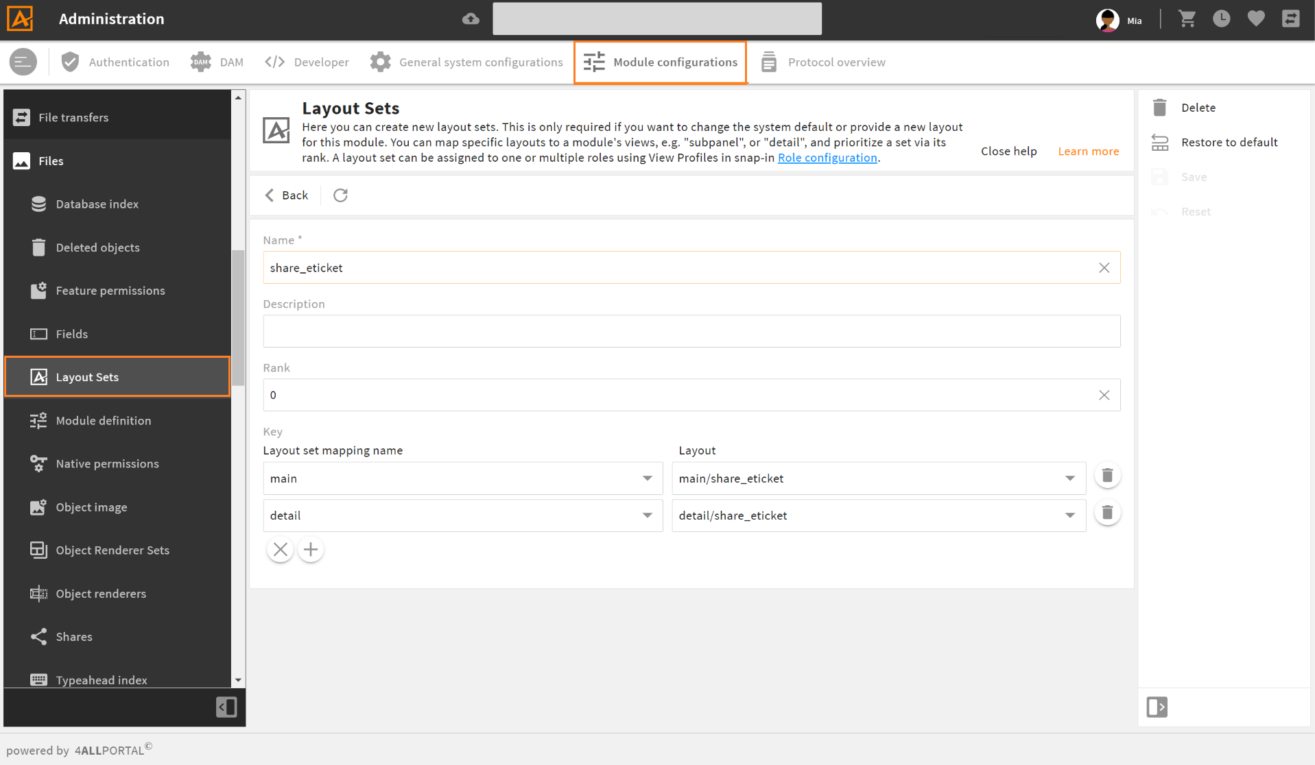
| Name | Description |
|---|---|
| Name | In a module, a set's name must be unique. |
| Description | Optional description, e.g., to define what role(s) this set is designed for. |
| Rank | If a module has more than one layout set and both are assigned in a view profile, this rank defines what set will apply. |
| Layout set mapping name * | A view from this module requesting the assigned layout on the right. |
| Layout * | The layout loaded for the defined view on the left. The layout drop-down offers all layouts stored in folder {module}/layouts. |
* In new sets, click the "+" button for these options.
# Changes: Customizing Layouts
A very common use case is to customize an existing layout instead of defining a completely new one: You can remove, move, or add some elements while most elements remain exactly the same.
For this case we work with layout changes (changes documentation). Layout changes are files that add just some changes to an existing layout. They depend, like a complete layout, on the parameters module, id, object_type, role_mapping and client_type.
# How to Make a Layout Change
- Create a change file in your custom folder at the desired path (e.g. file
default.4aplayout_cin foldermodules/user/layouts/detail). - The change file has to contain the root element, which can contain multiple tags.
- Add your change instructions. Use
<changes extends>to define the parent layout (can be a change file, too) - more details.
As a result, this change file changes the defined layout with its specified instructions.
Please note: Putting a custom change in a custom folder path (e.g., custom/modules/user/layouts/detail/custom_layout), makes this change addressable for other layout changes in that module.
# Changes Extends: Path Specification
A layout change starts with and requires the specification in tag <changes extends>, e.g., <changes extends="main/admin">.
Depending on the path defined here, the parent layout is determined by the system following this logic:
- no subfolder: change with
<changes extends="default">lies in foldermain: Parent layout is searched for in the path of the change itself:main/default - one subfolder: change with
<changes extends="main/layout_1">with namedefault.4aplayoutlies in foldercustom_layouts: Parent layout is searched for in pathmain/layout_1/default(this change explicitly defines to look in another layout folder) - two subfolders: change with
<changes extends="main/layout_1/layout_A">lies in foldercustom_layouts: Parent layout is searched for in pathmain/layout_1/layout_A
In all cases, the folder-based fallback would apply.
XPath
To define you changes instructions, use xpath (xpath elements).
Multiple Changes
If there is an existing change file with the same path in another 4App, they will both apply one after the other according to the defined app order (changes order). It is not required to copy contents like it was in previous versions.
# Layout Change XML Example
<changes extends="main/admin">
   <change type="add" xpath="/component[@component='div']/children/component[@id='cm4ap-viewstack']/children"
      at="2">
      <component component="cm4ap-icon">
              <parameter>
                <entry key="name">ICON_NAME</entry>
              </parameter>
      </component>
   </change>
</changes>
This change adds a new element to the viewstack at the second position of layout main/admin. All elements at the former second or higher position are moved down one position.
# Reference: Layout XML Example
<layout>
   <styles>
      <style>
         #viewstack_one {
            background_color: var(--theme-50);
         }
      </style>
   </styles>

   <consts>
      <const key="imageSource" class="string">niceImage.jpeg</const>
   </consts>

   <actors>
      <actor id="viewstackActor" type="ToggleActor">
         <parameter>
            <entry class="number" key="stateCount">2</entry>
         </parameter>
      </actor>
   </actors>

   <elements>
      <component component="div">
               <parameters>
                  <entry key="class" class="attribute">layout horizontal</entry>
               </parameters>
         <children>
            <component id="handler_4711" component="cm4ap-viewstack-handler">
               <parameter>
                  <entry key="toggleActor" class="actor">viewstackActor</value>
               </parameter>
            </component>
            <component component="cm4ap-beautiful-image">
               <parameter>
                  <entry key="src" class="const">imageSource</value>
               </parameter>
            </component>
            <component id="viewstack_one" component="cm4ap-viewstack">
               <parameter>
                  <entry key="toggleActor" class="actor">viewstackActor</value>
               </parameter>
               <children>

                  <import_layout layout_id="search_result" module="contact" object_type="portaluser">
                     <parameter>
                        <entry key="nameOfTheInnerActor" class="actor">viewstackActor</entry>
                        <entry key="nameOfTheInnerConst" class="const">imageSource</entry>
                     </parameter>
                  </import_layout>

                  <!-- further viewstack elements -->

               </children>
            </component>
         </children>
      </component>
   </elements>
</layout>
In this example, a viewstack handler is swapped out in a second component. The component can thus be placed anywhere and via the passed parameters contains a reference to the actor, which was also passed to the viewstack. The handler can change the view through this actor, and the viewstack can catch the corresponding event on the actor.
Thus, both viewstack handler and viewstack do not know what their actions actually cause, which makes them reusable. So these components are completely independent of each other and communicate only via the actors passed to them.