# InfoBanner
The InfoBanner component is used to display an information for the user. It can display a title, description, icon and a number of buttons which can provide different functionalities.
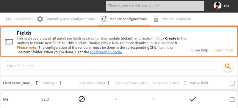
Info banner in admin snap-in Module configurations/Fields
# Properties
# Example
In the following example there is an info banner with a set icon, title and description. Additionally, there is one button which hides the info banner and one button to open a new tab with a specific URL.
<layout>
  <!-- other stuff -->

  <elements>
  <!-- other stuff -->

    <component component="cm4ap-info_banner">
      <parameter>
        <entry key="class" class="attribute">split_box_child</entry>

        <entry key="icon">M-USER</entry>
        <entry key="infoTitle">L-M-USER</entry>
        <entry key="description">L-M-USER-INFO</entry>
        <entry key="buttons" class="array">
          <value class="map">
            <entry key="type">close</entry>
            <entry key="label">L-GLOBAL-CLOSE</entry>
          </value>
          <value class="map">
            <entry key="type">url</entry>
            <entry key="label">L-GLOBAL-MORE_INFORMATION</entry>
            <entry key="tooltip">L-GLOBAL-MORE_INFORMATION-INFO</entry>
            <entry key="primary" class="boolean">true</entry>
            <entry key="parameter" class="map">
              <entry key="target_url">https://docs.4allportal.com</entry>
            </entry>
          </value>
        </entry>
      </parameter>
    </component>

  </elements>

</layout>