# Layouts
Layouts define the logical structure of a certain area, mostly the content area of the 4ALLPORTAL. With layouts you can define what elements shall be displayed e.g. in a record's detail view, a subpanel, or a modules main view. Each new view requires an own layout XML file in the file system.
# Storage
All layouts are stored either global in directory global/defaults/layouts or module-specific in directory modules/MODULE/layouts (any subdirectories). Each view requires a separate subdirectory. A layout's file extension is .4aplayout.
Subfolders example:
- modules/user/layouts/detail
- modules/user/layouts/detail/special_data
- modules/user/layouts/main
- modules/user/layouts/perssettings
- modules/user/layouts/subpanel
# How do Layouts Work?
A layout is basically a simplified syntax that is interpreted by the front end and builds the corresponding content of the page. It contains elements, attributes and styles, but unlike HTML only data-independent information is transferred - equivalent to templates, which have placeholders for corresponding values.
A layout depends on several parameters and can also be divided and retrieved according to these parameters. These parameters are:
moduleidobject_typerole_mappingclient_type
Using different parameters causes different ways to display content. For example:
- Make the content area of an object from the
filesmodule look completely different using ObjectType (prefixot_)jpegor ObjectTypedocx. - Choose completely different appearances for different user groups using prefix
ro_. - Hide unimportant elements on a mobile device or insert additional elements using prefix
ct_.
# Layout Fallback
Layouts follow a fallback logic that makes it impossible to not load a layout on request.
Example:
The requested layout "main/special_main" for module user results in the following fallback steps:
- use
modules/user/layouts/main/special_main/default.4aplayout(_c) - use
global/defaults/layouts/main/special_main/default.4aplayout(_c) - use
modules/user/layouts/main/default.4aplayout(_c) - use
global/defaults/layouts/main/default.4aplayout(_c) - use
modules/user/layouts/default.4aplayout(_c) - use
global/defaults/layouts/default.4aplayout(_c)
The fallback logic interrupts for the first "full layout" (without _c):
- If there is a full layout file in the specified path, this layout will be used (plus all changes from
_cin that path). - If there is just a change file in the specified path (i.e. with suffix
_c) or no layout file at all, then this change file (if it exists) will be applied to the first "full" layout file that is found in the next fallback step(s).
Exception: Role dependency
The role dependency is not only controlled by prefix ro_. This prefix can also create virtual roles, which must be mapped to the actual roles in the role configuration. This can be done for each module in section "Layouts". Its values are generated by the ro_ prefixes in the file system.
# Structure and Elements
A layout can become as complex as you need it. It consists of:
- mainly components, which are nested and can be passed parameters. To let these interact with each other, or to execute specific actions, there are
- actors, which represent pure logic classes. They have no representation themselves, but can act on it through various mechanisms.
- a styling area which makes it possible to give the layout specific styling rules to connect the view of composed components.
# XML Structure
A layout's XML tag is layout. A layout XML consists of the following:
| Name | Type | Description |
|---|---|---|
<styles> | Style | contains the layout specific stylings |
<consts> | Const | Constants can contain fixed values that can be used in a layout. When this layout is imported, these constants can be overwritten from outside. |
<actors> | Actor | contains any number of actor definitions that should be available in a layout |
<elements> | Component Import layout | Here the actual structure of the view is shown. |
# Style
The styling area offers the possibility to give special style rules to the layout so that the composite view looks harmonious.
Example: The toolbox can be given a shadow on the left side as long as it is placed on the right side. With another layout, where it might be on the left side, it would need a shadow on the right side.
To define these layout-specific style rules, <style> elements contain CSS text. They are removed after a layout switch and cannot collide with other layouts.
Exception: Styles can be overridden by imported layouts.
Please note: The #id selectors are converted and do not apply one-to-one as CSS. Stylings that do not explicitly refer to defined ids may not be applied correctly.
Allowed XML attributes:
| Name | Type | Description |
|---|---|---|
| exclude | String | exclude evaluates whether the element should be displayed for the respective user.Example: <actor ... exclude="!getFeature('user.audit_read')">. If true is returned, the element will be removed on delivery.The value in exclude is interpreted using the Template Engine. CoreEngine specific functions like getFeature can be found here. |
Example:
This example adds a background color for #my_element. That style is removed/excluded if the user is no superadmin.
<style exclude="!getFeature('global.has_superadmin')">
  #my_element {
    background: #FF8200;
  }
</style>
# Const
<const> elements define constants that are available for this layout. They have a name that is set with the key attribute, and a type that is defined with the class attribute.
The value is specified as the tag content and varies depending on the class.
| Name | Type | Description |
|---|---|---|
| key | String | A unique name used to reference this constant inside and outside the layout. |
| class | string (default) / number / boolean / array / map | Defines the data type of the constant and parses the content accordingly. |
Example:
<const key="name" class="boolean">true</const>
<const key="name" class="map">
   <entry key="subname" class="array">
      <value class="string">Value</value>
      <value class="map">
         <entry key="another level">Per default string</entry>
      </value>
   </entry>
   <entry key="subname2" class="number">5.7</entry>
</const>
# Actors
<actor> elements are used to provide logic for the layout. They can hold cross-element data, let elements communicate with each other, or simply execute some other logic.
The javascript class is specified using the type attribute, of which an instance is created. This can then be retrieved via the naming specified in the id attribute.
To enable different actor instances to behave differently, you can give them parameters. They can activate other behaviors of this actor if required.
| Name | Type | Description |
|---|---|---|
| id | String | A unique name used to reference this actor inside and outside the layout. |
| type | String | Defines the class from which an instance is created. |
| exclude | String | exclude evaluates whether the element should be displayed for the respective user.Example: <actor ... exclude="!getFeature('user.audit_read')">. If true is returned, the element will be removed on delivery.The value in exclude is interpreted using the Template Engine. CoreEngine specific functions like getFeature can be found here. |
# Actor Parameter
Actor parameters look similar to the declaration of constants. They have different types and a name. Maps and arrays can be nested and other values can be fixed.
Unlike constants, there are additional types of parameters that can be passed:
constactor
Example:
<consts>
   <const key="myConst" class="number">5</const>
</consts>

<actors>
   <actor id="myActor" type="ActorClass_1" />
   <actor id="mySecondActor" type="ActorClass_2">
      <parameter>
         <entry key="actorReference" class="actor">myActor</actor>
         <entry key="number" class="const">myConst</actor>
      </parameter>
   </actor>
</actors>
As values, the name of the constant, or the id of the actor are used.
# Components
<component> elements are used to describe the actual structure, i.e. the real layout of the page. They are nested within each other and can receive parameters that directly affect the behavior of the component.
The id can also be specified for the component to uniquely identify the component in this layout.
Additionally, you have to specify what kind of component should be created at this position. For this, the corresponding HTML element name must be entered in the component attribute. It is possible to enter any standard element like div or span, but also individual elements like cm4ap-label (label documentation).
| Name | Type | Description |
|---|---|---|
| id | String | A unique name used to reference and style this component inside the layout. |
| component | Elementname | Name of the HTML element to be created. |
| exclude | String | exclude evaluates whether the element should be displayed for the respective user.Example: <actor ... exclude="!getFeature('user.audit_read')">. If true is returned, the element will be removed on delivery.The value in exclude is interpreted using the Template Engine. CoreEngine specific functions like getFeature can be found here. |
# Component Children
Components can also contain child components. The <children> tag is used for this purpose.
Example:
<component component="div">
   ...
   <children>
      <component component="div">
         ...
      </component>
      <component component="cm4ap-label">
         ...
      </component>
      <import_layout layout_id="subpanel">
         ...
      </import_layout>
   </children>
</component>
# Component Parameter
The component parameters are exactly the same as those of the actors. The only difference is an additional type that can be passed:
attribute
Example:
<component component="cm4ap-label">
   <parameter>
      <entry key="class" class="attribute">cssClass anotherClass</entry>
   </parameter>
</component>
This example shows an HTML attribute assigned to the component. This way, CSS classes or other attributes can be passed, which can affect the appearance, and the behavior like other parameters.
# Import Layout
Similar to the <component> element, the <import_layout> element can be used to give instructions for the display. However, instead of an element, a whole new layout is loaded. Various attributes can determine which layout should be loaded:
layout_idis required. It defines the id name of the layout to be loaded.- Optionally,
moduleandobject_typecan be specified if they should differ from the outer layout.
All elements of the imported layout are inserted and displayed at the position of the <import_layout>. The styles of the parent layout also take effect, but can be overwritten by the imported layout rules. The rules of the imported layout, however, cannot influence the parent layout.
Also, the data management of actors and constants is strictly separated: Actor definitions within the imported layout have no effect on the outer one. There can be no collisions with id values, since these are limited to one layout, too.
However, actors and constants can be given manually from the parent layout to the inner layout: To do this, the desired contents are passed to the <import_layout> element as parameters. Make sure the name of the parameter corresponds to the name in the inner layout, and the value corresponds to the name of the actor or constant.
Example:
The following example of an import layout includes a subpanel with certain parameters like relation name, title label and others:
<import_layout layout_id="subpanel" module="file" exclude="!getPermission('module_access', 'file')">
    <parameter>
        <entry key="beanActor" class="actor">beanActor</entry>
        <entry key="defaultSortField" class="string">name</entry>
        <entry key="relationName" class="string">MY_FILE_RELATION</entry>
        <entry key="targetModule" class="string">file</entry>
        <entry key="subpanelTitle" class="string">L-LABEL_KEY</entry>
        <entry key="showQuickCreate" class="boolean">false</entry>
        <entry key="showAddRelation" class="boolean">false</entry>
    </parameter>
</import_layout>
| Name | Type | Description |
|---|---|---|
| layout_id | String | The name of the layout to be loaded. |
| module | String default: requested module of the current layout | The module from which the layout should be loaded. |
| object_type | String default: requested ObjectType of the current layout | The ObjectType for which the layout should be loaded. |
# Changes: Customizing Layouts
A very common use case is to customize an existing layout instead of defining a completely new one: You can remove, move, or add some elements while most elements remain exactly the same.
For this case we work with layout changes. Layout changes are files that add just some changes to an existing layout. They depend, like a complete layout, on the parameters module, id, object_type, role_mapping and client_type.
# How to Make a Layout Change
- Create a change file at the desired path in your layouts folder (mostly
default.4aplayout_c, but you can also use the specific prefixesro_,ct_and so on). - The change file has to contain the root element, which can contain multiple tags.
- Add your change instructions. They will apply to the next full layout (fallback logic).
As a result, this change file changes the "full layout" with its specified instructions.
Please note:
If there is an existing change file with the same path in another 4App, it will be overridden. Its changes will not apply. If you need them too, copy its changes into your new change file.
For all details, refer to our configuration changes documentation.
# Layout Change XML Example
<changes>
   <change
      xpath="/component[@component='div']/children/component[@id='cm4ap-viewstack']/children"
      type="add"
      at="2">

      <component component="cm4ap-icon">
              <parameter>
                <entry key="name">ICON_NAME</entry>
              </parameter>
      </component>
   </change>
</changes>
This change adds a new element to the viewstack at the second position. All elements previously at the second or higher position are moved down one position.
# Role-specific Layouts
If you want a role to have its own layout, you can create a role-specific layout change (in case you want to alter the default) or add a new layout for this role (in case you want to override the default). You must then map this layout to the respective role to activate it.
For general information about changes and how they apply, refer to our changes documentation. For layout specific changes, refer here.
# Alter the Default with a Layout Change
- Go to the module's path in your custom folder and create a layout change XML for the corresponding layout (e.g. file
default.4aplayout_cin foldercustom/modules/file/layouts/detail). - Replace
defaultwith prefixro_plus a significant name to describe the layout (e.g.ro_only_photographer.4aplayout_corro_layout_without_buttons.4aplayout_c). - Make your changes XML using the change syntax.
- Clear your system's configuration cache.
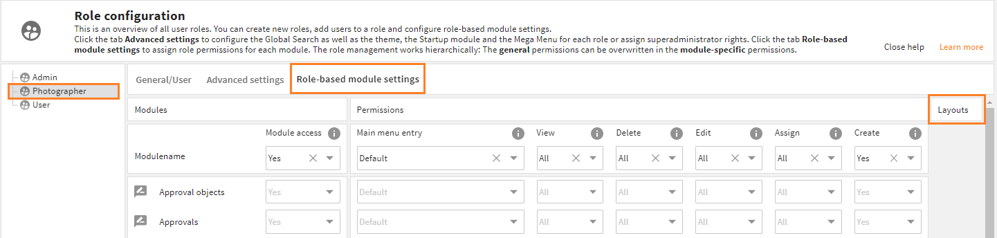
- Go to admin snap-in
General system configurations/User settings/Role configuration, select the role you made this layout for (e.g. photographer), and go to tabRole-based module settings. - To the right of the permissions you can open the "Layouts" section. It shows drop-down menus for each module and view. Go to the respective module (in our example: Files) and choose the layout you stored in the filesystem from the drop-down of the respective view (in our example: Detail View). Only manually added role-specific layouts will be shown.
- Save your settings and log out an in to see your changes.
If Your Layout Already Is a Change
This also works with layouts, that already come with a change by default (e.g. default.4aplayout_c). In this case, you need to copy the complete change file (e.g. default.4aplayout_c) to your custom folder and rename it as described above.
Now add the changes you need using the change syntax, or comment out changes you do not need.
Your custom change file will override the change which again alters the default layout.
Please note: This behaviour will change with Core Engine version 4.x. The 4ALLPORTAL then supports multiple changes.
open the role's Layouts section
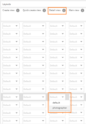
choose the specific layout from the drop-down
# Altering a Layout for All Roles But One
If you want to alter a layout or layout change for all roles but one (e.g. your admin role), just copy the respective standard layout (or layout change) to your custom folder and just rename it (e.g. ro_admin.4aplayout or ro_admin.4aplayout_c). The contents remain unchanged and resembles the former standard.
For all other roles that need a layout change, follow all steps above, except of adding ro_ or a role's name to the layout's file name. Your altered layout keeps its filename (complemented with _c) and will thus be the default layout file for all roles except the admin role.
# Override the Default With a New Layout
- Create your new layout XML and give it a unique name: Use prefix
ro_plus a significant name to describe the layout (e.g.ro_only_photographer.4aplayoutorro_layout_without_buttons.4aplayout). - Add this layout to the correspondent path in your custom folder (e.g.
custom/modules/contact/layouts/detail). This layout will override thedefault.4aplayoutfor this role. - Clear the configuration cache.
- Go to admin snap-in
General system configurations/User settings/Role configuration, select the corresponding role (in our example: user) and go to tabRole-based module settings. - To the right of the permissions you can open the "Layouts" section. It shows drop-down menus for each module and view. Go to the respective module (in our example: Contacts) and choose the layout you stored in the filesystem from the drop-down of the respective view (in our example: Detail View). Only manually added layouts for this specific role will be shown.
- Save your settings and log out an in to see your changes.
# Reference: Layout XML example
<layout>
   <styles>
      <style>
         #viewstack_one {
            background_color: var(--theme-50);
         }
      </style>
   </styles>

   <consts>
      <const key="imageSource" class="string">niceImage.jpeg</const>
   </consts>

   <actors>
      <actor id="viewstackActor" type="ToggleActor">
         <parameter>
            <entry class="number" key="stateCount">2</entry>
         </parameter>
      </actor>
   </actors>

   <elements>
      <component component="div">
               <parameters>
                  <entry key="class" class="attribute">layout horizontal</entry>
               </parameters>
         <children>
            <component id="handler_4711" component="cm4ap-viewstack-handler">
               <parameter>
                  <entry key="toggleActor" class="actor">viewstackActor</value>
               </parameter>
            </component>
            <component component="cm4ap-beautiful-image">
               <parameter>
                  <entry key="src" class="const">imageSource</value>
               </parameter>
            </component>
            <component id="viewstack_one" component="cm4ap-viewstack">
               <parameter>
                  <entry key="toggleActor" class="actor">viewstackActor</value>
               </parameter>
               <children>

                  <import_layout layout_id="search_result" module="contact" object_type="portaluser">
                     <parameter>
                        <entry key="nameOfTheInnerActor" class="actor">viewstackActor</entry>
                        <entry key="nameOfTheInnerConst" class="const">imageSource</entry>
                     </parameter>
                  </import_layout>

                  <!-- further viewstack elements -->

               </children>
            </component>
         </children>
      </component>
   </elements>
</layout>
In this example, a viewstack handler is swapped out in a second component. The component can thus be placed anywhere and via the passed parameters contains a reference to the actor, which was also passed to the viewstack. The handler can change the view through this actor, and the viewstack can catch the corresponding event on the actor.
Thus both viewstack handler and viewstack do not know what their actions actually cause, which makes them reusable. So these components are completely independent of each other and communicate only via the actors passed to them.