# Object Renderer
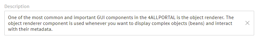
One of the most common and important GUI components in the 4ALLPORTAL is the object renderer. It is highly customizable and used whenever you want to display complex objects (beans) and interact with their metadata.
If you want to ...
- add a group of metadata fields to your object's detail view,
- add a search filter to your search,
- customize the displayed metadata in a list view,
you need to make all this in an object renderer configuration. They offer a lot of specifications and are thus highly customizable.
Prerequisites
In object renderers, the display of metadata in the GUI is defined. It provides the interface to the beans, corresponding actions are executed externally.
So as a prerequisite, you need create the fields or value option you want to refer to, and translate all appropriate label keys.
# Base Types
There are three basic types of object renderers designed for three different use cases:
-
- The metadata renderer is used to display, enter and edit metadata of an object.
- Most time used in an object's
detail view.

metadata renderer in the GUI -
- The search renderer is used to create search filters.
- Most time used in the
main view.
search renderer in the GUI -
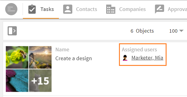
- The simple renderer is used to only display metadata of an object. You are not able to edit the values (readonly).
- Most time used in a
list view.
simple renderer in the GUI
Specifications
- All three types can be configured using the same basic configuration elements.
- Note the specifications and limitations for search renderers and simple renderers.
- Additionally, you can specify a field renderer's display and options using attributes depending on the field type.
# Storage, Configuration Request & Fallback Logic
# Filesystem
Most object renderers are module-specific and sorted by their base type. Their path locations in the file system are thus:
modules/{$module}/object_renderer/metadatamodules/{$module}/object_renderer/searchmodules/{$module}/object_renderer/simple
In these folders, more subfolders are possible according to the object renderer's location, e.g. admin or subpanel, or according to their content, e.g. search_for_status.
The filename extension for object renderers is .4aprenderer.
Examples:
modules/user/object_renderer/metadata/admin/default.4aprenderermodules/login_attempt/object_renderer/search/search_for_status/default.4aprenderer
Some object renderers are stored globally in folder global/defaults/object-renderer.
They are either not module-specfic (e.g. for basic admin snap-ins), or provide a default fallback renderer for each base type fallback logic).
# Unique Renderer ID
Each object renderer in the GUI requests its required configuration in the filesystem via an ID. There are two options to make a renderer unique:
A renderer ID can be the folder location of the renderer configuration.
For example, a search renderer in moduleuseris stored at and requested from pathmodules/user/object_renderer/search/base_search. Its corresponding configuration XML filedefault.4aprendererhas the IDbase_search.A renderer ID can as well be its unique XML file name, that best describes where it is located, e.g.
id_tagging_sidebar.4aprenderer.
# Fallback Logic
When an object renderer configuration is requested via its ID, the corresponding .4aprenderer file is delivered accordingly. If no renderer configuration is stored in the corresponding path, a fallback applies according to the system's fallback logic.
With this fallback mechanism, there is no way the object renderer gets no configuration.
# Changes
Like other configurations in the 4ALLPORTAL, object renderer files, too, can be partially modified by creating a change with postfix _c.
For all details, take a look at our changes documentation here.
# Object References and ReferenceFind
There is a huge number of configuration IDs that are generated automatically. For example, each displayed object reference uses a specific object renderer ID. The simple renderer in list items of a subpanel uses ID subpanel/{$relation_name}. With these individual IDs you are able to configure different object representations for each relation.
# Subpanel Fallback
Additional to the system's fallback logic, and to preserve you from a "configuration hell", there is a second fallback mechanism for relations:
Instead of creating tons of renderer files for each relation, the IDs will automatically be fallbacked step by step. If the object renderer requests ID a/b/c/d/e, the server tries to resolve the whole ID in the file system. If this path does not exist, the server tries to get the ID one level higher: a/b/c/d. With this routine, you are able to configure only renderer default.4aprenderer in simple/subpanel and every relation will get this renderer.
# Basic Configuration Elements
The following tags and wrapper elements are the basic structure of an object renderer and can be used for all three object renderer types.
While the metadata renderer may use all elements without restrictions, the search renderer and the simple renderer have restrictions, but also additional elements. Some differences are at the main level, but they mostly differ in the field renderer section.
An object renderer consists of the following basic elements:
<root_tag>
  <group_renderer_list>
    <group_renderer>
      <field_renderer_list>
        <field_renderer>
          <field>

          </field>
        </field_renderer>
      </field_renderer_list>
    </group_renderer>
  </group_renderer_list>
</root_tag>
| Name | Description |
|---|---|
| root_tag | defines the renderer type (metadata_renderer, search_renderer, or simple_renderer) |
| group_renderer | lets you create foldable groups for your field renderers |
| field_renderer | defines the way your fields should be rendered in the GUI. The looks and functions depend on the field renderer types |
| field | specifies the actual database field whose values should be rendered |
Example:
<metadata_renderer>
  <label_placement>top</label_placement>

  <group_renderer_list>
    <group_renderer>
      <type>flat</type>
      <default_open>true</default_open>
      <label>L-GLOBAL-METADATA_GROUP</label>
      <info>L-GLOBAL-METADATA_GROUP-INFO</info>
      <column_count>1</column_count>

      <field_renderer_list>

        <field_renderer>
          <type>text</type>
          <label>L-MY-LABEL</label>
          <info>L-MY-LABEL-INFO</info>
          <rowspan>1</rowspan>
          <colspan>1</colspan>
          <height>large</height>
          <width>large</width>
          <read_only>false</read_only>
          <read_only_type>multi_line</read_only_type>
          <hide_if_empty>false</hide_if_empty>
          <field_renderer_attributes>
            <!-- optional attributes -->
          </field_renderer_attributes>
          <field>
            <name>id</name>
            <type>CEId</type>
          </field>
        </field_renderer>

      </field_renderer_list>
    </group_renderer>
  </group_renderer_list>
</metadata_renderer>
Keep it simple!
Not all possible elements or defaults described in the following must be specified in a renderer configuration. If you do not need an element, keep your XML simple and just leave it out.
# Root Tag
XML root tags: <metadata_renderer>, <search_renderer>, <simple_renderer>
Possible specifications:
| Name | Value/Type | Description |
|---|---|---|
| label_placement | topleftinlinenone | Specifies the placement of the label. The most common values are top and left.inline, on the other hand, displays the name of the field within the field, if possible.none hides the label completely and frees the space for it if necessary. |
| label | Label key (string) | Displays a text for the renderer. This text is not displayed in all circumstances. For example, conditional operation form may use this label for a pop-up title. |
| info | Label key with-INFO (string) | Adds helpful information for the entire renderer. This text is not displayed in all circumstances. For example, this text may be embedded in a tooltip. |
| icon | Icon name (string) | Can add an icon to the renderer. The display type is currently not defined. |
| group_renderer_list | <group_renderer_list> | This wrapper contains your group renderers |
Example:
<metadata_renderer>
  <label_placement>top</label_placement>
  <label>L-FILE-METADATA_RENDERER-TITLE</label>
  <info>L-FILE-METADATA_RENDERER-TITLE-INFO</info>
  <icon>FILE-METADATA_RENDERER.4apicon</icon>
  <group_renderer_list>

    <!-- all the rest -->

  </group_renderer_list>
</metadata_renderer>
# Group Renderer
Each group renderer defines one or more groups of field renderers in the GUI. It can be made foldable to save space.
Wrapper element: <group_renderer_list>
XML tag: <group_renderer>
Possible specifications:
| Name | Value/Type | Description |
|---|---|---|
| label | Label key (string) | Displays a text for this group. It is placed above the fields, and in the area of the open/close function. |
| info | Label key (string) | Adds helpful information for the entire group. This text is likely to be embedded in a tooltip. |
| icon | Icon name (string) | Can add an icon to the group. This icon is displayed on the left of the group label. |
| type | foldable (default),flat | Defines whether the group renderer can be opened/closed. Flat hides the icon for opening and closing the group. |
| default_open | true (default),false | Defines whether the group is initially open or closed. This setting has no effect if the group is not foldable. |
| column_count | default: 1 (integer) | Defines the number of columns in this group and how many field renderer may be in a row until the next row starts. The number must be a positive integer greater than 0. |
| field_renderer_list | <field_renderer_list> | This wrapper contains your field renderers |
Example:
<metadata_renderer>
  <group_renderer_list>
    <group_renderer>
      <type>foldable</type>
      <default_open>false</default_open>
      <label>L-FILE-METADATA_RENDERER-GENERAL</label>
      <field_renderer_list>

        <!-- field renderer -->

      </field_renderer_list>
    </group_renderer>

    <group_renderer>
      <type>foldable</type>
      <default_open>true</default_open>
      <label>L-FILE-METADATA_RENDERER-COLOR-SEARCH</label>
      <field_renderer_list>

        <!-- field renderer -->

      </field_renderer_list>
    </group_renderer>
  </group_renderer_list>
</metadata_renderer>
multiple metadata groups in the GUI
# Field Renderer
For each field you want to display in your GUI, a separate field renderer must be configured. The looks and functions depend on the defined field renderer type.
Your object renderer can contain a list of one or multiple field renderers.
Also, one field renderer can refer to multiple database fields, e.g. when configuring a search.
Wrapper element: <field_renderer_list> XML tag: <field_renderer>
Possible specifications:
| Name | Value/Type | Description |
|---|---|---|
| label | Label key (string) | Displays the text for a field. The placement is defined by tag <label_placement> (see above). If no label was defined, a label key is automatically inserted according to the following pattern: L-MODULENAME-FIELDNAME. |
| info | Label key (string) | Adds helpful information for a field. This text is likely to be embedded in a tooltip. |
| placeholder | Label key (string) | Displays a prompt text to the user to give them an idea of what to enter or do, e.g. "John Doe" or "Please select a value". |
| icon | Icon name (string) | Can add an icon to a field. This icon is displayed on the left of the field name. |
| type | Field renderer types default: text | Defines which type of visualization should be used to display the value of a field. |
| read_only | false (default)true | If set to true, the representation is simplified: Only the plain value of a field is displayed. Its values cannot be edited. The exact representation depends on the field type.If not configured, a field will be filled automatically if the combination of renderer and field type supports editing. |
| read_only_type | single_line (default)multi_line | Defines whether the displayed value can be wrapped or not. |
| disabled | false (default)true | If set to true, the input of a value is blocked.Please note: If blocked, the display format should still be kept. Later extensions of dependent fields may activate this component afterwards. |
| colspan | default: 1 (integer) | Defines over how many columns a field extends. |
| rowspan | default: 1 (integer) | Defines over how many rows a field extends. |
| width | empty (default)smallmediumlargeauto | This value defines an explicit width using a fix value (e.g. small) to meet the need of different renderers. Often suitable for images.Please note: A renderer using a fix value is no longer dynamically adjusted to the available space. Value auto will fit the field size to the content. But in a grid view, unequal row values will not adjust to each other. |
| height | empty (default)smallmediumlargeauto | Analog to width, this value determines the height. |
| value_option_key | Name of a value option (string) | The values of this value option will be loaded and translated. If not set here, it is automatically read and set from the field's XML. |
| hide_if_empty | false (default)true | If set to true, a field renderer is completely hidden as soon as it does not contain a value.Please note: This option is only available for read_only fields. |
Further specifications:
| Name | Value/Type | Description |
|---|---|---|
| default_value | Default values | Defines a value that will be set if no corresponding value was set in a field. Please note: This option must be actively enabled in the frontend, e.g., in a create view. For an already existing object, the value set here has no effect. |
| field_renderer_attributes | Field Renderer Attributes | These attributes can determine the appearance and behavior depending on the individual field renderer types, e.g. if an entry should be a password displayed with "*". |
| validation | Validation | With validation you have various rules to check the correctness of a value in the frontend. If this option is not configured, it will be set from the field's XML. |
| typeahead | Typeahead | These settings can influence the behavior of a typeahead field. |
| field | Renderer Field | Here, the actual field of an object must be named. As soon as an object is loaded or read out, this configuration is responsible. |
Example:
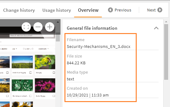
<metadata_renderer>
<group_renderer_list>
<group_renderer>
<field_renderer_list>
<field_renderer>
<hide_if_empty>true</hide_if_empty>
<read_only>true</read_only>
<read_only_type>multi_line</read_only_type>
<field>
<name>name</name>
</field>
</field_renderer>
<field_renderer>
<hide_if_empty>true</hide_if_empty>
<type>Metric</type>
<read_only>true</read_only>
<field_renderer_attributes>
<entry key="autoCompress" class="boolean">true</entry>
<entry key="metric" class="string">data</entry>
<entry key="defaultUnit" class="string">bytes</entry>
</field_renderer_attributes>
<field>
<name>size</name>
</field>
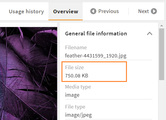
</field_renderer>
<field_renderer>
<hide_if_empty>true</hide_if_empty>
<value_option_key>mimetypes</value_option_key>
<read_only>true</read_only>
<read_only_type>single_line</read_only_type>
<field>
<name>mimetype</name>
</field>
</field_renderer>
<field_renderer>
<hide_if_empty>true</hide_if_empty>
<read_only>true</read_only>
<type>DateTime</type>
<read_only_type>single_line</read_only_type>
<field>
<name>created_time</name>
</field>
</field_renderer>
</field_renderer_list>
</group_renderer>
</group_renderer_list>
</metadata_renderer>
Result in the GUI:
# Field Renderer Types
A field renderer always requires a <type>. This type influences both appearance and functionality of the renderer. Not every renderer type can handle every CE value. Always select a renderer type that corresponds to your given data storage.
If no type is set, the default type of a field renderer is text.
We support the following field renderer types:
| Name | Description |
|---|---|
| Text | The text renderer is suitable for most plain text input. It is required to configure a standard typeahead. |
| Number | The number renderer offers different options to display numerical values. |
| Selection | The selection renderer is used to select one or more values from a fix selection list. |
| DateTime | Date and/or time values can be managed using the datetime renderer. |
| OnOff | This renderer is used to set a field to on or off. Additionally, there is an extra value "not set" (null). |
| Reference | To create and display references to other datasets, use the reference renderer. |
| Image | This renderer is used to turn the set value to an image. It supports object images as well as regular and parameterizable URLs. |
| Link | With the link renderer, HTML links can be parameterized and also overwritten. |
| Metric | Using the metric renderer, numeric values can be linked to a metric and a unit of that metric. |
| Dimension | For search renderers only. With a dimension renderer, values of active dimensions can be selected to limit search results. |
| Color | This renderer offers the possibility to display or set the string representation of a color value. |
| Spacer | The renderer type spacer is used to leave the corresponding cell free. Since <colspan> and <rowspan> values can also be set, the structure of the containing group can be defined quite freely. |
# Default Value
XML tag: <default_value>
A default value can be configured in order to deliver a field with an already set value, e.g. for a dropdown or boolean. It is understood and parsed depending on its individual field renderer type, which receives the default value as entered and handles it accordingly.
The following basic data types can be used as default values:
| Type | Description | Possible field(s) |
|---|---|---|
| boolean | The text will be trimmed and must be exactly true. In that case, a true boolean is adopted, otherwise it will be false.Case insensitive. | CEBoolean |
| number | The text will be trimmed and parsed as float or int. | CEInteger, CELong, CEFloat, CEDouble |
| string | The text will be trimmed and adopted one-to-one. | CEVarchar, CEText, CEEmail |
| date | The text will be trimmed, parsed as int parsed, and treated as the number of milliseconds since 01/01/1970 00:00:00.000 (UTC). | CETimestamp, CEDate, CEDateTime |
| array | The text will be parsed as JSON. The individual values will be trimmed and parsed as told above. | CEVarcharList, CETextList, CEEmailList, CEIntegerList, CELongList, CEFloatList, CEDoubleList, CEDecimalList, CETimestampList, CEDateList, CEDateTimeList |
Example:
<field_renderer>
  <label>L-GLOBAL-PASSWORD_SECURITY-COMPLEXITY</label>
  <info>L-GLOBAL-PASSWORD_SECURITY-COMPLEXITY-INFO</info>
  <type>Selection</type>
  <value_option_key>password_complexity</value_option_key>
  <default_value>nuls</default_value>
  <field_renderer_attributes>
    <entry key="visual_type" class="string">DROPDOWN</entry>
  </field_renderer_attributes>
  <validation>
    <not_null>true</not_null>
  </validation>
  <field>
    <name>complexity</name>
    <type>String</type>
  </field>
</field_renderer>
Result in the GUI:

# Field Renderer Attributes
XML tag: <field_renderer_attributes>
Additional attributes can be assigned to a field to specify its options and appearance in the GUI. Each field renderer type supports different, type-specific attributes. Refer all types with their attributes here.
The possible classes are:
- string (default)
- boolean
- number
- array
Example:
<field_renderer>
  <type>Selection</type>
  <field_renderer_attributes>
    <entry key="visual_type" class="string">radio</entry>
    <entry key="has_popup" class="boolean">true</entry>
    <entry key="show_groups" class="boolean">true</entry>
  </field_renderer_attributes>
  <field>
    <name>image_source</name>
  </field>
</field_renderer>
Result in the GUI:
# Validation
XML tag: <validation>
It is often useful to limit a user's entries to prevent incorrect values and to map certain permissions. With object renderers you can therefore define some validation rules that are checked while entering values and prevent sending certain values to the backend.
Possible specifications:
| Name | Value/Type | Description |
|---|---|---|
| not_null | false (default)true | Specifies whether this field is an required field and an entry must be made (<not_null>true</not_null>). If set to true, an asterisk * will be displayed beside the label. |
| min | doubledefault: null | Only for types string, number, or date with different effects per type: String: minimum string length Number: smallest accepted numerical value Date: number of milliseconds since 01/01/1970 00:00:00,000 UTC must be at least this large. |
| max | doubledefault: null | Analog to min, this is the maximum value. |
| min_entries | integerdefault: null | Defines the minimum number of list entries this field must have. |
| max_entries | integerdefault: null | Defines the maximum number of list entries this field may have. |
| regex_list | RegEx rule | Defines a list of regexes that check the input for a match. For this, all values are first converted to a string and then checked. |
| regex_success_text | Label key (string) default: null | If defined, this text is displayed as soon as the regex rules are fulfilled. |
# RegEx Rule
XML tag: <regex>
Using a regex rule restricts users when entering values, e.g. to prevent the creation of file names your system cannot operate with.
Possible specifications:
| Name | Value/Type | Description |
|---|---|---|
| rule | regex | Equivalent to the regular regex syntax with /.*/gmi |
| nomatch_type | error (default)warning | Specifies whether a message is displayed as an error or warning and whether a value is still valid although the rule is not fulfilled. |
| nomatch_text | Label key (string) | Label to display a text if this regex rule is not met. |
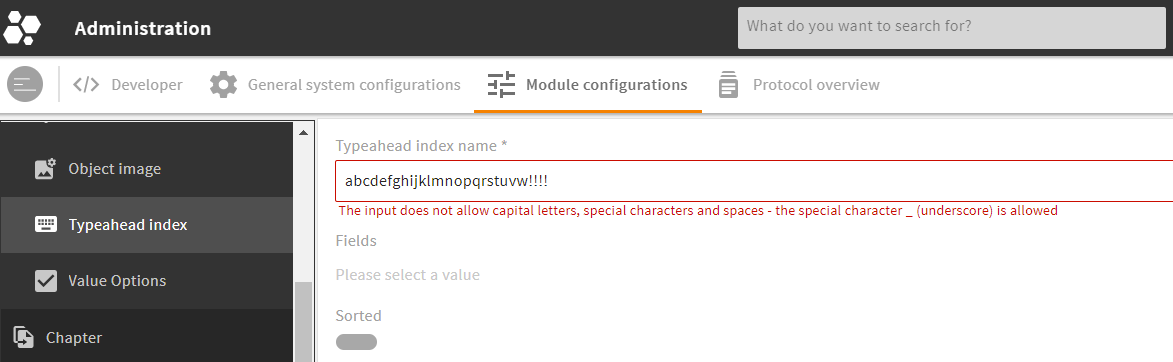
Example:
<field_renderer>
  <label>L-A-TYPEAHEADINDEX-NAME</label>
  <info>L-A-TYPEAHEADINDEX-NAME-INFO</info>
  <placeholder>L-A-TYPEAHEADINDEX-NAME-PROMPT</placeholder>
  <validation>
    <not_null>true</not_null>
    <max>28</max>
    <regex_list>
      <regex>
        <rule><![CDATA[^[a-z][0-9a-z_]*$]]></rule>
        <nomatch_text>L-GLOBAL-ADMIN-NAME-REGEX_INVALID</nomatch_text>
      </regex>
    </regex_list>
  </validation>
  <field>
    <name>name</name>
    <type>String</type>
  </field>
</field_renderer>
Result in the GUI:
# Typeahead
XML tag: <typeahead>
The typeahead functionality can help users entering values like search terms or keywords by matching the user's entry with an index. The configuration lets you limit the input to suggested values and specify the name of the index to be used.
Typeahead settings only affect renderers that explicitly support this, such as the text renderer (in "typeahead" mode) or reference renderer (in "bubble" mode).
Possible specifications:
| Name | Value/Type | Description |
|---|---|---|
| enabled | false (default)true | Enables the typeahead functionality. |
| restrict_values | false (default)true | Prevents the input of values that are not suggested. This prevents typos in the text renderer. |
| index_name | name of the typeahead index (string) | For a typeahead request, this index is used to return its specific results. |
Example:
<field_renderer>
  <typeahead>
    <enabled>true</enabled>
    <restrict_values>true</restrict_values>
    <index_name>name</index_name>
  </typeahead>
  <field_renderer_attributes>
    <entry key="visual_type" class="string">auto_complete</entry>
  </field_renderer_attributes>
  <comparator>LIKE</comparator>
  <wildcard_settings/>
  <operator>OR</operator>
  <search_fields>
    <search_field>
      <name>name</name>
    </search_field>
  </search_fields>
</field_renderer>
Result in the GUI:
For more information, refer our typeahead tutorial here.
# Renderer Field
XML tag: <field>
The renderer field tells which values are loaded into the object renderer and how they are read out again.
Possible specifications:
| Name | Value / Type | Description |
|---|---|---|
| name | string | Specifies the name of the field from which the values are read, or with whose name the values are later loaded back. |
| type | Type of the field list of CEtypes | The type is used to read the value of the renderer and convert it to this type accordingly. If the type is not specified here, it may be generated from the ModuleField. |
Example:
<field_renderer>
  <type>OnOff</type>
  <label>L-USER-SEND_WELCOME_MAIL</label>
  <info>L-USER-ACTION-SEND_WELCOME_MAIL-INFO</info>
  <default_value>true</default_value>
  <validation>
    <not_null>true</not_null>
  </validation>

  <field>
    <name>send_welcome_mail</name>
    <type>CEBoolean</type>
  </field>

</field_renderer>
Result in the GUI:

# Metadata Renderer Configuration
With a metadata renderer, you can display and interact with an object's metadata, mostly used in an object's detail view.
The metadata renderer works with all basic configuration elements as described above.
# XML Structure of a Metadata Renderer
XML tag: <metadata_renderer>
Storage: modules/{$module}/object_renderer/metadata
A metadata renderer is built from the following tags and wrapper elements:
<metadata_renderer>
  <group_renderer_list>
    <group_renderer>
      <field_renderer_list>
        <field_renderer>
          <field>

          </field>
        </field_renderer>
      </field_renderer_list>
    </group_renderer>
  </group_renderer_list>
</metadata_renderer>
For more details of each wrapper element, go to
# Full Metadata Renderer Example
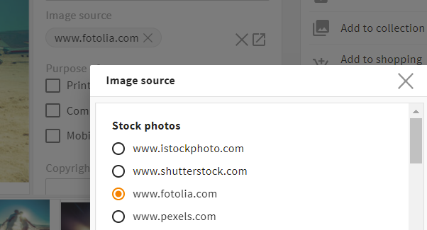
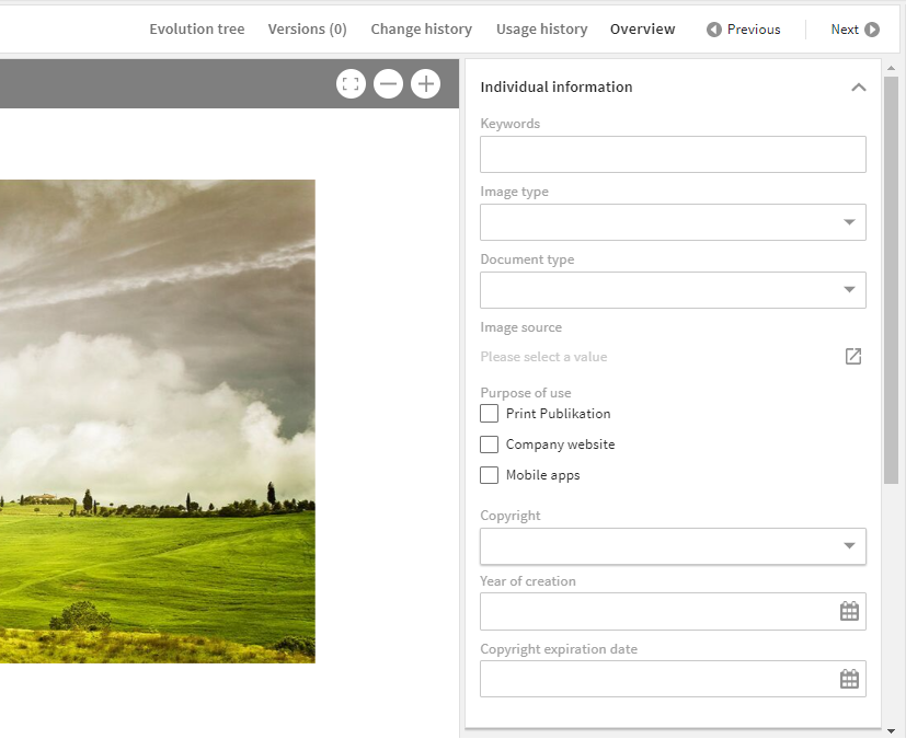
The following example creates a metadata group for individual object information. Compare the result in the GUI further down.
<metadata_renderer>
  <label_placement>top</label_placement>
  <label>L-FILE-METADATA_RENDERER-TITLE</label>
  <info>L-FILE-METADATA_RENDERER-TITLE-INFO</info>

  <group_renderer_list>
    <group_renderer>
      <label>L-FILE-METADATA_RENDERER-INDIVIDUAL</label>

      <field_renderer_list>

        <field_renderer>
          <field_renderer_attributes>
            <entry key="visual_type">auto_complete</entry>
          </field_renderer_attributes>
          <typeahead>
            <enabled>true</enabled>
            <index_name>keywords</index_name>
          </typeahead>
          <field>
            <name>keywords</name>
          </field>
        </field_renderer>

        <field_renderer>
          <type>Selection</type>
          <field_renderer_attributes>
            <entry key="visual_type">dropdown</entry>
          </field_renderer_attributes>
          <field>
            <name>image_type</name>
          </field>
        </field_renderer>

        <field_renderer>
          <type>Selection</type>
          <field_renderer_attributes>
            <entry key="visual_type">dropdown</entry>
          </field_renderer_attributes>
          <field>
            <name>document_type</name>
          </field>
        </field_renderer>

        <field_renderer>
          <type>Selection</type>
          <field_renderer_attributes>
            <entry key="visual_type" class="string">radio</entry>
            <entry key="has_popup" class="boolean">true</entry>
            <entry key="show_groups" class="boolean">true</entry>
          </field_renderer_attributes>
          <field>
            <name>image_source</name>
          </field>
        </field_renderer>

        <field_renderer>
          <type>Selection</type>
          <field_renderer_attributes>
            <entry key="visual_type" class="string">checkbox</entry>
          </field_renderer_attributes>
          <field>
            <name>purpose_of_use</name>
          </field>
        </field_renderer>

        <field_renderer>
          <type>Selection</type>
          <field_renderer_attributes>
            <entry key="visual_type">dropdown</entry>
          </field_renderer_attributes>
          <field>
            <name>copyright</name>
          </field>
        </field_renderer>

        <field_renderer>
          <type>Datetime</type>
          <field_renderer_attributes>
            <entry key="show_time" class="boolean">false</entry>
          </field_renderer_attributes>
          <field>
            <name>year_of_creation</name>
          </field>
        </field_renderer>

        <field_renderer>
          <type>Datetime</type>
          <field_renderer_attributes>
            <entry key="show_time" class="boolean">false</entry>
          </field_renderer_attributes>
          <field>
            <name>copyright_expire</name>
          </field>
        </field_renderer>

      </field_renderer_list>
    </group_renderer>
  </group_renderer_list>
</metadata_renderer>
Result in the GUI:
# Search Renderer Configuration
With a search renderer, you can set search filters and create a corresponding search query. The search renderer works a bit different from other renderers and uses special wrapper tags.
A search renderer gives you various options: Configure, e.g., that users may set a wildcard themselves, but only at the end of a term to save performance. However, this should not always be set automatically, so that also very restrictive searches can be made. This behavior can be defined with a regex.
Please note: In a search renderer, tag <search_field> replaces basic XML tag <field>.
Restrictions
Some basic elements make no sense to use in a search renderer. Please note the following specifications:
- No automatic hiding: The functionality
hide_if_emptyhas been completely removed. - Read only: In most cases, it makes no sense to set a search field to
read_only. To allow special use cases, this functionality remains though. - Validation: To define
validationfor a search field often makes no sense either. To allow special use cases, this functionality, too, remains.
# XML Structure of a Search Renderer
XML tag: <search_renderer>
Storage: modules/{$module}/object_renderer/search
A search renderer requires the following wrapper elements:
<search_renderer>
  <group_renderer_list>
    <group_renderer>
      <field_renderer_list>
        <field_renderer>
          <search_fields>
            <search_field>

            </search_field>
          </search_fields>
        </field_renderer>
      </field_renderer_list>
    </group_renderer>
  </group_renderer_list>
</search_renderer>
- For specifications of the root tag (e.g.
label_placement), refer here. - For specifications of optional group renderer (e.g.
label,type,default_open), refer here. - For specifications of the field renderer (e.g.
label,colspan,rowspan), refer here. - Additionally, the search renderer gives another option to specify with
Search Additions:
# Search Additions
Optional search additions can be used to visually restrict a search, e.g. to hide non-relevant mime types. Similar to non-editable renderers with default values, they cannot be used to save permissions. The frontend actively sends the name of the object renderer, so these additions will apply.
Wrapper <search_additions> (just below <search_renderer>) contains one or more <additions>. Each addition can contain one or more conditions.
Example:
<search_renderer>
  <label>L-FILE-VALID_FILES</label>
  <label_placement>top</label_placement>

  <search_additions>
    <additions>
      <condition>
        <value1 type="field">
          <value>status</value>
        </value1>
        <operator>!=</operator>
        <value2>
          <value>expired</value>
        </value2>
      </condition>
    </additions>
  </search_additions>

  <group_renderer_list>
# Search: Field Renderer
XML tag: <field_renderer>
Each search field in the GUI requires a separate field renderer (which can refer to and search in multiple search fields).
For basic specifications of the field renderer (e.g. label, placeholder, type), refer here.
Additionally, the search renderer requires further settings using the following tags:
| Name | Description |
|---|---|
| operator | Here you can define the logical operator to be used. This operator combines different search filters. |
| comparator | Here you can define the comparison operator to be used. Please note: Only the long form is supported. |
| wildcard_settings | Here you can define what wildcard options are possible (details). |
# Wildcard Settings
For a search with LIKE, you have the option to define whether a wildcard (*) is automatically placed in front of the search term, behind the search term or may manually be set by the user.
Please note: Wildcard settings have an effect on the system's performance. Decide whether your system should focus more on performance (lesser wildcard options) or usability (more wildcard options, lesser performance).
| Name | Value/Type | Description |
|---|---|---|
| user | true (default)false | Allows a user to set a wildcard (only supported for a search with LIKE). |
| after | true (default)false | A wildcard is automatically set at the end of the value. |
| before | false (default)true | Analogous to after. However, this wildcard has a huge effect on the system's performance and thus set to false by default. |
Please note:
- If options
beforeandafterare set totrue, the wildcard is set both in front and behind a search term.
# Search Field
Wrapper tag: <search_fields>
XML tag: <search_field> (replaces basic XML tag <field>)
The structure of a search field is similar to a basic renderer field. However, multiple search fields can be specified in one field renderer, allowing more than one database field to be searched in.
Possible specifications:
| Name | Value/Type | Description |
|---|---|---|
| name | string | Name of the field that should be searched in. |
| type | Type of the field list of CEtypes | If the type is not specified here, it may be generated from the ModuleField. |
# Full Search Renderer Example
<search_renderer>
  <label>L-FILE-DEFAULT_SEARCH_HS</label>
  <label_placement>top</label_placement>

  <group_renderer_list>
    <group_renderer>
      <type>flat</type>
      <default_open>true</default_open>
      <label>L-FILE-DEFAULT_SEARCH_HS</label>

      <field_renderer_list>

        <field_renderer>
          <label>L-FILE-GLOBAL_FILE_SEARCH</label>
          <placeholder>L-FILE-GLOBAL_FILE_SIMPLE-SEARCH-PROMPT</placeholder>
          <typeahead>
            <enabled>true</enabled>
            <restrict_values>false</restrict_values>
            <index_name>global_search_user</index_name>
          </typeahead>
          <field_renderer_attributes>
            <entry key="visual_type">auto_complete</entry>
          </field_renderer_attributes>
          <comparator>LIKE</comparator>
          <wildcard_settings>
            <before>true</before>
            <after>true</after>
          </wildcard_settings>
          <operator>OR</operator>
          <search_fields>
            <search_field>
              <name>compr_search</name>
            </search_field>
          </search_fields>
        </field_renderer>

        <field_renderer>
          <label>L-FILE-GLOBAL_FILE_FULLTEXT-SEARCH</label>
          <placeholder>L-FILE-GLOBAL_FILE_FULLTEXT-PROMPT</placeholder>
          <comparator>EQUAL</comparator>
          <operator>AND</operator>
          <field_renderer_attributes>
            <entry key="visual_type">single_line</entry>
          </field_renderer_attributes>
          <search_fields>
            <search_field>
              <type>CEText</type>
              <name>idnt_mkp_txt_file_id.text</name>
            </search_field>
          </search_fields>
        </field_renderer>

        <field_renderer>
          <type>selection</type>
          <value_option_key>release_status</value_option_key>
          <comparator>EQUAL</comparator>
          <operator>AND</operator>
          <field_renderer_attributes>
            <entry key="visual_type" class="string">dropdown</entry>
            <entry key="show_icon" class="boolean">true</entry>
          </field_renderer_attributes>
          <search_fields>
            <search_field>
              <name>release_status</name>
            </search_field>
          </search_fields>
        </field_renderer>

      </field_renderer_list>
    </group_renderer>
  </group_renderer_list>
</search_renderer>
Result in the GUI:
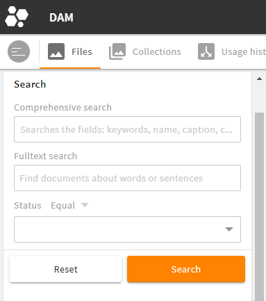
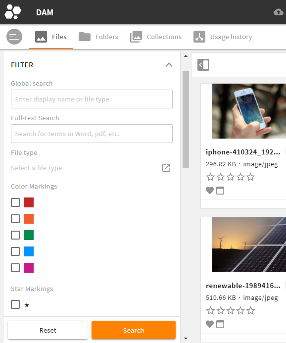
# Multiple Search Renderers in the GUI
If you have multiple search renderers you want your users to select from, you can combine them in one search panel in the GUI. Your users can select the required renderer themselves via a drop-down menu:
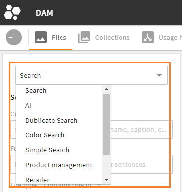
Multiple search renderers to choose from in the File module
To enable multiple search renderers, a feature permission is required with all renderers to be displayed listed.
4App DAM's Files module comes with this feature permission by default:
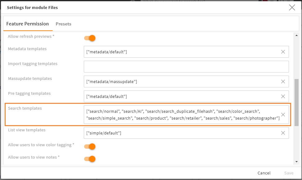
The corresponding configuration in the File module's feature permissions pop-up
With more than one renderer here, the system automatically creates the drop-down menu for users to choose from.
To configure this feature permission:
- go to snap-in
General system configurations/User settings/Role configuration - open tab
Role-based module settings - click the Files module and scroll to field
Search templates
Enter the exact names of all renderers in the order they should appear in the drop-down. The name represents the ID of the renderer, in this case (recommended) its folder path in the file system custom\modules\file\object_renderer\search:

If you want to create a new feature permission for another module, refer this tutorial.
# Simple Renderer Configuration
The simple renderer is a slimmer version of the metadata renderer and can thus be built up faster. The simple renderer is suitable e.g. for lists.
Restrictions
Some basic elements from the metadata renderer cannot be used in a simple renderer. Please note the following specifications:
- No group renderers: The simple renderer does not contain any group renderers, only the field renderers themselves. Thus,
column_countis placed with the root tag. - Just read only: Field renderers are always
read_only. This results in smaller DOM elements. Also, the logic for monitoring and saving changes is completely omitted.
Please note: Options such as validation, typehead and others are thus not possible.
# XML Structure of a Simple Renderer
XML tag: <simple_renderer>
Storage: modules/{$module}/object_renderer/simple
- For specifications of the root tag (e.g.
label_placement), refer here. Please note the restrictions above (column_count). - For specifications of the field renderer (e.g.
label,colspan,rowspan), refer here. Please note the restrictions above (read_only). - For the definition of the renderer field itself, refer here.
A simple renderer requires the following wrapper elements:
<simple_renderer>
  <field_renderer_list>
    <field_renderer>
      <field>

      </field>
    </field_renderer>
  </field_renderer_list>
</simple_renderer>
# Full Simple Renderer Example
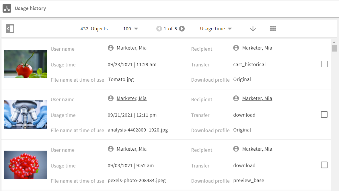
<simple_renderer>
  <label_placement>left</label_placement>
  <column_count>3</column_count>
  <field_renderer_list>

    <field_renderer>
      <type>Image</type>
      <label></label>
      <rowspan>3</rowspan>
      <width>auto</width>
      <height>auto</height>
      <field_renderer_attributes>
        <entry class="string" key="derivate">medium</entry>
        <entry class="string" key="image_height">medium</entry>
        <entry class="string" key="image_width">medium</entry>
      </field_renderer_attributes>
      <field>
        <name>id</name>
        <type>CEId</type>
      </field>
    </field_renderer>

    <field_renderer>
      <type>Reference</type>
      <label>L-USA_HIS_ASS-USERNAME</label>
      <field_renderer_attributes>
        <entry class="string" key="module">user</entry>
        <entry class="string" key="displayField">friendlyname</entry>
      </field_renderer_attributes>
      <field>
        <name>creator</name>
        <type>CEId</type>
      </field>
    </field_renderer>

    <field_renderer>
      <type>Reference</type>
      <label>L-USA_HIS_ASS-RECIPIENT</label>
      <field_renderer_attributes>
        <entry class="string" key="module">contact</entry>
        <entry class="string" key="displayField">friendlyname</entry>
      </field_renderer_attributes>
      <field>
        <name>recipient</name>
      </field>
    </field_renderer>

    <field_renderer>
      <type>DateTime</type>
      <label>L-USA_HIS_ASS-USED_TIME</label>
      <field>
        <name>created_time</name>
        <type>CETimestamp</type>
      </field>
      <field_renderer_attributes>
        <entry key="show_date" class="boolean">true</entry>
        <entry key="show_time" class="boolean">true</entry>
      </field_renderer_attributes>
    </field_renderer>

    <field_renderer>
      <label>L-USA_HIS_ASS-TRANSFER_TYPE</label>
      <field>
        <name>type</name>
        <type>CEVarchar</type>
      </field>
    </field_renderer>

    <field_renderer>
      <label>L-USA_HIS_ASS-FILENAME</label>
      <field>
        <name>name</name>
        <type>CEVarchar</type>
      </field>
    </field_renderer>

    <field_renderer>
      <label>L-USA_HIS_ASS-DOWNLOAD_PROFILE</label>
      <field>
        <name>usage</name>
        <type>CEVarchar</type>
      </field>
    </field_renderer>

  </field_renderer_list>
</simple_renderer>
Result in the GUI:
# Renderers Depending on Role, Object Type, Client Type
In some cases you need different object renderers for the same requested ID:
- A certain role should get more options than other roles to view and edit an object's metadata
- An object type does not require certain metadata fields
- A client type should get fewer data to be displayed properly
For these use cases, the 4ALLPORTAL provides specific attributes, i.e., file name notations.
The hierarchy of these specific renderers is:
- role-specific (
ro_) before - object-type-specific (
ot_) before - client-type-specific (
ct_)
So if there are three files with a specific condition for the same requested ID, the ro_ renderer will be used.
# Role-Specific Renderers
To make an object renderer configuration role-specific, prefix ro_ is used. Currently, it is used to map to a role name.
If you have users mapped to role advanced_users, configuration file ro_advanced_users.4aprenderer is delivered only to users of this role. For all users of other roles, this configuration does not exist.
# Object-Type-Specific Renderers
To make an object renderer configuration object type-specific, prefix ot_ is used. Different object types are determined by the value in field type of your object. If you have an object type my_type, configuration file ot_my_type.4aprenderer is delivered only if the requested object type is my_type. Otherwise, the server behaves like the file does not exist.
# Client-Type-Specific Renderers
To make an object renderer configuration client type-specific, prefix ct_ is used. There are different client types that work with a 4ALLPORTAL: web (default type), phone, and tablet. If you want an object renderer to be displayed only for client type web, configuration file ct_web.4aprenderer will affect only the default browser GUI of your 4ALLPORTAL.
# Combination of Specific Renderers
If you need multiple of those specifications, you can combine them by connecting them with a dot, e.g. ro_my_role.ot_my_type.ct_web.4aprenderer. This configuration file is only used for users of role my_role, for objects of type my_type, and for the standard browser GUI. If only one of these conditions is not met, the configuration is not delivered.
For details on attribute-based fallbacks, refer here.
# Reference: Field Renderer Types
All fields created for a module can basically be displayed in the GUI using a field renderer. The following renderer types are available for display. Just make sure a field's type and data fits the chosen renderer.
Default values: Note that some field renderer types have specific default value settings. If nothing is mentioned for a type, there are no specific settings.
# Text Renderer
The text renderer is suitable for most plain text input. This field renderer is required to configure a standard typeahead.
Please note: If no type is specified in a renderer, text is the default field renderer type.
# Text Renderer Attributes
You may use the following options in element <field_renderer_attributes>:
| Name | Value/Type | Description |
|---|---|---|
| visual_type |
|
|
| module | module key | Can optionally set the module for the typeahead request, to load suggestions from other modules. Setting for auto_complete |
| password_equal_to | id of another field renderer | The entered password must be equal to the value of the other field. Setting for password |
| use_password_policy | false (default)true | The entered password must match the password policy of the system. Setting for password |
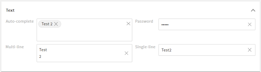
Example:
<field_renderer>
  <type>Text</type>
  <field_renderer_attributes>
    <entry key="visual_type" class="string">multi_line</entry>
  </field_renderer_attributes>
  <field>
    <name>description</name>
  </field>
</field_renderer>
Result in the GUI:
# Number Renderer
The number renderer offers different options to display numerical values, for example as a slider.
# Number Renderer Attributes
You may use the following options in element <field_renderer_attributes>:
| Name | Value/Type | Description |
|---|---|---|
| visual_type |
| Defines the appearance of this field. |
| decimal_places | number (0-14) default: 5 | Defines the maximum number of decimal places. |
| force_decimal_places | false (default)true | Ensures that trailing zeros after decimal point are not trimmed. |
| show_thousand_point | true (default)false | Shows a thousands separator. |
| unit_left | string | Displays a letter or text (e.g. a currency symbol like "$") to the left of the number. |
| unit_right | string | Displays a letter or text (e.g. a currency symbol like "$") to the right of the number. |
| step_size | number default: 1 | For visual_type stepper or slider only. Defines in which steps the value increases or decreases.For slider, no other value is possible. For the stepper, other values can be set manually. |
| num_thumbs |
| For visual_type slider only. Defines the number of thumbs and thus the number of possible values. |
| step_indicator | number default: 1 | For visual_type slider only. Places dots on the slider for a better overview of it's values. The number set here indicates not the quantity, but the spacing of the dots. |
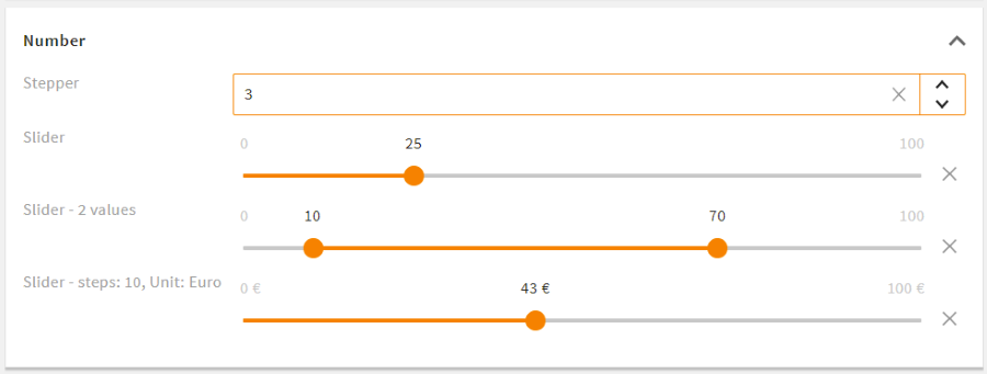
Example:
<field_renderer>
  <type>number</type>
  <validation>
    <min>0</min>
    <max>100</max>
  </validation>
  <field_renderer_attributes>
    <entry key="visual_type">slider</entry>
    <entry key="unit_right">%</entry>
  </field_renderer_attributes>
  <field>
    <name>discount</name>
  </field>
</field_renderer>
Result in the GUI:

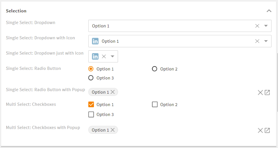
# Selection Renderer
The selection renderer is used for selecting one or multiple values from a fix selection list. If defined in the value options, images can be displayed for individual entries.
# Selection Renderer Attributes
You may use the following options in element <field_renderer_attributes>:
| Name | Value/Type | Description |
|---|---|---|
| single_value |
| Defines whether to return single values or arrays. This excludes some representations and changes the way others work. If not configured and the field type is not a list, this value is automatically set to true. |
| visual_type |
| Defines the appearance of this selection. Options:
|
| show_groups |
| Displays the grouping of the value options. |
| show_icon |
| Defines whether the icons from value options are displayed. |
| show_label |
| Defines whether the name of the value option is displayed. |
| has_popup |
| For visual_types checkbox and radio only. Displays the selection within a popup and the selected values as text. |
| global_all |
| For visual_type checkbox only. Adds the option to (de)select all checkboxes at the same time. |
| group_all |
| For visual_type checkbox only. Adds the option to (de)select all checkboxes of one group at the same time. |
Example:
<field_renderer>
  <type>selection</type>
  <label>L-FILE-MIMETYPE</label>
  <placeholder>L-FILE-MIMETYPE_POP_UP_SELECTION</placeholder>
  <comparator>IN</comparator>
  <operator>AND</operator>
  <field_renderer_attributes>
    <entry key="visual_type" class="string">checkbox</entry>
    <entry key="has_popup" class="boolean">true</entry>
    <entry key="global_all" class="boolean">true</entry>
    <entry key="group_all" class="boolean">true</entry>
  </field_renderer_attributes>
  <search_fields>
    <search_field>
      <name>mimetype</name>
    </search_field>
  </search_fields>
</field_renderer>
Result in the GUI:

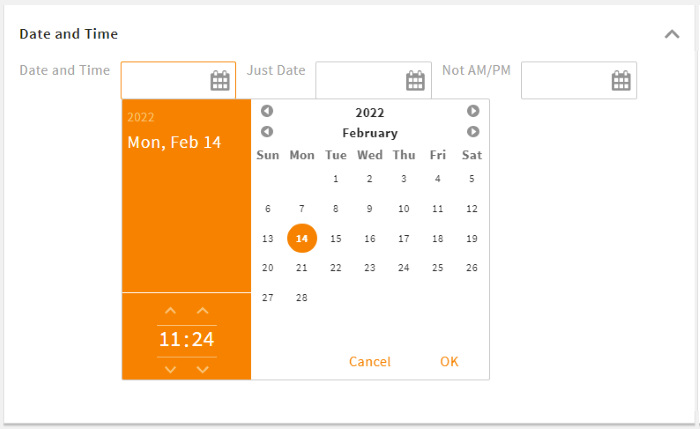
# DateTime Renderer
Date and/or time values can be displayed and set using the datetime renderer.
# DateTime Renderer Attributes
You may use the following options in element <field_renderer_attributes>:
| Name | Value/Type | Description |
|---|---|---|
| show_date |
| Allows to set a specific date value. |
| show_time |
| Allows to set a specific time value. |
| am_pm |
| Defines whether time values are displayed in 24h (default) or 12h mode. |
| show_full |
| Displays this renderer either in a full or in a smaller (default) version. |
| now_relative_validation |
| Ensures that the minimum and maximum values of the validation are relative to "NOW" (when the renderer is shown in UI). The minimum value 0 means "NOW" and must not be in the past. |
Please note: If both show_date and show_time are set to false, this field will be deactivated.
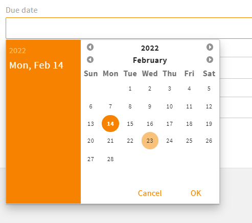
Example:
<field_renderer>
  <type>DateTime</type>
  <field_renderer_attributes>
    <entry key="show_time" class="boolean">false</entry>
  </field_renderer_attributes>
  <field>
    <name>due_date</name>
  </field>
</field_renderer>
Result in the GUI:
# DateTime Renderer Default Values
In addition to the timestamp, the following constants are supported:
- NOW: current time
- TODAY: current day
- TOMORROW: current time + 24 hours
- YESTERDAY: current time - 24 hours
# OnOff Renderer
This renderer is used to set a field to on or off. Additionally, there is a default third value "not set" (null). A user can set this state by clicking X.
# OnOff Renderer Attributes
There are no specific settings for this renderer type.
Example:
<field_renderer>
  <type>OnOff</type>
  <label>L-A-TYPEAHEADINDEX-ORDERED</label>
  <info>L-A-TYPEAHEADINDEX-ORDERED-INFO</info>
  <field>
    <name>ordered</name>
    <type>Boolean</type>
  </field>
</field_renderer>
Result in the GUI:

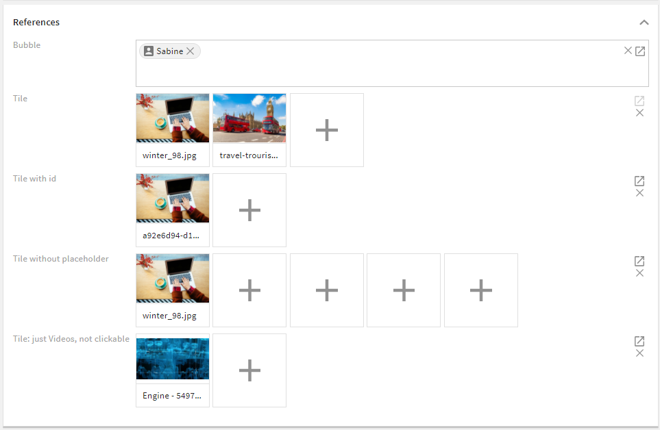
# Reference Renderer
To create and display references to other datasets, you can use the reference renderer.
# Reference Renderer Attributes
You may use the following options in element <field_renderer_attributes>:
| Name | Value/Type | Description |
|---|---|---|
| modules |
| This field does not work without a module name and must refer to a valid CE module. If not set, the values from the field configuration are used. |
| visual_type |
| Defines the appearance of this field.
|
| type_filter |
| Filters for these types when searching for new references. E.g., if portaluser is specified, only contacts of type portaluser are available for selection.If no type is specified, there are no restrictions. |
| has_popup |
| Option to hide the "open reference find popup" icon. For type bubble, only the typehead functionality is left to choose new values. For type tile, the popup still opens by clicking on an empty tile |
| show_image |
| Displays either the object image or the module icon of each value (to be set with image_type). |
| image_type |
| Only if show_image true. Defines the type of the displayed image. |
| clickable |
|
|
| display_field | string default: friendlyname | Defines the field whose text value should represent a record. |
| show_placeholder_tile |
| Only for visual_type tile. Displays a placeholder tile (plus icon) that can be used to open the reference find popup |
| fill_placeholder_tiles |
| Only for visual_type tile. If max_entries is set in validation, all unset tiles will have placeholders. |
| tile_width |
| Only for visual_type tile. Defines the width of each tile |
| tile_height |
| Only for visual_type tile. Defines the height of each tile |
Example:
<field_renderer>
  <type>Reference</type>
  <label>L-TASK-ADD_PERMISSION</label>
  <field_renderer_attributes>
    <entry class="array" key="modules">
      <value>user</value>
    </entry>
    <entry class="boolean" key="show_image">true</entry>
    <entry class="string" key="image_type">object_image</entry>
  </field_renderer_attributes>
  <field>
    <name>add_permission</name>
    <type>CEAdditionalPermissionList</type>
  </field>
</field_renderer>
Result in the GUI:
# Image Renderer
This renderer is used to turn the set value to an image. It supports object images as well as regular and parameterizable URLs.
# Image Renderer Attributes
You may use the following options in element <field_renderer_attributes>:
| Name | Value/Type | Description |
|---|---|---|
| image_type |
| Defines the way a value will be used (more details) |
| module | string | Defines a CE module whose object image or module icon should be displayed. |
| remove_ois_options | array:
| Only for image_type object_image. This setting allows to hide object image options (upload, delete) even if they are actually allowed. |
| image_height |
| Defines the absolute height of the image. fit will fit the image to the size of the field renderer.Please note: If the field renderer does not have an explicit height, the image may be 0 pixels high and therefore not visible. |
| image_width |
| Defines the absolute width of the image. |
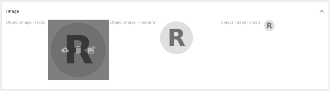
| derivate | string default: medium | Only for image_type object_image. Enter the required derivative name to define the preview size for the object image. |
| url | string | Only for image_type param_url and plain_url. Defines the base URL of the field.
|
Example:
<group_renderer_list>
  <group_renderer>
    <type>flat</type>
    <label>L-USER-MAIN_GROUP_TITLE</label>
    <column_count>4</column_count>

    <field_renderer_list>

      <field_renderer>
        <read_only>false</read_only>
        <type>Image</type>
        <label/>
        <rowspan>6</rowspan>
        <height>auto</height>
        <width>auto</width>
        <field_renderer_attributes>
          <entry key="image_height" class="string">large</entry>
          <entry key="image_width" class="string">large</entry>
          <entry key="image_type" class="string">object_image</entry>
          <entry key="derivate" class="string">medium</entry>
        </field_renderer_attributes>
        <field>
          <name>id</name>
        </field>
      </field_renderer>
Result in the GUI:
# Image Type Options
object_image: Displays the image for an ID (and the module from config) or a CE object link.module_icon: Displays the image for a string, the module from config, or a CE object link.param_url: Replaces all occurrences of%param%in the configured URL with the value of the field and displays the corresponding image.plain_url: Takes the set value as the URL for the image.
# Link Renderer
With the link renderer, field values can be used as hyperlinks, links can be parameterized for dynamic URLs, and URLs can also be overwritten.
# Link Renderer Attributes
You may use the following options in element <field_renderer_attributes>:
| Name | Value/Type | Description |
|---|---|---|
| link_type |
| Changes the way a value will be used:
|
| display_text | Label key (string) | Defines the hyperlink text. If this configuration is missing, the URL itself is displayed. If an empty string is configured, the fallback text "Link" will be displayed. |
| new_tab |
| Defines whether the link should be opened in the same or a new browser tab. |
| url | string | For link_type param_url only. Defines the base URL of the field. All %param% are replaced with the value of the field. |

Example:
<field_renderer>
<type>OnOff</type>
<read_only>false</read_only>
<default_value>false</default_value>
<read_only_type>single_line</read_only_type>
<label>L-WORDPRESS_CONNECTOR_METADATA_FIELD</label>
<field>
<name>wordpress_enabled</name>
<type>CEBoolean</type>
</field>
</field_renderer>
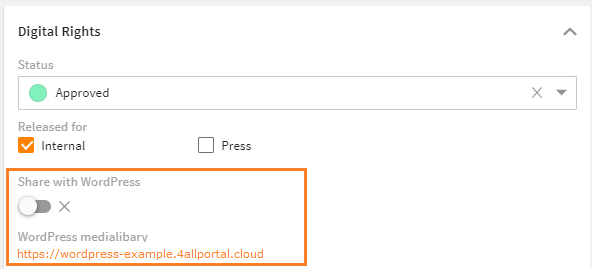
<field_renderer>
<type>Link</type>
<label>L-FILE-LINK-WORDPRESS</label>
<field_renderer_attributes>
<entry key="link_type">param_url</entry>
<entry key="url">https://wordpress-example.4allportal.cloud/wp-admin/upload.php?id=%param%</entry>
<entry key="display_text">https://wordpress-example.4allportal.cloud</entry>
</field_renderer_attributes>
<field>
<name>id</name>
</field>
</field_renderer>
Result in the GUI:
# Metric Renderer
The metric renderer displays numeric values together with a metric unit. Both the numeric value and the unit can be changed via this renderer.
The Metric Renderer can manage CE types CEMetric and CEMetricList as well as all other numerical CE types.
If CEMetric or CEMetricList are used, the unit can be selected using a combo-box in addition to the actual value.
# Metric Renderer Attributes
You may use the following options in element <field_renderer_attributes>:
| Name | Value/Type | Description |
|---|---|---|
| metric | string | If your field is of type CEMetric or CEMetricList, this attribute must be set. The units of the metric are available to select. If your field is not of type CEMetric or CEMetricList, the metric is only used for automatic compression or to show a not changable unit |
| defaultUnit | string | This attribute is optional and does not have to be defined. This attribute is used to find out the base unit within metric. This base unit is always used if no unit could be determined via the supplied data from an object. |
| autoCompress | false (default), true | Only for read_only representations. Defines whether the set value should be converted to the unit with smallest number size (e.g. 1000 bytes => 1 kilobyte) |
| decimal_places | number (0-14) default: 5 | Defines the maximum number of decimal places. |
If metric or defaultUnit have not been configured in the renderer, the respective attribute is taken from the configured field. If this renderer is part of a search renderer, the first field of the field list is considered.
Example:
<field_renderer>
  <hide_if_empty>true</hide_if_empty>
  <type>Metric</type>
  <read_only>true</read_only>
  <field_renderer_attributes>
    <entry key="autoCompress" class="boolean">true</entry>
    <entry key="metric" class="string">data</entry>
    <entry key="defaultUnit" class="string">bytes</entry>
  </field_renderer_attributes>
  <field>
    <name>size</name>
  </field>
</field_renderer>
Result in the GUI:
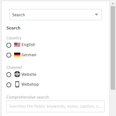
# Dimension Renderer
For search renderers only.
With a dimension renderer, a user gets an additional search filter to choose from active dimensions and limit their search result.
A dimension renderer is added to an existing search renderer and will apply to all configured field renderers. It affects all search fields designed for dimensions and does not affect non-dimensional fields. A dimension renderer does not require a search field setting itself.
If no dimension is selected, all dimensions will be searched in.
# Dimension Renderer Attributes
You may use the following options in element <field_renderer_attributes>:
| Name | Value/Type | Description |
|---|---|---|
| dimension_name | string | Enter a dimension whose values should be displayed. |
Please note: The dimension renderer is derived from and supports all attributes of the selection renderer, e.g. its visual type or pop-up options.
Example:
<group_renderer_list>
  <group_renderer>
    <type>flat</type>
    <default_open>true</default_open>
    <label>L-FILE-DEFAULT_SEARCH</label>
    <field_renderer_list>

      <field_renderer>
        <type>Dimension</type>
        <label>L-D-LOCALE</label>
        <field_renderer_attributes>
          <entry key="dimension_name">locale</entry>
          <entry key="visual_type" class="string">radio</entry>
          <entry key="show_icon" class="boolean">true</entry>
        </field_renderer_attributes>
      </field_renderer>

      <field_renderer>
        <type>Dimension</type>
        <label>L-D-CHANNEL</label>
        <field_renderer_attributes>
          <entry key="dimension_name">channel</entry>
          <entry key="visual_type" class="string">radio</entry>
          <entry key="show_icon" class="boolean">true</entry>
        </field_renderer_attributes>
      </field_renderer>

      <field_renderer>
        <label>L-FILE-GLOBAL_FILE_SEARCH</label>
        <placeholder>L-FILE-GLOBAL_FILE_SIMPLE-SEARCH-PROMPT</placeholder>
        <typeahead>
          <enabled>true</enabled>
          <restrict_values>false</restrict_values>
          <index_name>global_search_user</index_name>
        </typeahead>
        <field_renderer_attributes>
          <entry key="visual_type">auto_complete</entry>
        </field_renderer_attributes>
        <comparator>LIKE</comparator>
        <wildcard_settings>
          <before>true</before>
          <after>true</after>
        </wildcard_settings>
        <operator>OR</operator>
        <search_fields>
          <search_field>
            <name>compr_search</name>
          </search_field>
        </search_fields>
      </field_renderer>
Result in the GUI:
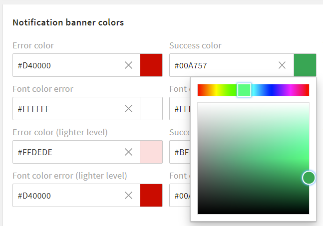
# Color Renderer
The color renderer offers the possibility to select a color value using the ColorPicker component. It is used for example in the admin area to select the theme colors.
A color value is always returned as a hexadecimal code.
Please note: Since there is no CEType for color values, all string types can be used to contain the hex code of a color.
# Color Renderer Attributes
There are no specific settings for this renderer type.
Example:
<field_renderer>
  <type>Color</type>
  <label>L-A-THEME-ERROR_C</label>
  <info>L-A-THEME-ERROR_C-INFO</info>
  <field>
    <name>error_c</name>
    <type>String</type>
  </field>
</field_renderer>
<field_renderer>
<type>Color</type>
<label>L-A-THEME-SUCCESS_C</label>
<info>L-A-THEME-SUCCESS_C-INFO</info>
<field>
  <name>success_c</name>
  <type>String</type>
</field>
</field_renderer>
Result in the GUI: