# Themes and System Styling
The 4ALLPORTAL allows you to customize almost all areas of the GUI. This includes labels, icons and value options, but also larger aspects such as object renderers and layouts.
The general appearance of the 4ALLPORTAL is configured in a theme. A theme defines the actual looks of a 4ALLPORTAL, it's colors and icons. With a theme, you can change the looks as required or provide e.g. a dark theme or role specific themes.
4ALLPORTAL dark theme
System styling requires some basic knowledge. You should inform yourself about hexadecimal color codes (e.g. #ff8200), and the differences between vector-based and pixel graphics.
Also, the 4ALLPORTAL implements everything you tell it, no matter if it makes sense or looks good. So you may need to play around a bit.
# Available Themes
A default 4ALLPORTAL installation comes with a 4ALLPORTAL default theme, a dark theme, a high-contrast theme, and an automatic theme (that takes the browser's settings for light/dark into account). Admins can also restrict the theme selection for users.
Users can choose from available themes in their personal settings:
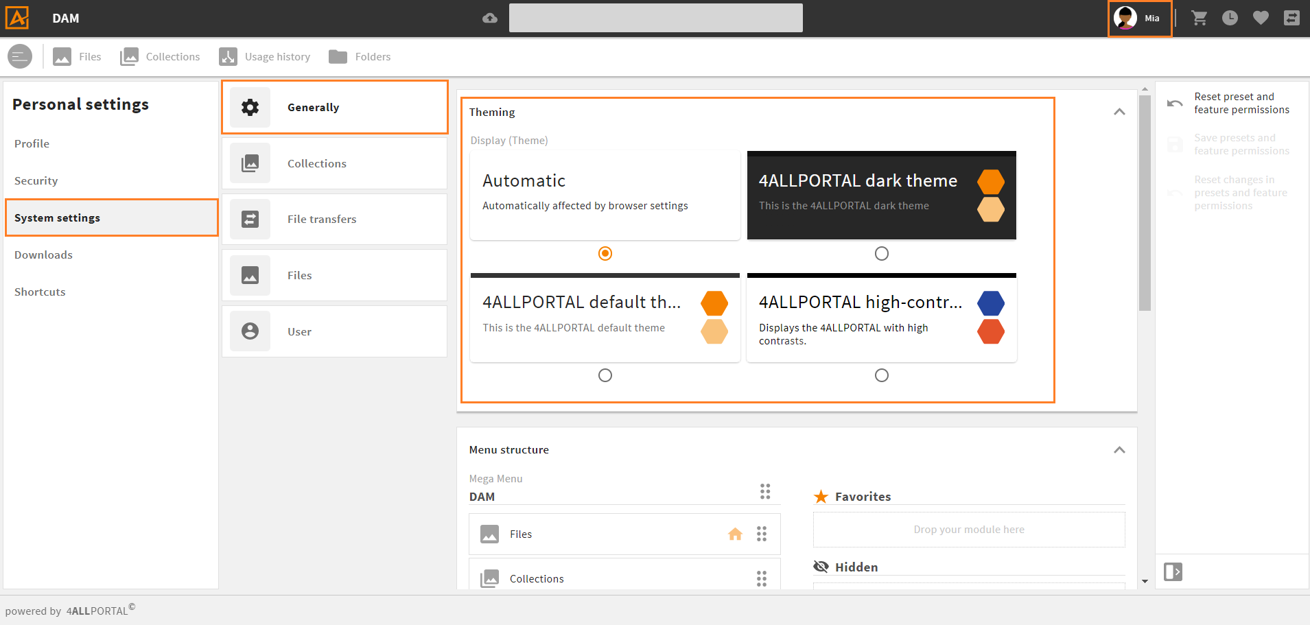
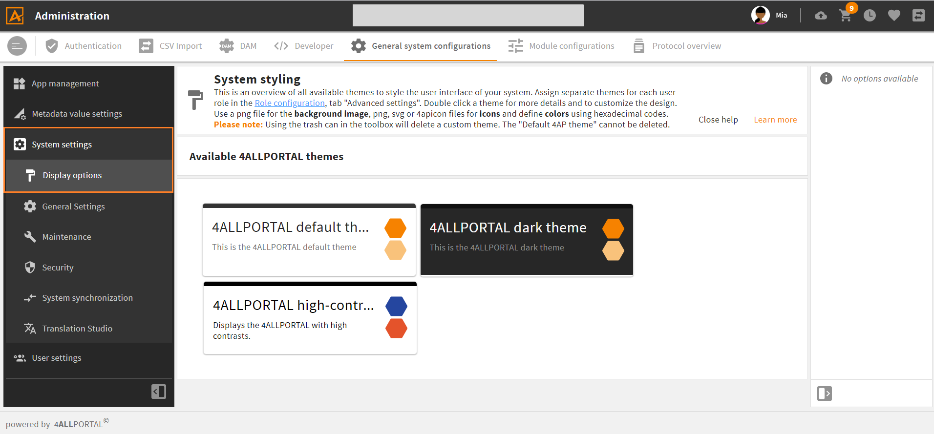
Admins can get details and customize the "default" (and, if required, the "dark") theme to match a company's CI in admin snap-in General system configurations/System settings/Display options:
Learn how to customize a theme here.
# Elements and Storage of a Theme
In simple terms, a 4ALLPORTAL theme is a set of variables. The number and names of these variables are predefined by the system, but their values can be adjusted. The configurable elements are:
- logos and background image
- theme colors
- notification banner colors
A theme's corresponding XML file (theme.4aptheme) with the basic color information is stored in the file system's global styles folder global/styles/{theme_name}.
All icons referred to in a theme are also stored in the global "styles" folder (icon storage information).
# Restrict Theme Selection for Users
If users should not be able to select a theme in their personal settings themselves, admins can change their rights to "read only" in the corresponding feature permission:
- go to admin snap-in
General system configurations/User settings/Feature permissions - open permission
gui_theme - deactivate boolean "User is allowed to edit the value" (default: active)
- save and reload your system
Now, users have no "Themes" panel in their personal system settings anymore.
# Customize a Theme
A 4ALLPORTAL comes with the standard "4ALLPORTAL default theme" (technical name: default),the "4ALLPORTAL dark theme" (technical name: dark), and the "4ALLPORTAL high-contrast theme" (technical name: high_contrast_default).
For a custom interface, the easiest way is to edit and overwrite the "4ALLPORTAL default theme", which is sufficient in most cases:
- Go to admin snap-in
General system configurations/System settings/Display options. - Select the "default" theme and double-click it for its details. In a theme's detail view, there are three panels for customizing:
- Make your desired changes by uploading logos and editing color variables.
- Save your changes and reload the system in the maintenance area.
- Logged-in users must just reload the page to see the changes.
Please note: Users may choose the dark theme in their personal settings which automatically applies a darker look based on the configured "default theme" values. We suggest testing the dark mode after customizing the "default" and make adjustments, if required (dark theme details).
Restore to Default
If you customize the "default theme" and save your settings, they override the default. Use toolbar action "Restore to default" to reset the "default theme" to the 4ALLPORTAL original state. This will delete the corresponding custom file in the custom folder!
Save as
Note that there is no action "Save as" for themes. If you change and save a value in a theme, you will overwrite the former value.
Delete
The "4ALLPORTAL default theme", and the "4ALLPORTAL dark theme" cannot be deleted. If you want to overwrite them permanently (i.e. deleting the system's default), create the corresponding default or dark structure and files with same names in your "custom" folder.
Multiple Themes
In special cases, more than the "default" theme is required (e.g. to allow multitenancy). Learn more about creating new themes from scratch here.
Roles
Learn how to assign different themes to different roles here.
# Logos and Background Image
In the first panel, you can customize the system logos as well as the background image of the login screen:
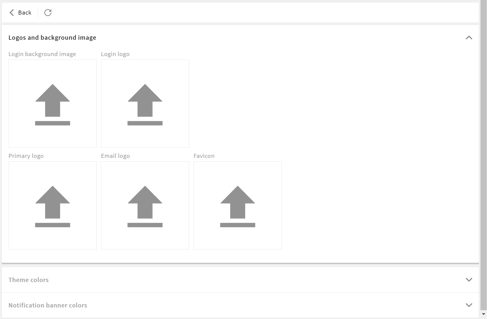
Login background image
- Format: .png or .jpg
- Width: up to 4000 px width
- Size: we recommend < 1 MB
Login logo
- Format: .svg, .png, 4apicon
- Width: up to 1000 px width
- Size: we recommend < 50 KB
Primary logo (on the header bar)
- Format: .svg, .png, 4apicon
- Width: up to 200 px width
- Size: we recommend < 50 KB
Email logo (in all emails leaving your system)
- Format: .png
- Width: up to 500 px width
- Size: we recommend < 250 KB
Favicon (on the browser tab)
- Format: .svg, .png, 4apicon
- Width: up to 200 px width
- Size: we recommend < 50 KB
# Logo Example
If you make settings like this:
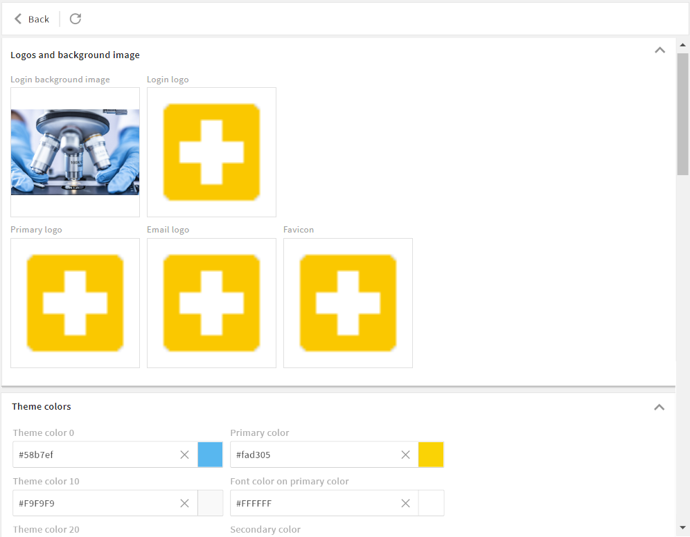
Your login screen will look like this:

Your browser tab will look like this:

# Theme Colors
In the second panel, you can customize the theme colors. You can define the primary color and the general appearance of your system.
- On the left, you can change the theme colors (including main background and font color).
- On the right, you can change the accent colors (including the primary, in most cases a company's CI color).
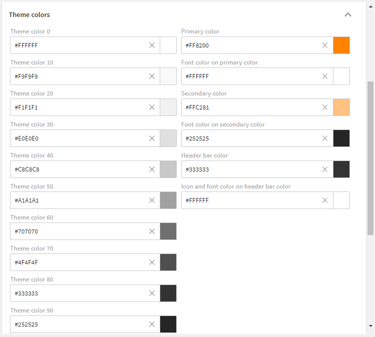
Settings of the "4ALLPORTAL default theme"
Colors you most likely want to customize:
- Primary color (defines the main customer color)
- Theme color 0 (defines the main background color)
- Theme color 90 (defines the main font color)
# Accent and Header Colors
With accent and header colors, you define the system's characteristic colors, e.g. a company's CI color.
The primary color and its lighter level are for the system's key components, and always used when an action, button or field needs to be visibly highlighted. These colors have to be clearly distinct from the ten theme colors so that the user's attention is guided as desired.
Color Variables
In short, almost every color in the system is controlled by the color variables of the active theme. Theoretically, if all colors are set to white or black, nothing in the system should be visible (except for images and some special cases).
The terms "dark" and "light" in the following relate to the main background color, or the main font color. Thus, "light" means that it approximates the main background color (Theme color 0) and "dark" means that it approximates the main font color (Theme color 90).
Color variables must use hexadecimal codes.
Helpful Tool
Color variables must be set in hexadecimal codes. Use a gradient generator like Gradient Generator (external link) (opens new window) to calculate gradations from two main colors and get their hexadecimal codes.
| Name | Technical Field Name | Description |
|---|---|---|
| Primary color | primary_c | It represents the main accent color and is often the main color of the customer. Of the accent colors, this occurs most often, especially on buttons, or checkboxes. |
| Font color on primary color | primary_fc | It represents the font color on your primary color. This color should contrast very well with your primary color. |
| Secondary color | primary_light_c | It represents a light gradation to the primary color. In this case, light means that this color approaches the main background color Theme color 0. |
| Font color on secondary color | primary_light_fc | It represents the font color on your lighter primary color. |
| Header bar color | header_c | Represents the background color of the global page header. There is often a requirement to change this individually from the rest of the application, so a separate variable is used here. |
| Icon and font color on header bar color | header_fc | It represents the font color on the global page header. This color should contrast perfectly with the Header bar color, as this is its only usage. |
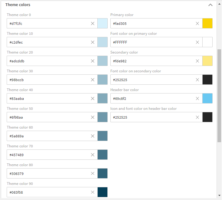
# Theme Colors
With theme colors you define the basic looks of your system, like its background, pop-up and font colors, as well as the looks of your system e-mails. They should work well with your accent colors.
The ten theme colors range from the main background color ("Theme color 0", e.g. white) and the main font color ("Theme color 90", e.g. black). The eight theme colors between are gradations. They need to be chosen in a way that there is some contrast and even gradation to archive a harmonious color range in the system.
We recommend using 10 % steps from Theme color 0 to Theme color 90. This way, the contrasts in the system always look good. This works with any start/target colors - but the 10 % rule should be respected.
| Name | Technical Field Name | Description |
|---|---|---|
| Theme color 0 | theme_0 | First theme color. It represents the main background color of your system. This color should contrast very well with the main font color (Theme color 90). However, it can also appear in other places. |
| Theme color 10 | theme_10 | Second theme color and first gradation (10 %) to the main background color. It is used for light highlights and light effects or as a very light font color. However, it can also appear in other places. |
| Theme color 20 | theme_20 | Third theme color and further gradation (20 %). |
| Theme color 30 | theme_30 | Fourth theme color and further gradation (30 %). It often appears as a frame of containers. However, it can also appear in other places. |
| Theme color 40 | theme_40 | Fifth theme color and further gradation (40 %). It is considered the darkest "light" gradation and is used for clearer highlighting. However, it can also appear in other places. |
| Theme color 50 | theme_50 | Sixth theme color and further gradation (50 %). It is considered the lightest "dark" gradation and is used more as a lighter font, or as a dark background. However, it can also appear in other places. |
| Theme color 60 | theme_60 | Seventh theme color and further gradation (60 %). It finds its application as a lighter font, darker background or frame colors. However, it can also appear in other places. |
| Theme color 70 | theme_70 | Eighth theme color and further gradation (70 %). |
| Theme color 80 | theme_80 | Ninth theme color and further gradation (80 %). It provides a very dark background or a slight gradation to the main font color. However, may appear in other places as well. |
| Theme color 90 | theme_90 | Tenth theme color. It represents the main font color. This color should contrast very well with the main background color (Theme color 0). However, it can appear in other places as well. |
# Color Example
If you make settings like this:
Your system will appear like this:
# Customize Notification Banner Colors
Notification banner colors are used to highlight system messages to the user. They usually "toast" up in the bottom left corner of your system.
There are four different types of system messages: Success (displays a success message), Error (displays an error message), Warning (displays a warning message), and Information (displays an information message). These four different system messages are highlighted by four different system colors as illustrated below.
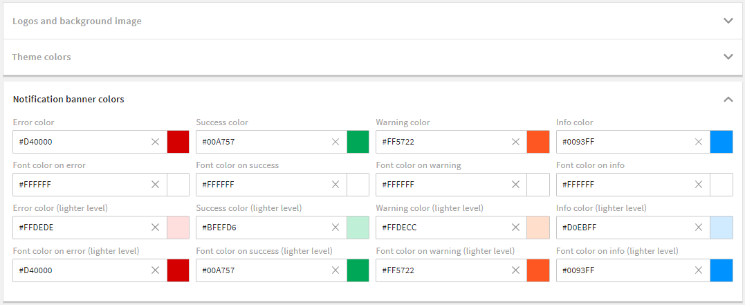
Settings of the "4ALLPORTAL default theme"
| Name | Technical Field Name | Description |
|---|---|---|
| Error color | error_c | This color is used when an error message is displayed to the user (e.g. in the form of a "toast"). |
| Font color on error | error_fc | It represents the font color on your error color. |
| Error color (lighter level) | error_light_c | It represents a light gradation to the error color. In this case, light means that this color approaches the main background color Theme color 0. |
| Font color on error (lighter level) | error_light_fc | It represents the font color on your lighter error color. |
| Success color | success_c | This color is used when a success message is displayed to the user (e.g. in the form of a "toast"). |
| Font color on success | success_fc | It represents the font color on your success color. |
| Success color (lighter level) | success_light_c | It represents a light gradation to the success color. In this case, light means that this color approaches the main background color Theme color 0. |
| Font color on success (lighter level) | success_light_fc | It represents the font color on your lighter success color. |
| Warning color | warning_c | This color is used when a warning message is displayed to the user (e.g. in the form of a "toast"). |
| Font color on warning | warning_fc | It represents the font color on your warning color. |
| Warning color (lighter level) | warning_light_c | It represents a light gradation to the warning color. In this case, light means that this color approaches the main background color Theme color 0. |
| Font color on warning (lighter level) | warning_light_fc | It represents the font color on your lighter warning color. |
| Info color | info_c | This color is used when an info message is displayed to the user (e.g. in the form of a "toast"). |
| Font color on info | info_fc | It represents the font color on your info color. |
| Info color (lighter level) | info_light_c | It represents a light gradation to the info color. In this case, light means that this color approaches the main background color Theme color 0. |
| Font color on info (lighter level) | info_light_fc | It represents the font color on your lighter info color. |
# Dark Theme
The dark theme lets the 4ALLPORTAL appear in a darker mode. Users can select it in their personal settings by default.
To keep the characteristic system colors, the "dark" theme takes most values automatically from the "default" theme values (primary, secondary, and notification banner colors), as long as they are not defined in the dark theme itself.
For a darker appearance, the dark theme replaces some "default theme" values with the following:
| Name | Dark Theme Value |
|---|---|
| Theme color 0 | #272727 |
| Theme color 10 | #333333 |
| Theme color 20 | #202020 |
| Theme color 30 | #474747 |
| Theme color 40 | #808080 |
| Theme color 50 | #919191 |
| Theme color 60 | #919191 |
| Theme color 70 | #b5b5b5 |
| Theme color 80 | #ffffff |
| Theme color 90 | #fafafa |
| Header bar color | #101010 |
| Icon and font color on header bar | #ffffff |
Please note: Since it refers to values of the "default theme", the dark theme is currently not available for other than the "default theme".
# Effect on a Customized Default Theme
Admins should consider the effect of the dark theme on their customized "default theme". The dark theme and header colors as described in the table above will apply if a users selects the "dark theme".
We suggest testing the dark theme to make sure the darker theme colors apply harmoniously. If they don't, customize the "dark" theme according to your custom "default theme".
# Create a New Theme
In some cases you may need more than one/the "default theme", e.g. if a company has several sub-brands or subsidiaries they want to represent in one 4ALLPORTAL.
Note that the actual number of themes is unlimited.
If you want to create a new theme from scratch, you need to:
- create a new theme folder in your file system's custom global folder (
custom/global/styles/{theme_name}) - create a new XML file named
theme.4apthemeand store it in your new theme folder
Optional: If you have custom icons for your theme, you additionally need the following:
- create a new icon library folder in your new custom global theme folder (
custom/global/styles/{theme_name}/icon_library) - add all new 4APIcon proxy files to your new theme folder (just next to
theme.4aptheme) - add all icon image files to your new icon library (more details on the icon folder structure and creation)
Please note: All requested icons not stored in your custom folder are automatically taken from the default.
Now you can go to admin snap-in General system configurations/System settings/Display options and assign color values and icons as described here.
If required, you can now:
- assign different themes to different roles (more information).
- keep your users from selecting from all themes in their personal settings by restricting their options (more details)
Use "Default Theme" Values
If you want to use the "4ALLPORTAL default theme" values as a basis for a new theme, just copy, paste and rename the respective files from the styles folder to your new theme's folder.
Dark Theme Limitation
Note that themes other than the "default" cannot be referred to by the "dark theme".
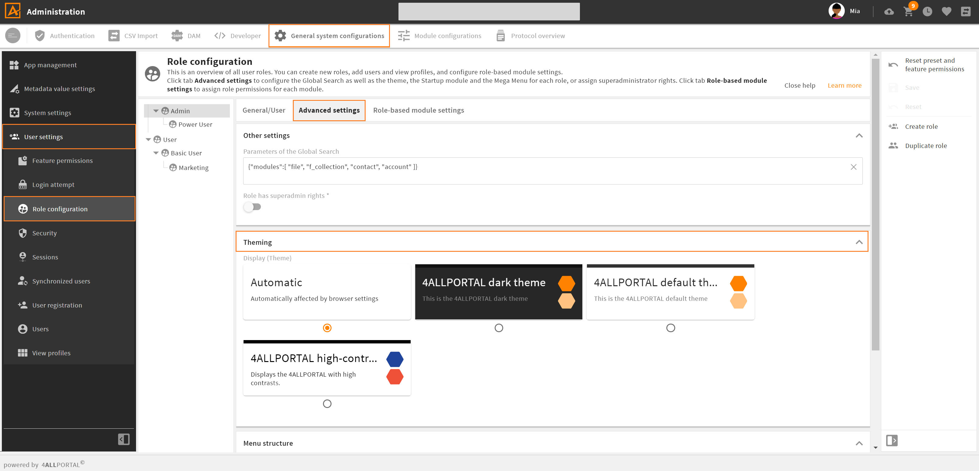
# How to Assign a Theme to a Role
The default theme assigned to all roles is the "4ALLPORTAL default theme". You can change this default and assign each role a different theme, if you like:
- go to admin snap-in
General system configurations/User settings/Role configurations - choose a role and select tab "Advanced settings".
- choose a theme from subpanel "Theming".
- save your changes and restart your system.