# Themes and System Styling
The 4ALLPORTAL allows you to customize almost all areas of the GUI. This includes labels, icons and value options, but also larger aspects such as object renderers and layouts.
But to adapt the general appearance of the 4ALLPORTAL, you need to create a theme. The styling options include editing:
System styling requires some basic knowledge. You should inform yourself about hexadecimal color codes (e.g. #ff8200), and the differences between vector-based and pixel graphics.
Also, our "style manager" implements everything you tell it, no matter if it makes sense or looks good. So you may need to play around a bit.
# What is a Theme?
In simple terms, a 4ALLPORTAL theme is a set of variables. The number and names of these variables are predefined by the system, but their values can be adjusted by an admin. However, the actual number of themes is unlimited.
Themes define the actual looks of your system. Admins can create themes, e.g. to match a company's CI or to implement a dark mode. They can configure a theme for all system users or assign different themes to different roles (How to assign a theme).
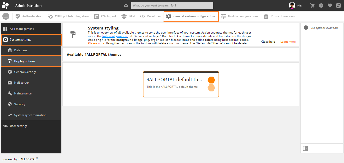
All available themes are listed and can be edited in admin snap-in General system configurations/System settings/Display options:
A theme's corresponding XML files (theme.4aptheme) are stored in the file system's folder custom/global/styles/{$THEME_NAME}.
Upcoming style options
- Currently, only the role's assigned theme is selected for a user. A selection option for the user, e.g. for a light and a dark mode, will be implemented in the future.
- Also, a theme currently contains only color variables. However, upcoming variables that have been planned can be used to customize the font, frames, spacing, and other graphical elements.
# Create a New Theme
The 4ALLPORTAL comes with the standard "4ALLPORTAL default theme" (technical name: default). You can just work with it and customize it in admin snap-in Display options.
If you want to work with a new theme, you need to create a new XML file theme.4aptheme and a new theme folder in your file system here:
custom/global/styles/{theme_name}/theme.4aptheme
For your theme's icons to be stored, you additionally need the following structure:
  custom/global/styles_pre_login/{theme_name}/{icon_library}/{icon_name}
  custom/modules/{module_name}/styles/{theme_name}/{ICON-NAME}/{icon_library}/{icon_name}
Please note:
There is no action like "Save as" for themes. If you want to use the "Default 4AP theme" or any other theme's values as a basis for a new theme, just copy, paste and rename the respective XML files to your new theme's folder.
The "4ALLPORTAL default theme" cannot be deleted. If you want to overwrite the "Default 4AP theme" permanently (i.e. deleting the system's default), create the corresponding "default theme" files with same names in your "custom" folder.
# How to Customize a Theme
To customize a theme, just double-click it and its details will open. You can now make your desired changes by uploading logos and editing the color variables. Save your changes and reload the Core Engine once. Logged in users must log out and in to see the changes.
In admin snap-in General system configurations/System settings/Display options, there are three panels for customizing a theme:
Color Variables
Color variables help you to manage colors across the entire system. Theoretically, when all colors are set to white or black, nothing in the system is visible (except for images). If this does not happen, then it is considered a bug. In short, every color in the system is controlled by the color variables of the active theme.
The terms "dark" and "light" in the following refer to the relationship to the main font color and main background color. Thus, "light" means that it approximates the main background color (Theme color 0) and "dark" means that it approximates the main font color (Theme color 90).
Color variables must use hexadecimal codes.
# Customize the Login Screen
You can customize the following items and variables of the standard login screen:
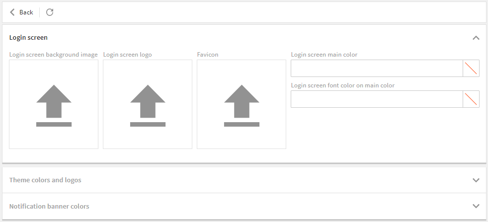
Login screen background image
- Format: .png or .jpg
- Width: up to 4000 px width
- Size: we recommend < 1 MB
Login screen logo
- Format: .svg, .png, 4apicon
- Width: up to 1000 px width
- Size: we recommend < 50 KB
Favicon (for the browser tab)
- Format: .svg, .png, 4apicon
- Width: up to 200 px width
- Size: we recommend < 50 KB
Login screen main and font color (for buttons and fields)
- in hexadecimal codes
- technical field name: primary_login_c
- technical field name: primary_login_fc
- may be the same as the main accent color
# Example
If you make settings like this:
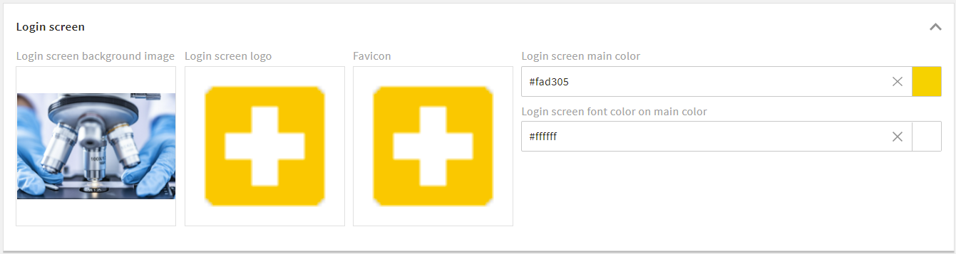
Your login screen will look like this:
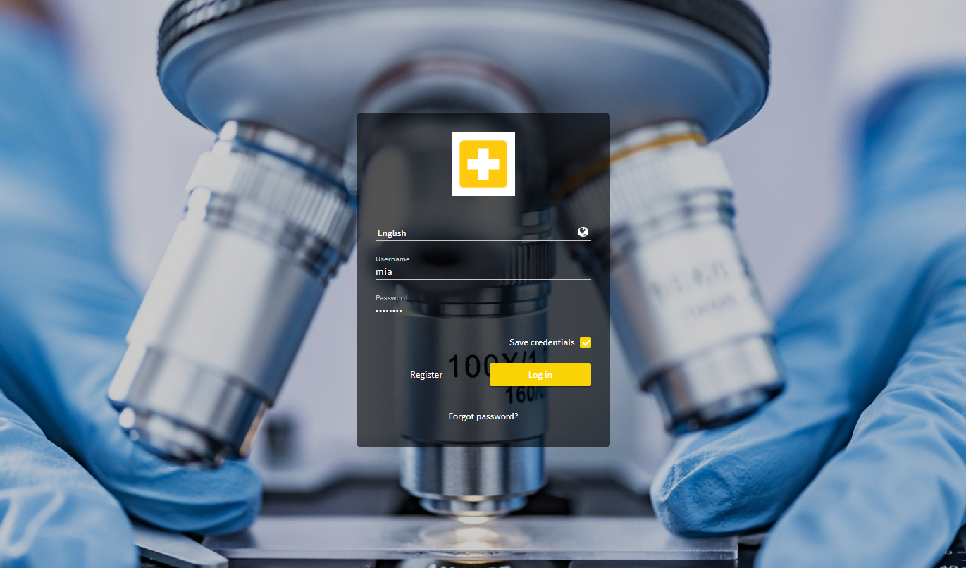
Your browser tab will look like this:

# Customize the General System Appearance
You can customize the following items and variables of the general system appearance:
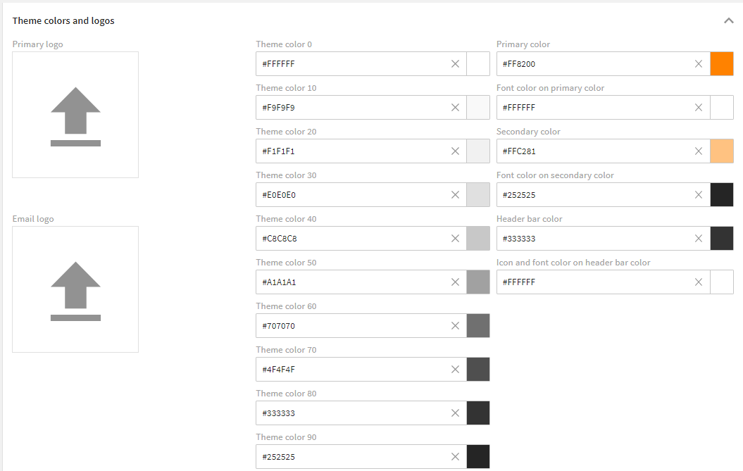
Settings of the "4ALLPORTAL default theme"
# Primary Logo
The primary logo is displayed on the header bar.
- Format: .svg, .png, 4apicon
- Width: up to 200 px width
- Size: we recommend < 50 KB
# Email logo
The email logo is used in all emails leaving your system, e.g., when sending an eTicket.
- Format: .png
- Width: up to 500 px width
- Size: we recommend < 250 KB
# Theme Colors
With theme colors you define the basic look of your system, like its background, pop-up and font colors, as well as the looks of your system e-mails. They should work well with your accent colors.
The ten theme colors range from the main background color ("Theme color 0", e.g. white) and the main font color ("Theme color 90", e.g. black). The eight theme colors between are gradations. They need to be chosen in a way that there is some contrast and even gradation to archive a harmonious color range in the system.
We recommend using 10 % steps from Theme color 0 to Theme color 90. This way, the contrasts in the system always look good. This works with any start/target colors - but the 10 % rule should be respected.
Helpful tools
Color variables must be set in hexadecimal codes. Use a gradient generator like Gradient Generator (external link) (opens new window) or Farbverlauf Generator (external link) (opens new window) to calculate gradations from two main colors and get their hexadecimal codes.
| Name | Technical Field Name | Description |
|---|---|---|
| Theme color 0 | theme_0 | First theme color. It represents the main background color of your system. This color should contrast very well with the main font color (Theme color 90). However, it can also appear in other places. |
| Theme color 10 | theme_10 | Second theme color and first gradation (10 %) to the main background color. It is used for light highlights and light effects or as a very light font color. However, it can also appear in other places. |
| Theme color 20 | theme_20 | Third theme color and further gradation (20 %). |
| Theme color 30 | theme_30 | Fourth theme color and further gradation (30 %). It often appears as a frame of containers. However, it can also appear in other places. |
| Theme color 40 | theme_40 | Fifth theme color and further gradation (40 %). It is considered the darkest "light" gradation and is used for clearer highlighting. However, it can also appear in other places. |
| Theme color 50 | theme_50 | Sixth theme color and further gradation (50 %). It is considered the lightest "dark" gradation and is used more as a lighter font, or as a dark background. However, it can also appear in other places. |
| Theme color 60 | theme_60 | Seventh theme color and further gradation (60 %). It finds its application as a lighter font, darker background or frame colors. However, it can also appear in other places. |
| Theme color 70 | theme_70 | Eighth theme color and further gradation (70 %). |
| Theme color 80 | theme_80 | Ninth theme color and further gradation (80 %). It provides a very dark background or a slight gradation to the main font color. However, may appear in other places as well. |
| Theme color 90 | theme_90 | Tenth theme color. It represents the main font color. This color should contrast very well with the main background color (Theme color 0). However, it can appear in other places as well. |
# Accent and Header Colors
With accent and header colors, you define the system's characteristic colors, e.g. a company's CI color.
The primary color and its lighter level are for the system's key components. They are always used when an action, button or field needs to be visibly highlighted. These colors have to be clearly distinct from the theme colors so that the user's attention is guided as desired.
| Name | Technical Field Name | Description |
|---|---|---|
| Primary color | primary_c | It represents the main accent color and is often the main color of the customer. Of the accent colors, this occurs most often. |
| Font color on primary color | primary_fc | It represents the font color on your primary color. This color should contrast very well with your primary color. |
| Secondary color | primary_light_c | It represents a light gradation to the primary color. In this case, light means that this color approaches the main background color Theme color 0. |
| Font color on secondary color | primary_light_fc | It represents the font color on your lighter primary color. |
| Header bar color | header_c | Represents the background color of the global page header. There is often a requirement to change this individually from the rest of the application, so a separate variable is used here. |
| Icon and font color on header bar color | header_fc | It represents the font color on the global page header. This color should contrast perfectly with the Header bar color, as this is its only usage. |
# Example
If you make settings like this:
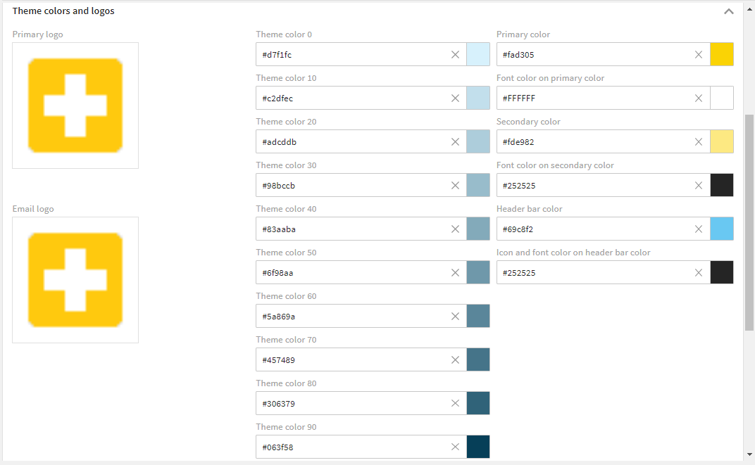
Your system will appear like this:
# Customize Notification Banner Colors
Notification banner colors are used to highlight system messages to the user. They usually "toast" up in the bottom left corner of your system.
There are four different types of system messages: Success (displays a success message), Error (displays an error message), Warning (displays a warning message), and Information (displays an information message). These four different system messages are highlighted by four different system colors as illustrated below.
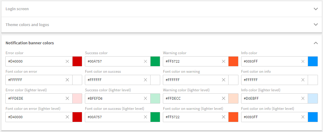
Settings of the "4ALLPORTAL default theme"
| Name | Technical Field Name | Description |
|---|---|---|
| Error color | error_c | This color is used when an error message is displayed to the user (e.g. in the form of a "toast"). |
| Font color on error | error_fc | It represents the font color on your error color. |
| Error color (lighter level) | error_light_c | It represents a light gradation to the error color. In this case, light means that this color approaches the main background color Theme color 0. |
| Font color on error (lighter level) | error_light_fc | It represents the font color on your lighter error color. |
| Success color | success_c | This color is used when a success message is displayed to the user (e.g. in the form of a "toast"). |
| Font color on success | success_fc | It represents the font color on your success color. |
| Success color (lighter level) | success_light_c | It represents a light gradation to the success color. In this case, light means that this color approaches the main background color Theme color 0. |
| Font color on success (lighter level) | success_light_fc | It represents the font color on your lighter success color. |
| Warning color | warning_c | This color is used when a warning message is displayed to the user (e.g. in the form of a "toast"). |
| Font color on warning | warning_fc | It represents the font color on your warning color. |
| Warning color (lighter level) | warning_light_c | It represents a light gradation to the warning color. In this case, light means that this color approaches the main background color Theme color 0. |
| Font color on warning (lighter level) | warning_light_fc | It represents the font color on your lighter warning color. |
| Info color | info_c | This color is used when an info message is displayed to the user (e.g. in the form of a "toast"). |
| Font color on info | info_fc | It represents the font color on your info color. |
| Info color (lighter level) | info_light_c | It represents a light gradation to the info color. In this case, light means that this color approaches the main background color Theme color 0. |
| Font color on info (lighter level) | info_light_fc | It represents the font color on your lighter info color. |
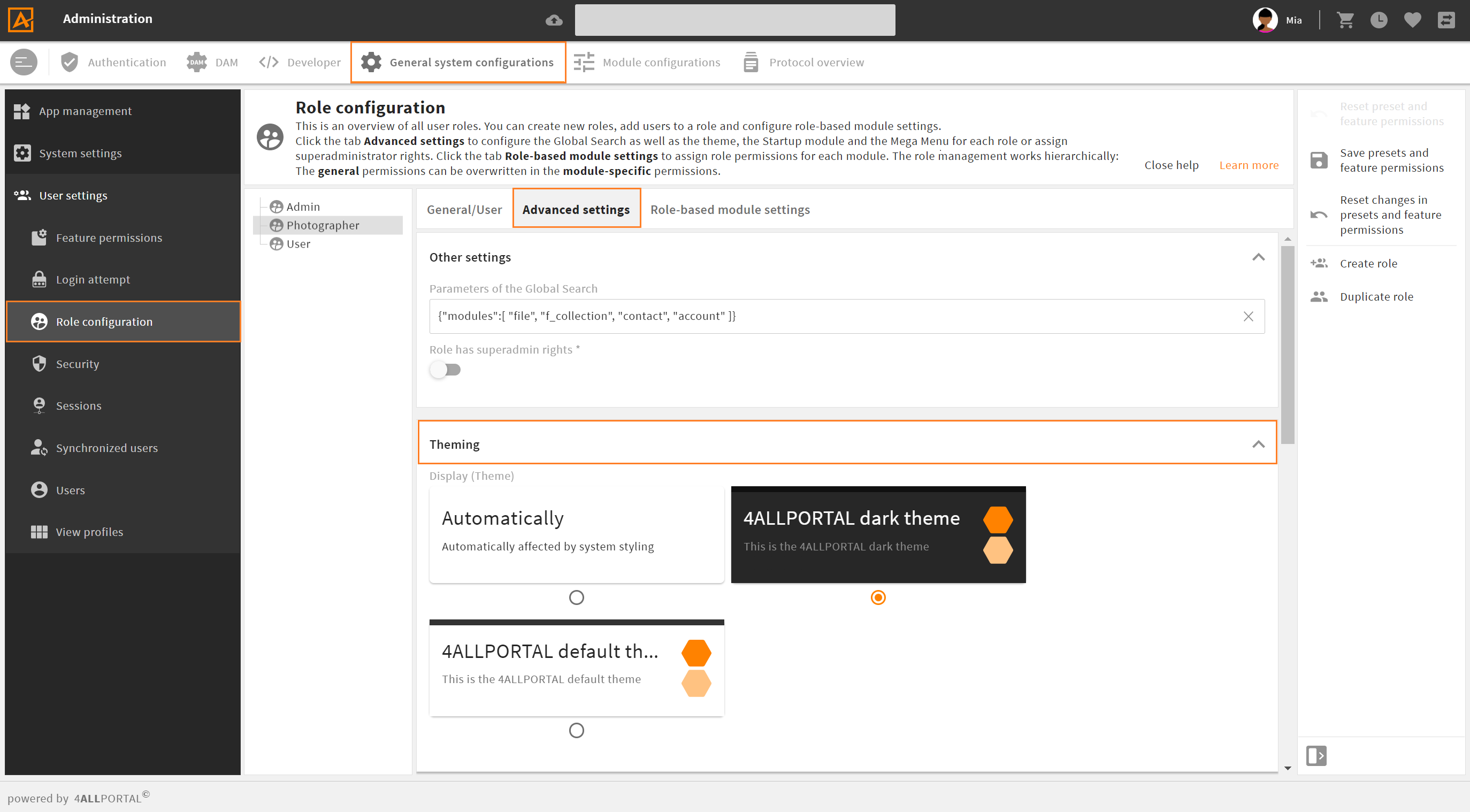
# How to Assign a Theme to a Role
The default theme assigned to all roles is the "4ALLPORTAL default theme". You can change this default and assign each role a different theme, if you like:
- Go to admin snap-in
General system configurations/User settings/Role configurations, tab "Advanced settings". - Enter the name of your theme in field "Display (Theme)".
- Save your changes and restart your system once.