# Object Renderer
One of the most common and important GUI components in the 4ALLPORTAL is the object renderer. It is highly customizable and used whenever you want to display complex objects (beans) and interact with their metadata.
If you want to ...
- add a group of metadata fields to your object's detail view,
- add a search filter to your search,
- customize the displayed metadata in a list view,
you need to make all this in an object renderer configuration. They offer a lot of specifications and are thus highly customizable.
Prerequisites
In object renderers, the display of metadata in the GUI is defined. It provides the interface to the beans, corresponding actions are executed externally.
So as a prerequisite, you need create the fields or value option you want to refer to, and translate all appropriate label keys.
# Base Types
There are three basic types of object renderers designed for three different use cases:
-
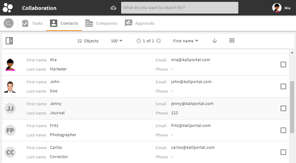
- The metadata renderer is used to display, enter and edit metadata of an object.
- Most time used in an object's
detail view.

metadata renderer in the GUI -
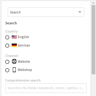
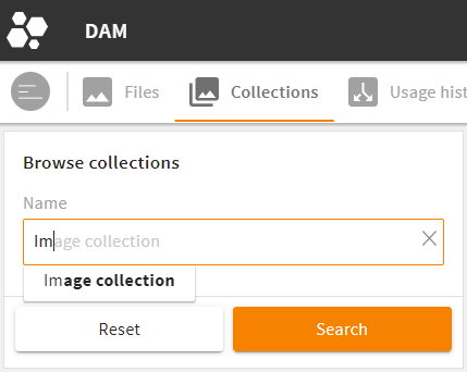
- The search renderer is used to create search filters.
- Most time used in the
main view.
search renderer in the GUI -
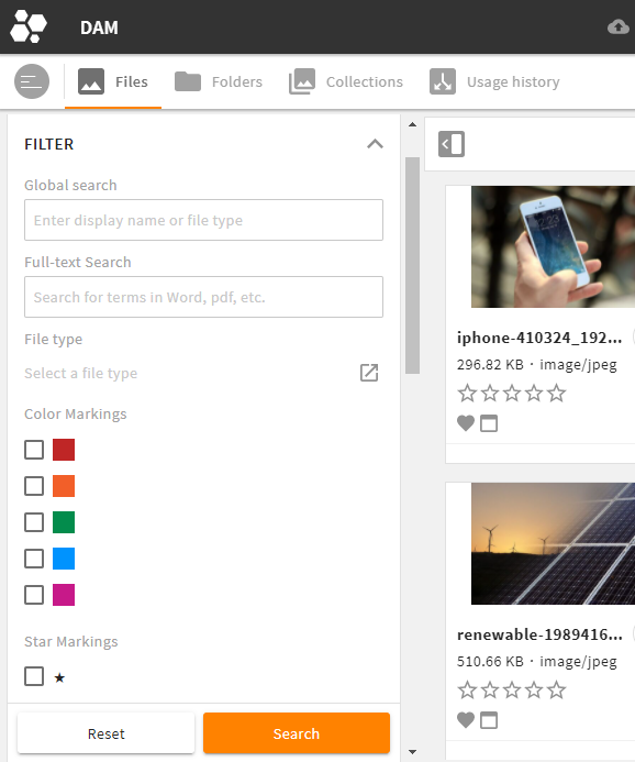
- The simple renderer is used to only display metadata of an object. You are not able to edit the values (readonly).
- Most time used in a
list view.
simple renderer in the GUI
Specifications
- All three types can be configured using the same basic configuration elements.
- Note the specifications and limitations for search renderers and simple renderers.
- Additionally, you can specify a field renderer's display and options using attributes depending on the field type.
# Storage, Request & Fallback Logic
# Filesystem and Filetype
An object renderer is an XML file with extension .4aprenderer.
An object renderer can also be a folder containing further XML files (required e.g., for object-type specific renderers).
In the filesystem, object renderers are always sorted and stored by their base type.
If an object renderer is module-specific, it is stored in an 4App's module folder, if it is global, it is stored in an 4App's global folder.
The path locations in the file system are thus:
modules/{$module}/object_renderer/metadatamodules/{$module}/object_renderer/searchmodules/{$module}/object_renderer/simple
andglobal/object_renderer/metadataglobal/object_renderer/searchglobal/object_renderer/simple
Please note: In each of these folders, a file or folder default is required.
Within these folders, more subfolders are possible according to an object renderer's location or function, e.g. subpanel, object_compare, or admin.
Admin Renderers
All object renderers for the general administration area are stored in the global folder.
Exception: If a module is displayed in the administration area, the admin renderers are stored in a module's folder (e.g. for module "User": modules/user/object_renderer/simple/admin).
# Request and ID
A metadata renderer is requested by name (to enable a flexible mapping to a folder path in a module's object renderer set). Search and simple renderers are requested directly by their folder path. The name/folder path in the file system is an object renderer's unique ID, used in layouts to define what renderer to call.
The folder path of a renderer is also used as parent path in change files.
Examples:
- A metadata renderer in module "Collections" is requested via name "create" and mapped in the module's object renderer set to metadata renderer "create_collection" from path
modules/f_collection/object_renderer/metadata/create. - A search renderer in module "User" is stored at and requested from path
modules/user/object_renderer/search/.
Request From Runtime
When requesting, the system checks the global and module's folders in the runtime. For change files, multiple changes are supported: To provide the requested configuration, the system checks the corresponding path in all installed 4Apps according to the system's app order, including the customizations from the custom folder:
- Core Engine (applies first)
- all other 4Apps according to the system's app order
- custom folder (applies at last)
If the required folder can be found in all these places, the requested configuration (e.g. default.4aprenderer) will build up on one another.
# Fallback and Mapping
When an object renderer is requested, the corresponding .4aprenderer file from a module's metadata, search, or simple folder in the file system is delivered. The system has the following logic:
Metadata Renderer
- If a requested view is mapped to a specific renderer via a module's object renderer set, that specific renderer will load.
- If a requested view is not mapped to a specific renderer (i.e., no specific mapping), the renderer from the corresponding folder in the file system will load.
Please note: If no renderer is stored in the corresponding folder, no renderer can be loaded. There is no further fallback and an error will throw.
Search and Simple Renderer
Both renderers are explicitly set in a module's object renderer set, if they are required for a module. If no renderer is specified here, it is not required and therefore has no fallback.
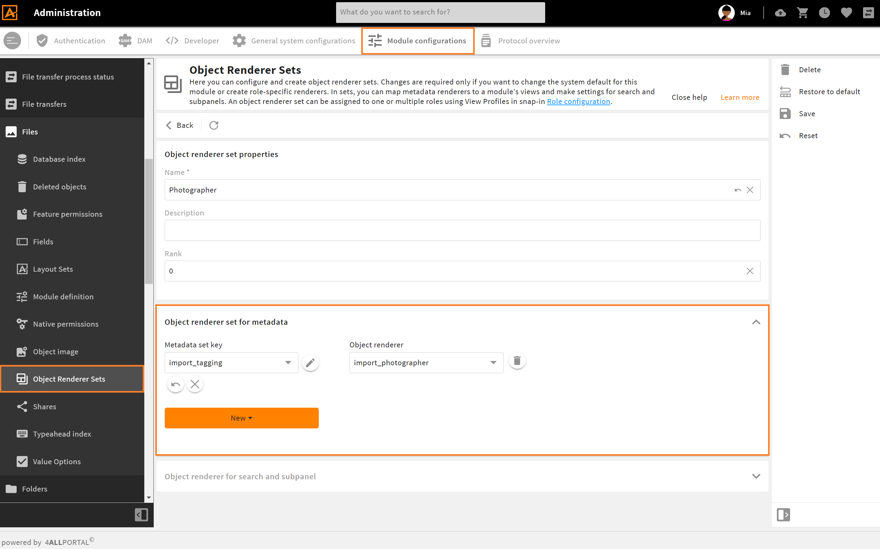
Admin snap-in "Object Renderer Sets" with a role specific mapping in module "Files"
# Changes
Like other configurations in the 4ALLPORTAL, object renderer files, too, can be partially modified by creating a change with postfix _c. A change is a configuration supplement and alters a full configuration XML. For all details, refer our changes documentation.
Changes Fallback
Change files work with a mapping and not with a fallback logic: In a change file's tag <changes extends>, the path to the parent renderer is exactly defined (can be a full configuration or another change).
# Basic Configuration Elements
The following tags and wrapper elements are the basic structure of an object renderer and can be used for all three object renderer types.
While the metadata renderer may use all elements without restrictions, the search renderer and the simple renderer have restrictions, but also additional elements. Some differences are at the main level, but they mostly differ in the field renderer section.
An object renderer consists of the following basic elements:
<root_tag>
  <group_renderer_list>
    <group_renderer>
      <field_renderer_list>
        <field_renderer>
          <field>

          </field>
        </field_renderer>
      </field_renderer_list>
    </group_renderer>
  </group_renderer_list>
</root_tag>
| Name | Description |
|---|---|
| root_tag | defines the renderer type (metadata_renderer, search_renderer, or simple_renderer) |
| group_renderer | lets you create foldable groups for your field renderers |
| field_renderer | defines the way your fields should be rendered in the GUI. The looks and functions depend on the field renderer types |
| field | specifies the actual database field whose values should be rendered |
Example:
<metadata_renderer>
  <label_placement>top</label_placement>

  <group_renderer_list>
    <group_renderer>
      <type>flat</type>
      <default_open>true</default_open>
      <label>L-GLOBAL-METADATA_GROUP</label>
      <info>L-GLOBAL-METADATA_GROUP-INFO</info>
      <column_count>1</column_count>

      <field_renderer_list>

        <field_renderer>
          <type>text</type>
          <label>L-MY-LABEL</label>
          <info>L-MY-LABEL-INFO</info>
          <rowspan>1</rowspan>
          <colspan>1</colspan>
          <height>large</height>
          <width>large</width>
          <read_only>false</read_only>
          <read_only_type>multi_line</read_only_type>
          <hide_if_empty>false</hide_if_empty>
          <field_renderer_attributes>
            <!-- optional attributes -->
          </field_renderer_attributes>
          <field>
            <name>id</name>
            <type>CEId</type>
          </field>
        </field_renderer>

      </field_renderer_list>
    </group_renderer>
  </group_renderer_list>
</metadata_renderer>
Keep it simple!
Not all possible elements or defaults described in the following must be specified in a renderer configuration. If you do not need an element, keep your XML simple and just leave it out.
# Root Tag
XML root tags: <metadata_renderer>, <search_renderer>, <simple_renderer>
Possible specifications:
| Name | Value/Type | Description |
|---|---|---|
| label_placement | topleftinlinenone | Specifies the placement of the label. The most common values are top and left.inline, on the other hand, displays the name of the field within the field, if possible.none hides the label completely and frees the space for it if necessary. |
| label | Label key (string) | Displays a text for the renderer. This text is not displayed in all circumstances. For example, conditional operation form may use this label for a pop-up title. |
| info | Label key with-INFO (string) | Adds helpful information for the entire renderer. This text is not displayed in all circumstances. For example, this text may be embedded in a tooltip. |
| icon | Icon name (string) | Can add an icon to the renderer. The display type is currently not defined. |
| group_renderer_list | <group_renderer_list> | This wrapper contains your group renderers |
Example:
<metadata_renderer>
  <label_placement>top</label_placement>
  <label>L-FILE-METADATA_RENDERER-TITLE</label>
  <info>L-FILE-METADATA_RENDERER-TITLE-INFO</info>
  <icon>FILE-METADATA_RENDERER.4apicon</icon>
  <group_renderer_list>

    <!-- all the rest -->

  </group_renderer_list>
</metadata_renderer>
# Group Renderer
Each group renderer defines one or more groups of field renderers in the GUI. It can be made foldable to save space.
Wrapper element: <group_renderer_list>
XML tag: <group_renderer>
Possible specifications:
| Name | Value/Type | Description |
|---|---|---|
| label | Label key (string) | Displays a text for this group. It is placed above the fields, and in the area of the open/close function. |
| info | Label key (string) | Adds helpful information for the entire group. This text is likely to be embedded in a tooltip. |
| icon | Icon name (string) | Can add an icon to the group. This icon is displayed on the left of the group label. |
| type | foldable (default),flat | Defines whether the group renderer can be opened/closed. Flat hides the icon for opening and closing the group. |
| default_open | true (default),false | Defines whether the group is initially open or closed. This setting has no effect if the group is not foldable. |
| column_count | default: 1 (integer) | Defines the number of columns in this group and how many field renderer may be in a row until the next row starts. The number must be a positive integer greater than 0. |
| field_renderer_list | <field_renderer_list> | This wrapper contains your field renderers |
Example:
<metadata_renderer>
  <group_renderer_list>
    <group_renderer>
      <type>foldable</type>
      <default_open>false</default_open>
      <label>L-FILE-METADATA_RENDERER-GENERAL</label>
      <field_renderer_list>

        <!-- field renderer -->

      </field_renderer_list>
    </group_renderer>

    <group_renderer>
      <type>foldable</type>
      <default_open>true</default_open>
      <label>L-FILE-METADATA_RENDERER-COLOR-SEARCH</label>
      <field_renderer_list>

        <!-- field renderer -->

      </field_renderer_list>
    </group_renderer>
  </group_renderer_list>
</metadata_renderer>
multiple metadata groups in the GUI
# Field Renderer
For each field you want to display in your GUI, a separate field renderer must be configured. The looks and functions depend on the defined field renderer type.
Your object renderer can contain a list of one or multiple field renderers.
Also, one field renderer can refer to multiple database fields, e.g. when configuring a search.
Wrapper element: <field_renderer_list> XML tag: <field_renderer>
Possible specifications:
| Name | Value/Type | Description |
|---|---|---|
| label | Label key (string) | Displays the text for a field. The placement is defined by tag <label_placement> (see above). If no label was defined, a label key is automatically inserted according to the following pattern: L-MODULENAME-FIELDNAME. |
| info | Label key (string) | Adds helpful information for a field. This text is likely to be embedded in a tooltip. |
| placeholder | Label key (string) | Displays a prompt text to the user to give them an idea of what to enter or do, e.g. "John Doe" or "Please select a value". |
| icon | Icon name (string) | Can add an icon to a field. This icon is displayed on the left of the field name. |
| type | Field renderer types default: text | Defines which type of visualization should be used to display the value of a field. |
| read_only | false (default)true | If set to true, the representation is simplified: Only the plain value of a field is displayed. Its values cannot be edited. The exact representation depends on the field type.If not configured, a field will be filled automatically if the combination of renderer and field type supports editing. |
| read_only_type | single_line (default)multi_linedisabled | Defines whether the displayed value can be wrapped or not.disabled fields are displayed grayed out and keep their frame. |
| disabled | false (default)true | If set to true, the input of a value is blocked.Please note: If blocked, the display format should still be kept. Later extensions of dependent fields may activate this component afterwards. |
| colspan | default: 1 (integer) | Defines over how many columns a field extends. |
| rowspan | default: 1 (integer) | Defines over how many rows a field extends. |
| width | empty (default)smallmediumlargeauto | This value defines an explicit width using a fix value (e.g. small) to meet the need of different renderers. Often suitable for images.Please note: A renderer using a fix value is no longer dynamically adjusted to the available space. Value auto will fit the field size to the content. But in a grid view, unequal row values will not adjust to each other. |
| height | empty (default)smallmediumlargeauto | Analog to width, this value determines the height. |
| value_option_key | Name of a value option (string) | The values of this value option will be loaded and translated. If not set here, it is automatically read and set from the field's XML. |
| hide_if_empty | false (default)true | If set to true, a field renderer is completely hidden as soon as it does not contain a value.Please note: This option is only available for read_only fields. |
Further specifications:
| Name | Value/Type | Description |
|---|---|---|
| default_value | Default values | Defines a value that will be set if no corresponding value was set in a field. Please note: This option must be actively enabled in the frontend, e.g., in a create view. For an already existing object, the value set here has no effect. |
| field_renderer_attributes | Field Renderer Attributes | These attributes can determine the appearance and behavior depending on the individual field renderer types, e.g. if an entry should be a password displayed with "*". |
| validation | Validation | With validation you have various rules to check the correctness of a value in the frontend. If this option is not configured, it will be set from the field's XML. |
| typeahead | Typeahead | These settings can influence the behavior of a typeahead field. |
| field | Renderer Field | Here, the actual field of an object must be named. As soon as an object is loaded or read out, this configuration is responsible. |
Example:
<metadata_renderer>
<group_renderer_list>
<group_renderer>
<field_renderer_list>
<field_renderer>
<hide_if_empty>true</hide_if_empty>
<read_only>true</read_only>
<read_only_type>multi_line</read_only_type>
<field>
<name>name</name>
</field>
</field_renderer>
<field_renderer>
<hide_if_empty>true</hide_if_empty>
<type>Metric</type>
<read_only>true</read_only>
<field_renderer_attributes>
<entry key="auto_compress" class="boolean">true</entry>
<entry key="metric" class="string">data</entry>
<entry key="default_unit" class="string">bytes</entry>
</field_renderer_attributes>
<field>
<name>size</name>
</field>
</field_renderer>
<field_renderer>
<hide_if_empty>true</hide_if_empty>
<value_option_key>mimetypes</value_option_key>
<read_only>true</read_only>
<read_only_type>single_line</read_only_type>
<field>
<name>mimetype</name>
</field>
</field_renderer>
<field_renderer>
<hide_if_empty>true</hide_if_empty>
<read_only>true</read_only>
<type>DateTime</type>
<read_only_type>single_line</read_only_type>
<field>
<name>created_time</name>
</field>
</field_renderer>
</field_renderer_list>
</group_renderer>
</group_renderer_list>
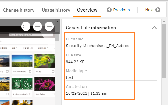
</metadata_renderer>
Result in the GUI:
# Field Renderer Types
A field renderer always requires a <type>. This type influences both appearance and functionality of the renderer. Not every renderer type can handle every CE value. Always select a renderer type that corresponds to your given data storage.
If no type is set, the default type of field renderer is text.
We support the following field renderer types:
| Name | Description |
|---|---|
| Text | The text renderer is suitable for most plain text input. It is required to configure a standard typeahead. |
| Number | The number renderer offers different options to display numerical values. |
| Selection | The selection renderer is used to select one or more values from a fix selection list. |
| DateTime | Date and/or time values can be managed using the datetime renderer. |
| OnOff | This renderer is used to set a field to on or off. Additionally, there is an extra value "not set" (null). |
| StaticText | This renderer is used to place a static text in an object renderer, e.g. for additional descriptions or table headings (no field needs to be specified). |
| Reference | To create and display references to other datasets, use the reference renderer. |
| Image | This renderer is used to turn the set value to an image. It supports object images as well as regular and parameterizable URLs. |
| Link | With the link renderer, HTML links can be parameterized and also overwritten. |
| Metric | Using the metric renderer, numeric values can be linked to a metric and a unit of that metric. |
| Color | This renderer offers the possibility to display or set the string representation of a color value. |
| HTML | This renderer allows to render and edit HTML content. The value is just a normal string type. |
| Dimension | For search renderers only. With a dimension renderer, values of active dimensions can be selected to limit search results. |
| Spacer | The renderer type spacer is used to leave the corresponding cell free. Since <colspan> and <rowspan> values can also be set, the structure of the containing group can be defined quite freely. |
# Default Value
XML tag: <default_value>
A default value can be configured in order to deliver a field with an already set value, e.g. for a dropdown or boolean. It is understood and parsed depending on its individual field renderer type, which receives the default value as entered and handles it accordingly.
The following basic data types can be used as default values:
| Type | Description | Possible field(s) |
|---|---|---|
| boolean | The text will be trimmed and must be exactly true. In that case, a true boolean is adopted, otherwise it will be false.Case insensitive. | CEBoolean |
| number | The text will be trimmed and parsed as float or int. | CEInteger, CELong, CEFloat, CEDouble |
| string | The text will be trimmed and adopted one-to-one. | CEVarchar, CEText, CEEmail |
| date | The text will be trimmed, parsed as int parsed, and treated as the number of milliseconds since 01/01/1970 00:00:00.000 (UTC). | CETimestamp, CEDate, CEDateTime |
| array | The text will be parsed as JSON. The individual values will be trimmed and parsed as told above. | CEVarcharList, CETextList, CEEmailList, CEIntegerList, CELongList, CEFloatList, CEDoubleList, CEDecimalList, CETimestampList, CEDateList, CEDateTimeList |
Example:
<field_renderer>
  <label>L-GLOBAL-PASSWORD_SECURITY-COMPLEXITY</label>
  <info>L-GLOBAL-PASSWORD_SECURITY-COMPLEXITY-INFO</info>
  <type>Selection</type>
  <value_option_key>password_complexity</value_option_key>
  <default_value>nuls</default_value>
  <field_renderer_attributes>
    <entry key="visual_type" class="string">DROPDOWN</entry>
  </field_renderer_attributes>
  <validation>
    <not_null>true</not_null>
  </validation>
  <field>
    <name>complexity</name>
    <type>String</type>
  </field>
</field_renderer>
Result in the GUI:

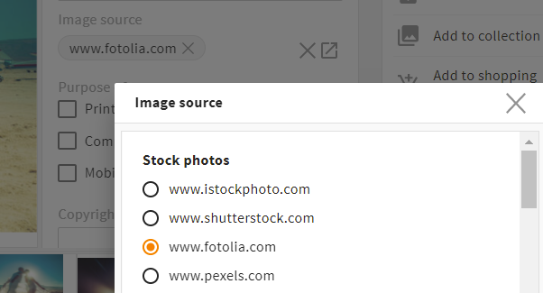
# Field Renderer Attributes
XML tag: <field_renderer_attributes>
Additional attributes can be assigned to a field to specify its options and appearance in the GUI. Each field renderer type supports different, type-specific attributes. Refer all types with their attributes here.
The possible classes are:
- string (default)
- boolean
- number
- array
Example:
<field_renderer>
  <type>Selection</type>
  <field_renderer_attributes>
    <entry key="visual_type" class="string">radio</entry>
    <entry key="has_popup" class="boolean">true</entry>
    <entry key="show_groups" class="boolean">true</entry>
  </field_renderer_attributes>
  <field>
    <name>image_source</name>
  </field>
</field_renderer>
Result in the GUI:
# Validation
XML tag: <validation>
It is often useful to limit a user's entries to prevent incorrect values and to map certain permissions. With object renderers you can therefore define some validation rules that are checked while entering values and prevent sending certain values to the backend.
Possible specifications:
| Name | Value/Type | Description |
|---|---|---|
| not_null | false (default)true | Specifies whether this field is an required field and an entry must be made (<not_null>true</not_null>). If set to true, an asterisk * will be displayed beside the label. |
| min | doubledefault: null | Only for types string, number, or date with different effects per type: String: minimum string length Number: smallest accepted numerical value Date: number of milliseconds since 01/01/1970 00:00:00,000 UTC must be at least this large. |
| max | doubledefault: null | Analog to min, this is the maximum value. |
| min_entries | integerdefault: null | Defines the minimum number of list entries this field must have. |
| max_entries | integerdefault: null | Defines the maximum number of list entries this field may have. |
| regex_list | RegEx rule | Defines a list of regexes that check the input for a match. For this, all values are first converted to a string and then checked. |
| regex_success_text | Label key (string) default: null | If defined, this text is displayed as soon as the regex rules are fulfilled. |
# RegEx Rule
XML tag: <regex>
Using a regex rule restricts users when entering values, e.g. to prevent the creation of file names your system cannot operate with.
Possible specifications:
| Name | Value/Type | Description |
|---|---|---|
| rule | regex | Equivalent to the regular regex syntax with /.*/gmi |
| nomatch_type | error (default)warning | Specifies whether a message is displayed as an error or warning and whether a value is still valid although the rule is not fulfilled. |
| nomatch_text | Label key (string) | Label to display a text if this regex rule is not met. |
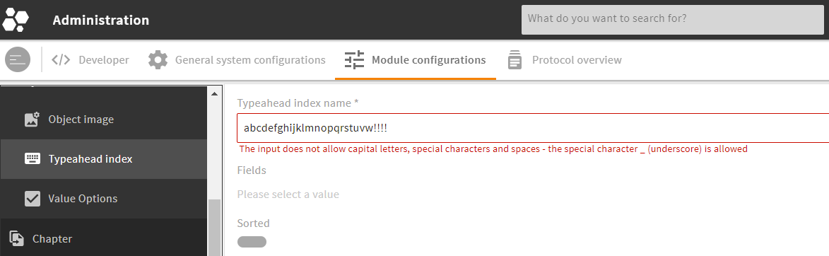
Example:
<field_renderer>
  <label>L-A-TYPEAHEADINDEX-NAME</label>
  <info>L-A-TYPEAHEADINDEX-NAME-INFO</info>
  <placeholder>L-A-TYPEAHEADINDEX-NAME-PROMPT</placeholder>
  <validation>
    <not_null>true</not_null>
    <max>28</max>
    <regex_list>
      <regex>
        <rule><![CDATA[^[a-z][0-9a-z_]*$]]></rule>
        <nomatch_text>L-GLOBAL-ADMIN-NAME-REGEX_INVALID</nomatch_text>
      </regex>
    </regex_list>
  </validation>
  <field>
    <name>name</name>
    <type>String</type>
  </field>
</field_renderer>
Result in the GUI:
# Typeahead
XML tag: <typeahead>
The typeahead functionality can help users entering values like search terms or keywords by matching the user's entry with an index. The configuration lets you limit the input to suggested values and specify the name of the index to be used.
Typeahead settings only affect renderers that explicitly support this, such as the text renderer (in "typeahead" mode) or reference renderer (in "bubble" mode).
Possible specifications:
| Name | Value/Type | Description |
|---|---|---|
| enabled | false (default)true | Enables the typeahead functionality. |
| restrict_values | false (default)true | Prevents the input of values that are not suggested. This prevents typos in the text renderer. |
| index_name | name of the typeahead index (string) | For a typeahead request, this index is used to return its specific results. |
Example:
<field_renderer>
  <typeahead>
    <enabled>true</enabled>
    <restrict_values>true</restrict_values>
    <index_name>name</index_name>
  </typeahead>
  <field_renderer_attributes>
    <entry key="visual_type" class="string">auto_complete</entry>
  </field_renderer_attributes>
  <comparator>LIKE</comparator>
  <wildcard_settings/>
  <operator>OR</operator>
  <search_fields>
    <search_field>
      <name>name</name>
    </search_field>
  </search_fields>
</field_renderer>
Result in the GUI:
For more information, refer our typeahead tutorial here.
# Renderer Field
XML tag: <field>
The renderer field tells which values are loaded into the object renderer and how they are read out again.
Possible specifications:
| Name | Value / Type | Description |
|---|---|---|
| name | string | Specifies the name of the field from which the values are read, or with whose name the values are later loaded back. |
| type | Type of the field list of CEtypes | The type is used to read the value of the renderer and convert it to this type accordingly. If the type is not specified here, it may be generated from the ModuleField. |
Example:
<field_renderer>
  <type>OnOff</type>
  <label>L-USER-SEND_WELCOME_MAIL</label>
  <info>L-USER-ACTION-SEND_WELCOME_MAIL-INFO</info>
  <default_value>true</default_value>
  <validation>
    <not_null>true</not_null>
  </validation>

  <field>
    <name>_send_welcome_mail</name>
    <type>CEBoolean</type>
  </field>

</field_renderer>
Result in the GUI:

# Metadata Renderer Configuration
With a metadata renderer, you can display and interact with an object's metadata, mostly used in an object's detail view.
The metadata renderer works with all basic configuration elements as described above.
# XML Structure of a Metadata Renderer
XML tag: <metadata_renderer>
Storage: modules/{$module}/object_renderer/metadata
A metadata renderer is built from the following tags and wrapper elements:
<metadata_renderer>
  <group_renderer_list>
    <group_renderer>
      <field_renderer_list>
        <field_renderer>
          <field>

          </field>
        </field_renderer>
      </field_renderer_list>
    </group_renderer>
  </group_renderer_list>
</metadata_renderer>
For more details of each wrapper element, go to
# Full Metadata Renderer Example
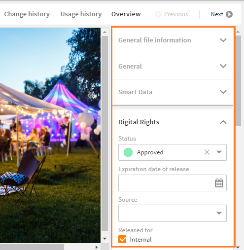
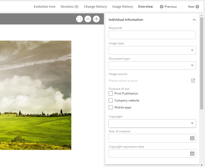
The following example creates a metadata group for individual object information. Compare the result in the GUI further down.
<metadata_renderer>
  <label_placement>top</label_placement>
  <label>L-FILE-METADATA_RENDERER-TITLE</label>
  <info>L-FILE-METADATA_RENDERER-TITLE-INFO</info>

  <group_renderer_list>
    <group_renderer>
      <label>L-FILE-METADATA_RENDERER-INDIVIDUAL</label>

      <field_renderer_list>

        <field_renderer>
          <field_renderer_attributes>
            <entry key="visual_type">auto_complete</entry>
          </field_renderer_attributes>
          <typeahead>
            <enabled>true</enabled>
            <index_name>keywords</index_name>
          </typeahead>
          <field>
            <name>keywords</name>
          </field>
        </field_renderer>

        <field_renderer>
          <type>Selection</type>
          <field_renderer_attributes>
            <entry key="visual_type">dropdown</entry>
          </field_renderer_attributes>
          <field>
            <name>image_type</name>
          </field>
        </field_renderer>

        <field_renderer>
          <type>Selection</type>
          <field_renderer_attributes>
            <entry key="visual_type">dropdown</entry>
          </field_renderer_attributes>
          <field>
            <name>document_type</name>
          </field>
        </field_renderer>

        <field_renderer>
          <type>Selection</type>
          <field_renderer_attributes>
            <entry key="visual_type" class="string">radio</entry>
            <entry key="has_popup" class="boolean">true</entry>
            <entry key="show_groups" class="boolean">true</entry>
          </field_renderer_attributes>
          <field>
            <name>image_source</name>
          </field>
        </field_renderer>

        <field_renderer>
          <type>Selection</type>
          <field_renderer_attributes>
            <entry key="visual_type" class="string">checkbox</entry>
          </field_renderer_attributes>
          <field>
            <name>purpose_of_use</name>
          </field>
        </field_renderer>

        <field_renderer>
          <type>Selection</type>
          <field_renderer_attributes>
            <entry key="visual_type">dropdown</entry>
          </field_renderer_attributes>
          <field>
            <name>copyright</name>
          </field>
        </field_renderer>

        <field_renderer>
          <type>Datetime</type>
          <field_renderer_attributes>
            <entry key="show_time" class="boolean">false</entry>
          </field_renderer_attributes>
          <field>
            <name>year_of_creation</name>
          </field>
        </field_renderer>

        <field_renderer>
          <type>Datetime</type>
          <field_renderer_attributes>
            <entry key="show_time" class="boolean">false</entry>
          </field_renderer_attributes>
          <field>
            <name>copyright_expire</name>
          </field>
        </field_renderer>

      </field_renderer_list>
    </group_renderer>
  </group_renderer_list>
</metadata_renderer>
Result in the GUI:
# Search Renderer Configuration
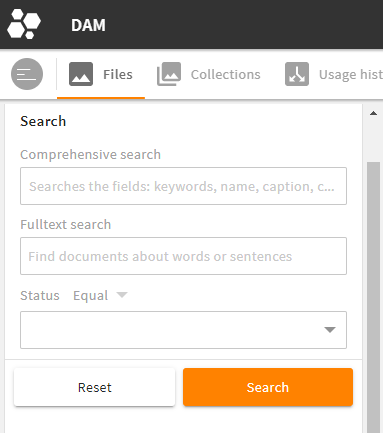
With a search renderer, you can set search filters and create a corresponding search query. The search renderer works a bit different from other renderers and uses special wrapper tags.
A search renderer gives you various options: Configure, e.g., that users may set a wildcard themselves, but only at the end of a term to save performance. However, this should not always be set automatically, so that also very restrictive searches can be made. This behavior can be defined with a regex.
Please note: In a search renderer, tag <search_field> replaces basic XML tag <field>.
Restrictions
Some basic elements make no sense to use in a search renderer. Please note the following specifications:
- No automatic hiding: The functionality
hide_if_emptyhas been completely removed. - Read only: In most cases, it makes no sense to set a search field to
read_only. To allow special use cases, this functionality remains though. - Validation: To define
validationfor a search field often makes no sense either. To allow special use cases, this functionality, too, remains.
# XML Structure of a Search Renderer
XML tag: <search_renderer>
Storage: modules/{$module}/object_renderer/search
A search renderer requires the following wrapper elements:
<search_renderer>
  <group_renderer_list>
    <group_renderer>
      <field_renderer_list>
        <field_renderer>
          <search_fields>
            <search_field>

            </search_field>
          </search_fields>
        </field_renderer>
      </field_renderer_list>
    </group_renderer>
  </group_renderer_list>
</search_renderer>
- For specifications of the root tag (e.g.
label_placement), refer here. - For specifications of optional group renderer (e.g.
label,type,default_open), refer here. - For specifications of the field renderer (e.g.
label,colspan,rowspan), refer here. - Additionally, the search renderer gives another option to specify with
Search Additions:
# Search Additions
Optional search additions can be used to visually restrict a search, e.g. to hide non-relevant mime types. Similar to non-editable renderers with default values, they cannot be used to save permissions. The frontend actively sends the name of the object renderer, so these additions will apply.
Wrapper <search_additions> (just below <search_renderer>) contains one or more <additions>. Each addition can contain one or more conditions.
Example:
<search_renderer>
  <label>L-FILE-VALID_FILES</label>
  <label_placement>top</label_placement>

  <search_additions>
    <additions>
      <condition>
        <value1 type="field">
          <value>status</value>
        </value1>
        <operator>!=</operator>
        <value2>
          <value>expired</value>
        </value2>
      </condition>
    </additions>
  </search_additions>

  <group_renderer_list>
  </group_renderer_list>
</search_renderer>
# Search: Field Renderer
XML tag: <field_renderer>
Each search field in the GUI requires a separate field renderer (which can refer to and search in multiple search fields).
For basic specifications of the field renderer (e.g. label, placeholder, type), refer here.
Additionally, the search renderer requires further settings using the following tags:
| Name | Description |
|---|---|
| operator | Here you can define the logical operator to be used. This operator combines different search filters. |
| comparator | Here you can define the comparison operator to be used. Please note: Only the long form is supported. |
| wildcard_settings | Here you can define what wildcard options are possible (details). |
# Wildcard Settings
For a search with LIKE, you have the option to define whether a wildcard (*) is automatically placed in front of the search term, behind the search term or may manually be set by the user.
Please note: Wildcard settings have an effect on the system's performance. Decide whether your system should focus more on performance (lesser wildcard options) or usability (more wildcard options, lesser performance).
| Name | Value/Type | Description |
|---|---|---|
| user | false (default)true | Allows a user to set a wildcard (only supported for a search with LIKE). |
| after | true (default)false | A wildcard is automatically set at the end of the value. |
| before | false (default)true | Analogous to after. However, this wildcard has a huge effect on the system's performance and thus set to false by default. |
Please note:
- If options
beforeandafterare set totrue, the wildcard is set both in front and behind a search term.
# Search Field
Wrapper tag: <search_fields>
XML tag: <search_field> (replaces basic XML tag <field>)
The structure of a search field is similar to a basic renderer field. However, multiple search fields can be specified in one field renderer, allowing more than one database field to be searched in.
Possible specifications:
| Name | Value/Type | Description |
|---|---|---|
| name | string | Name of the field that should be searched in. |
| type | Type of the field list of CEtypes | If the type is not specified here, it may be generated from the ModuleField. |
# Full Search Renderer Example
<search_renderer>
  <label>L-FILE-DEFAULT_SEARCH_HS</label>
  <label_placement>top</label_placement>

  <group_renderer_list>
    <group_renderer>
      <type>flat</type>
      <default_open>true</default_open>
      <label>L-FILE-DEFAULT_SEARCH_HS</label>

      <field_renderer_list>

        <field_renderer>
          <label>L-FILE-GLOBAL_FILE_SEARCH</label>
          <placeholder>L-FILE-GLOBAL_FILE_SIMPLE-SEARCH-PROMPT</placeholder>
          <typeahead>
            <enabled>true</enabled>
            <restrict_values>false</restrict_values>
            <index_name>global_search_user</index_name>
          </typeahead>
          <field_renderer_attributes>
            <entry key="visual_type">auto_complete</entry>
          </field_renderer_attributes>
          <comparator>LIKE</comparator>
          <wildcard_settings>
            <before>true</before>
            <after>true</after>
          </wildcard_settings>
          <operator>OR</operator>
          <search_fields>
            <search_field>
              <name>compr_search</name>
            </search_field>
          </search_fields>
        </field_renderer>

        <field_renderer>
          <label>L-FILE-GLOBAL_FILE_FULLTEXT-SEARCH</label>
          <placeholder>L-FILE-GLOBAL_FILE_FULLTEXT-PROMPT</placeholder>
          <comparator>EQUAL</comparator>
          <operator>AND</operator>
          <field_renderer_attributes>
            <entry key="visual_type">single_line</entry>
          </field_renderer_attributes>
          <search_fields>
            <search_field>
              <type>CEText</type>
              <name>idnt_mkp_txt_file_id.text</name>
            </search_field>
          </search_fields>
        </field_renderer>

        <field_renderer>
          <type>selection</type>
          <value_option_key>release_status</value_option_key>
          <comparator>EQUAL</comparator>
          <operator>AND</operator>
          <field_renderer_attributes>
            <entry key="visual_type" class="string">dropdown</entry>
            <entry key="show_icon" class="boolean">true</entry>
          </field_renderer_attributes>
          <search_fields>
            <search_field>
              <name>release_status</name>
            </search_field>
          </search_fields>
        </field_renderer>

      </field_renderer_list>
    </group_renderer>
  </group_renderer_list>
</search_renderer>
Result in the GUI:
# Multiple Search Renderers in the GUI
If you have multiple search renderers you want your users to select from, you can combine them in one search panel in the GUI. Your users can select the required renderer themselves via a drop-down menu:
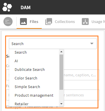
Multiple search renderers to choose from in the File module
Multiple search renderers can easily be configured in a module's object renderer set, panel "Object renderer for search and subpanel". Here, all required search renderers can be added to and ordered in field "Search Renderers" (object renderer set documentation).
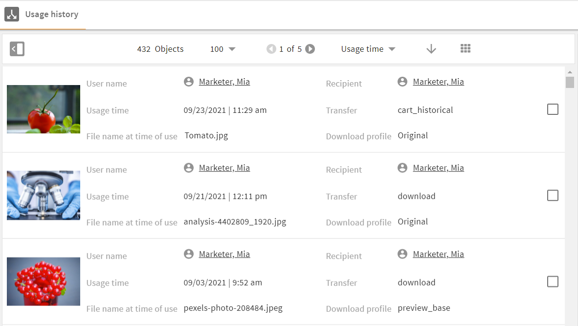
# Simple Renderer Configuration
The simple renderer is a slimmer version of the metadata renderer and can thus be built up faster. The simple renderer is suitable e.g. for lists.
Restrictions
Some basic elements from the metadata renderer cannot be used in a simple renderer. Please note the following specifications:
- No group renderers: The simple renderer does not contain any group renderers, only the field renderers themselves. Thus,
column_countis placed with the root tag. - Just read only: Field renderers are always
read_only. This results in smaller DOM elements. Also, the logic for monitoring and saving changes is completely omitted.
Please note: Options such as validation, typehead and others are thus not possible.
# XML Structure of a Simple Renderer
XML tag: <simple_renderer>
Storage: modules/{$module}/object_renderer/simple
- For specifications of the root tag (e.g.
label_placement), refer here. Please note the restrictions above (column_count). - For specifications of the field renderer (e.g.
label,colspan,rowspan), refer here. Please note the restrictions above (read_only). - For the definition of the renderer field itself, refer here.
- If you want to add an extendable panel with extra information, refer here.
A simple renderer requires the following wrapper elements:
<simple_renderer>
  <field_renderer_list>
    <field_renderer>
      <field>

      </field>
    </field_renderer>
  </field_renderer_list>
</simple_renderer>
# Full Simple Renderer Example
<simple_renderer>
  <label_placement>left</label_placement>
  <column_count>3</column_count>
  <field_renderer_list>

    <field_renderer>
      <type>Image</type>
      <label></label>
      <rowspan>3</rowspan>
      <width>auto</width>
      <height>auto</height>
      <field_renderer_attributes>
        <entry class="string" key="derivate">medium</entry>
        <entry class="string" key="image_height">medium</entry>
        <entry class="string" key="image_width">medium</entry>
      </field_renderer_attributes>
      <field>
        <name>id</name>
        <type>CEId</type>
      </field>
    </field_renderer>

    <field_renderer>
      <type>Reference</type>
      <label>L-USA_HIS_ASS-USERNAME</label>
      <field_renderer_attributes>
        <entry class="string" key="module">user</entry>
        <entry class="string" key="displayField">friendlyname</entry>
      </field_renderer_attributes>
      <field>
        <name>creator</name>
        <type>CEId</type>
      </field>
    </field_renderer>

    <field_renderer>
      <type>Reference</type>
      <label>L-USA_HIS_ASS-RECIPIENT</label>
      <field_renderer_attributes>
        <entry class="string" key="module">contact</entry>
        <entry class="string" key="displayField">friendlyname</entry>
      </field_renderer_attributes>
      <field>
        <name>recipient</name>
      </field>
    </field_renderer>

    <field_renderer>
      <type>DateTime</type>
      <label>L-USA_HIS_ASS-USED_TIME</label>
      <field>
        <name>created_time</name>
        <type>CETimestamp</type>
      </field>
      <field_renderer_attributes>
        <entry key="show_date" class="boolean">true</entry>
        <entry key="show_time" class="boolean">true</entry>
      </field_renderer_attributes>
    </field_renderer>

    <field_renderer>
      <label>L-USA_HIS_ASS-TRANSFER_TYPE</label>
      <field>
        <name>type</name>
        <type>CEVarchar</type>
      </field>
    </field_renderer>

    <field_renderer>
      <label>L-USA_HIS_ASS-FILENAME</label>
      <field>
        <name>name</name>
        <type>CEVarchar</type>
      </field>
    </field_renderer>

    <field_renderer>
      <label>L-USA_HIS_ASS-DOWNLOAD_PROFILE</label>
      <field>
        <name>usage</name>
        <type>CEVarchar</type>
      </field>
    </field_renderer>

  </field_renderer_list>
</simple_renderer>
Result in the GUI:
# Extendable Lists
You can extend a list with additional information panels (e.g., further metadata or related objects). If active, a list displays an 'Expand' button next to each list element. Users can open the additional content for a list entry without leaving the current view.
An extendable list is activated in the layout by adding parameter extendedContent to the CEObjectListItemRenderer component. Here, you can also define the content to be displayed (subpanels or object renderers both in read-only).
Please note: As soon as there is content for parameter extendedContent, the 'Expand' button will automatically show.
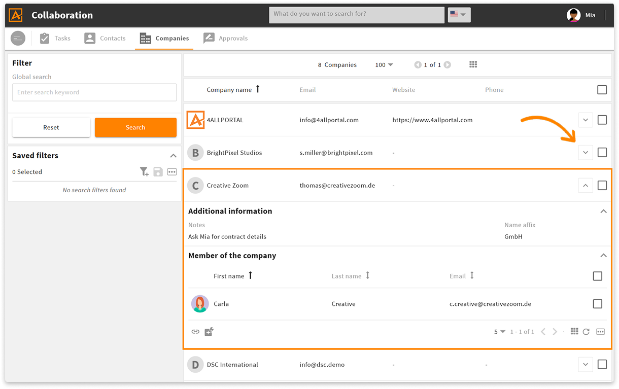
list with expanded panel in the Companies module
# Renderers Depending on Role, Object Type, Client Type
The 4ALLPORTAL can be configured to deliver different object renderers for the same requested view, depending on the current user role, object type, or client type. For example, if:
- a certain role should get more options than other roles to view and edit an object's metadata.
- an object type (e.g., all video files) does not require certain metadata fields.
- a client type (e.g., smartphone) requires reduced data to be displayed properly.
# Role-Specific Renderers
If you want a role to receive a renderer different from the system default/other roles, you can configure a renderer mapping in the GUI:
- create and store your custom object renderer with the required changes from the default in your file system
- map your renderer in the module's object renderer set in admin snap-in
Module configuration/{module}/Object Renderer Set - add module and set to a view profile in admin snap-in
General system configurations/User settings/View Profiles - assign this view profile in the role configurations to the role in admin snap-in
General system configurations/User settings/Role Configurations
Example
You want your photographers to see more metadata fields in your Files module:
- create object renderer "default.4aprenderer_c" with your changes of the default metadata renderer in folder
custom/modules/file/object_renderer/metadata/photographer - create an object renderer set "Photographer" for the Files module and assign renderer "photographer" as the default renderer
- create a view profile "Photographer", add module "Files" and select object renderer set "Photographer"
- open role "Photographers" in your role configurations and assign view profile "Photographer"
Further Documentation
# Object-Type-Specific Renderers
If you want to match your object's metadata fields with its object-type (i.e., display specific fields only for audios, videos, images, or for cameras, laptops, tablets), you need different object renderers that apply only if the corresponding object-type is selected.
An object's object-type is determined by its value in default field type.
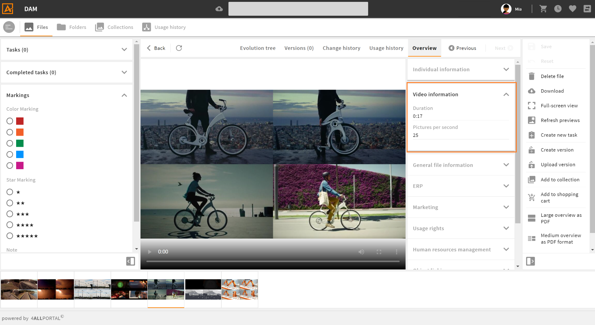
object-type specific metadata renderer for video files in the Files module
# Create an Object-Type Specific Renderer
Every object renderer can become object-type specific. To add an object-type logic to a renderer, you need to create a renderer folder instead of a .4aprenderer file, add the required renderers/changes and a mapping in a config.xml:
- go to the module's renderer folder you need the object-type logic for (e.g.
modules/files/object_renderer/metadata) - create a folder which name resembles the name of the renderer requested in the frontend (e.g.
defaultorcreate_eticket) - add all required renderers/change files, e.g., named after the type you configure in them (e.g.
audio.4aprenderer_c)- Please note: Change files can apply to any renderer in this module.
- add a
config.xmlwith the required object-type mapping - assign this renderer folder to a module's object renderer set
Please note: Each renderer referred to in a mapping must be stored in the same object renderer folder.
Example:
For module file, the metadata renderer default is a folder. Its content is as follows:
- audio.4aprenderer_c
- image.4aprenderer_c
- video.4aprenderer_c
- config.xml
All change files refer to metadata renderer default.4aprenderer (<changes extends="metadata/default">).
File config.xml is used to map each object-type to the desired renderer:
<renderer_config>
    <object_type_mapping>
        <entry class="string" key="image">image</entry>
        <entry class="string" key="audio">audio</entry>
        <entry class="string" key="video">video</entry>
    </object_type_mapping>
</renderer_config>
As a result, the system displays the metadata fields according to this mapping as soon as the default metadata renderer is requested. If a user opens a file of type "audio", the audio renderer according to file audio.4aprenderer_c applies.
If a folder contains both file and folder default, the folder applies first.
file/object_renderer/metadata/defaultfile/object_renderer/metadata, filedefault.4aprenderer
# Map Multiple Object Types to One Renderer
Some systems work with a lot of different object types. Using the config.xml, you can also map multiple object types to only one renderer:
<renderer_config>
    <object_type_mapping>
        <entry class="string" key="product1">renderer1</entry>
	<entry class="string" key="product2">renderer1</entry>
	<entry class="string" key="product3">renderer1</entry>
	<entry class="string" key="product4">renderer1</entry>
	<entry class="string" key="product5">renderer2</entry>
	<entry class="string" key="product6">renderer2</entry>
	<entry class="string" key="product7">renderer2</entry>
	<entry class="string" key="product_special">renderer_special</entry>
    </object_type_mapping>
</renderer_config>
In this example, you need to create and store three actual renderers (or change files) for your eight object types. In the file system, the object renderer folder would look like this:
- renderer1.4aprenderer
- renderer2.4aprenderer_c
- renderer_special.4aprenderer
- config.xml
If a renderer file from here is a change file, it refers to the renderer defined in its XML with <changes extends="{path}">, or (if not defined) to the next higher default.4aprenderer in this module (more details).
# Object Type Inheritance
If your system works with multiple object types that are almost similar with just smaller changes, they can inherit from each other using a change.
Example: A product "Chocolate vegan" has only two differences from product "Chocolate". It can thus inherit from "Chocolate".
Structure of renderer folder
products/object_renderer/metadata/default:chocolate.4aprenderer
chocolate_vegan.4aprenderer_c
config.xml
Contents of
config.xml:
<renderer_config>
    <object_type_mapping>
        <entry class="string" key="chocolate_plain">chocolate</entry>
	<entry class="string" key="chocolate_almond">chocolate</entry>
	<entry class="string" key="chocolate_nuts">chocolate</entry>
	<entry class="string" key="chocolate_vegan">chocolate_vegan</entry>
    </object_type_mapping>
</renderer_config>
- Contents of
chocolate_vegan.4aprenderer_c:
<changes extends="metadata/default/chocolate">
    <change at="last" type="add" xpath="//group_renderer_list">
        <group_renderer>
            <label>L-PRODUCTS-CHOCOLATE-VEGAN</label>
            ...
	</group_renderer>
    </change>
</changes>
Look for more details about changes and xpath notations here.
# Client-Type-Specific Renderers
To make an object renderer configuration client type-specific, prefix ct_ is used. There are different client types that work with a 4ALLPORTAL:
web(default type)phonetablet
If you want an object renderer to be displayed only for client type web, configuration file ct_web.4aprenderer will affect only the default browser GUI of your 4ALLPORTAL.
# Reference: Field Renderer Types
All fields created for a module can basically be displayed in the GUI using a field renderer. The following renderer types are available for display. Just make sure a field's type and data fits the chosen renderer.
Default values: Note that some field renderer types have specific default value settings. If nothing is mentioned for a type, there are no specific settings.
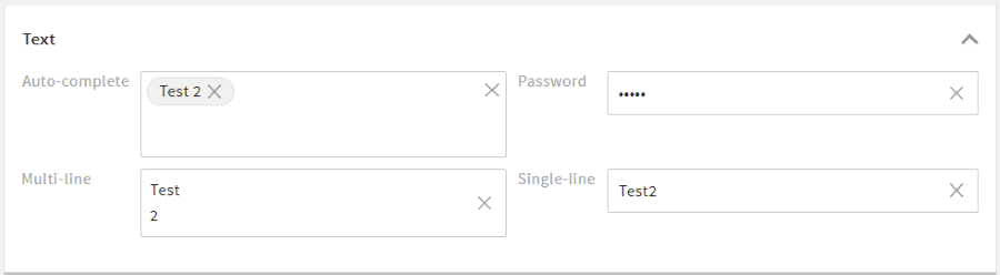
# Text Renderer
The text renderer is suitable for most plain text input. This field renderer is required to configure a standard typeahead.
Please note: If no type is specified in a renderer, text is the default field renderer type.
# Text Renderer Attributes
You may use the following options in element <field_renderer_attributes>:
| Name | Type and Values | Description and Requirements |
|---|---|---|
| visual_type | Type: string Possible values:
Default value: SINGLE_LINE |
Requirements:
|
| use_password_policy | Type: boolean Default value: false | The entered password must match the password policy of the system. Requirements:
|
| password_equal_to | Type: string | The entered password must be equal to the value of the other field. Requirements:
|
| module | Type: string | Set the module for the typeahead request, to load suggestions from other modules. Requirements:
|
Example:
<field_renderer>
  <type>Text</type>
  <field_renderer_attributes>
    <entry key="visual_type" class="string">multi_line</entry>
  </field_renderer_attributes>
  <field>
    <name>description</name>
  </field>
</field_renderer>
Result in the GUI:
# Number Renderer
The number renderer offers different options to display numerical values, for example as a slider.
# Number Renderer Attributes
You may use the following options in element <field_renderer_attributes>:
| Name | Type and Values | Description and Requirements |
|---|---|---|
| visual_type | Type: string Possible values:
Default value: text | Defines the appearance of this field. Requirements:
|
| decimal_places | Type: number Default value: -42 | Defines the maximum number of decimal places. Requirements: |
| force_decimal_places | Type: boolean Default value: false | Ensures that trailing zeros after decimal point are not trimmed. Requirements:
|
| show_thousand_point | Type: boolean Default value: true | Shows a thousands separator. Requirements: |
| unit_left | Type: string | Displays a letter or text (e.g. a currency symbol like "$") to the left of the number. Requirements: |
| unit_right | Type: string | Displays a letter or text (e.g. a currency symbol like "$") to the right of the number. Requirements: |
| step_size | Type: number Default value: 1 | Requirements:
|
| num_thumbs | Type: number Default value: 1 | Defines the number of thumbs and thus the number of possible values. Requirements:
|
| step_indicator | Type: number Default value: 0 | Requirements:
|
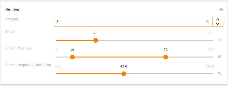
Example:
<field_renderer>
  <type>number</type>
  <validation>
    <min>0</min>
    <max>100</max>
  </validation>
  <field_renderer_attributes>
    <entry key="visual_type">slider</entry>
    <entry key="unit_right">%</entry>
  </field_renderer_attributes>
  <field>
    <name>discount</name>
  </field>
</field_renderer>
Result in the GUI:

# Selection Renderer
The selection renderer is used for selecting one or multiple values from a fix selection list. If defined in the value options, images can be displayed for individual entries.
# Selection Renderer Attributes
You may use the following options in element <field_renderer_attributes>:
| Name | Type and Values | Description and Requirements |
|---|---|---|
| visual_type | Type: string Possible values:
Default value:
single_value is set to false | Defines the appearance of this selection. Requirements:
|
| multiple_value | Type: boolean Default value: false | Displays the values in a dropdown menu with checkboxes to select from. Requirements:
|
| has_popup | Type: boolean Default value: false | Displays the selection within a popup and the selected values as text. Requirements:
|
| show_groups | Type: boolean Default value: true | Displays the grouping of the value options. Requirements:
|
| group_all | Type: boolean Default value: false | Adds the option to (de)select all checkboxes of one group at the same time. Requirements:
|
| global_all | Type: boolean Default value: false | Adds the option to (de)select all checkboxes at the same time. Requirements:
|
| filterable | Type: boolean Default value: false | Allows you to filter the items in the drop-down menu. Requirements:
|
| allow_custom_value | Type: boolean Default value: false | Requirements:
|
| sortable | Type: boolean Default value: false | Allows you to sort selected values manually Requirements:
|
| show_icon required | Type: boolean | Defines whether the icons from value options are displayed. Requirements: |
| show_label | Type: boolean Default value: true | Defines whether the name of the value option is displayed. Requirements: |
| availableLabelKey | Type: string Default value: L-GLOBAL-SELECTION_RENDERER-AVAILABLE_LABEL_KEY | Defined label for the column with available entries Requirements:
|
| valueLabelKey | Type: string Default value: L-GLOBAL-SELECTION_RENDERER-VALUE_LABEL_KEY | Defined label for the column with selected entries Requirements:
|
| allow_new_values | Type: boolean Default value: false | Requirements:
|
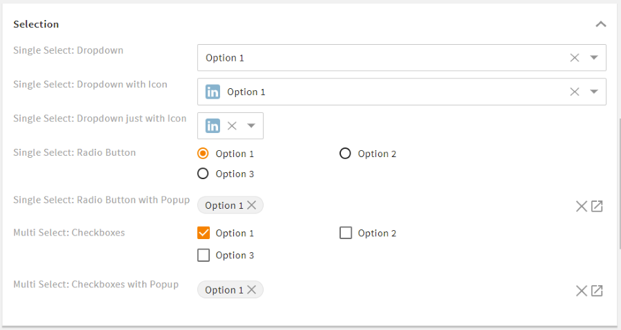
Example:
<field_renderer>
  <type>selection</type>
  <label>L-FILE-MIMETYPE</label>
  <placeholder>L-FILE-MIMETYPE_POP_UP_SELECTION</placeholder>
  <comparator>IN</comparator>
  <operator>AND</operator>
  <field_renderer_attributes>
    <entry key="visual_type" class="string">checkbox</entry>
    <entry key="has_popup" class="boolean">true</entry>
    <entry key="global_all" class="boolean">true</entry>
    <entry key="group_all" class="boolean">true</entry>
  </field_renderer_attributes>
  <search_fields>
    <search_field>
      <name>mimetype</name>
    </search_field>
  </search_fields>
</field_renderer>
Result in the GUI:

# DateTime Renderer
Date and/or time values can be displayed and set using the datetime renderer.
# DateTime Renderer Attributes
You may use the following options in element <field_renderer_attributes>:
| Name | Type and Values | Description and Requirements |
|---|---|---|
| visual_type | Type: string Possible values:
Default value: FIELD | Defines the type of visualization of the date input. Requirements:
|
| show_date | Type: boolean Default value: true | Allows to set a specific date value. Requirements: |
| show_time | Type: boolean Default value: true | Allows to set a specific time value. Requirements: |
| am_pm | Type: boolean Default value: false | Defines whether time values are displayed in 24h (default) or 12h mode. Requirements: |
| now_relative_validation | Type: boolean Default value: false | Requirements:
|
Please note: If both show_date and show_time are set to false, this field will be deactivated.
Example:
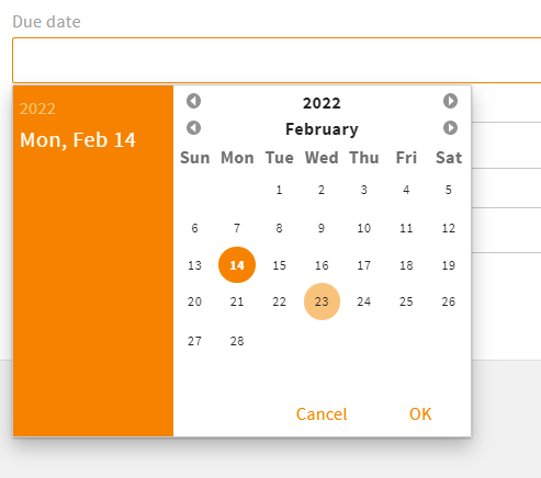
<field_renderer>
  <type>DateTime</type>
  <field_renderer_attributes>
    <entry key="show_time" class="boolean">false</entry>
  </field_renderer_attributes>
  <field>
    <name>due_date</name>
  </field>
</field_renderer>
Result in the GUI:
# DateTime Renderer Default Values
In addition to the timestamp, the following constants are supported:
- NOW: current time
- TODAY: current day
- TOMORROW: current time + 24 hours
- YESTERDAY: current time - 24 hours
# OnOff Renderer
This renderer is used to set a field to on or off. Additionally, there is a default third value "not set" (null). A user can set this state by clicking X.
# OnOff Renderer Attributes
You may use the following options in element <field_renderer_attributes>:
| Name | Type and Values | Description and Requirements |
|---|---|---|
| visual_type | Type: string Possible values:
Default value: switch | Defines the display type of the renderer. Requirements: |
| icon_name_true | Type: string Default value: GLOBAL-ON_OFF-RENDERER_ON | Defines the name of the read-only icon with value true.Requirements:
|
| icon_name_false | Type: string Default value: GLOBAL-ON_OFF-RENDERER_OFF | Defines the name of the read-only icon with value false.Requirements:
|
| icon_name_null | Type: string Default value: GLOBAL-ON_OFF-RENDERER_NULL | Defines the name of the read-only icon with value null.Requirements:
|
| icon_info_true | Type: string | Sets the tooltip label key for the read-only icon with value true.Requirements:
|
| icon_info_false | Type: string | Sets the tooltip label key for the read-only icon with value false.Requirements:
|
| icon_info_null | Type: string | Sets the tooltip label key for the read-only icon with value null.Requirements:
|
Example:
<field_renderer>
  <type>OnOff</type>
  <label>L-A-TYPEAHEADINDEX-ORDERED</label>
  <info>L-A-TYPEAHEADINDEX-ORDERED-INFO</info>
   <field_renderer_attributes>
      <entry key="icon_name_true">RENDERER_ON</entry>
      <entry key="icon_name_false">RENDERER_OFF</entry>
      <entry key="icon_name_null"/> /* No icon is displayed */
   </field_renderer_attributes>
  <field>
    <name>ordered</name>
    <type>Boolean</type>
  </field>
</field_renderer>
Result in the GUI:

# StaticText Renderer
This renderer can be used to place a static text in an object renderer without linking to a metadata field (no field needs to be specified). You can display additional descriptions, important information, or headings for tables or groups. HTML is supported if set to true.
# StaticText Renderer Attributes
You may use the following options in element <field_renderer_attributes>:
| Name | Type and Values | Description and Requirements |
|---|---|---|
| label_key required | Type: string | Defines the label key used for translation or the label, if translation is set to false. Requirements: |
| translate | Type: boolean Default value: true | Defines whether the label key should be translated or not. Requirements: |
| allow_html | Type: boolean Default value: false | Defines whether the label key is displayed as HTML text. Requirements: |
| variables | Type: object | Must list the variables, if any occur in the label translation. Requirements: |
| module_name | Type: string | Defines a module Name for module specific variables used in the label key. Requirements: |
Example:
<field_renderer>
  <type>StaticText</type>
   <field_renderer_attributes>
      <entry key="label_key">L-FILE-KEYWORDS-STATICTEXT</entry>
      <entry key="allow_html" class="boolean">true</entry>
   </field_renderer_attributes>
</field_renderer>
# Reference Renderer
To create and display references to other datasets, you can use the reference renderer.
# Reference Renderer Attributes
You may use the following options in element <field_renderer_attributes>:
| Name | Type and Values | Description and Requirements |
|---|---|---|
| visual_type | Type: string Possible values:
Default value: bubble | Requirements: |
| modules | Type: array of string | Requirements: |
| show_image | Type: boolean Default value: true | Requirements:
|
| image_type | Type: string Possible values:
Default value: module_icon | Defines the type of the displayed image. Requirements:
|
| has_popup | Type: boolean Default value: true | Requirements:
|
| clickable | Type: boolean Default value: true | Requirements: |
| tile_width | Type: string Possible values:
Default value: medium | Defines the width of each tile Requirements:
|
| tile_height | Type: string Possible values:
Default value: medium | Defines the height of each tile Requirements:
|
| display_field | Type: string Default value: friendlyname | Defines the field whose text value should represent a record. Requirements:
|
| type_filter | Type: array of string | Requirements:
|
| show_placeholder_tile | Type: boolean Default value: true | Displays a placeholder tile (plus icon) that can be used to open the reference find popup Requirements:
|
| fill_placeholder_tiles | Type: boolean Default value: false | Requirements:
|
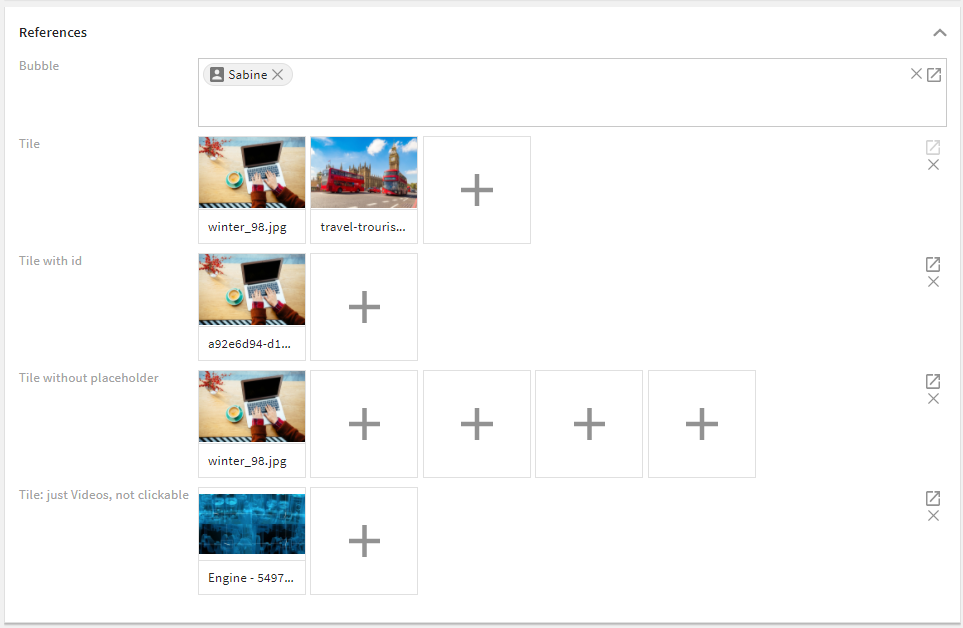
Example:
<field_renderer>
  <type>Reference</type>
  <label>L-TASK-ADDITIONAL_PERMISSION</label>
  <field_renderer_attributes>
    <entry class="array" key="modules">
      <value>user</value>
    </entry>
    <entry class="boolean" key="show_image">true</entry>
    <entry class="string" key="image_type">object_image</entry>
  </field_renderer_attributes>
  <field>
    <name>additional_permission</name>
    <type>CEAdditionalPermissionList</type>
  </field>
</field_renderer>
Result in the GUI:
# Image Renderer
This renderer is used to turn the set value to an image. It supports object images as well as regular and parameterizable URLs.
# Image Renderer Attributes
You may use the following options in element <field_renderer_attributes>:
| Name | Type and Values | Description and Requirements |
|---|---|---|
| image_width | Type: string Possible values:
Default value: small | Defines the absolute width of the image. Requirements: |
| image_height | Type: string Possible values:
Default value: small | Requirements: |
| image_type | Type: string Possible values:
Default value: object_image | Defines the way a value will be used (more details) Requirements: |
| derivate | Type: string Possible values:
Default value: medium | Defines the preview size for the object image. Requirements:
|
| allowed_ois_options | Type: array of string Possible values:
| This setting allows to hide object image options even if they are actually allowed. Requirements:
|
| url required | Type: string | Requirements:
|
| module | Type: string | Defines a CE module whose object image or module icon should be displayed. Requirements:
|
| show_alpha | Type: boolean Default value: false | Defines whether a chessboard is displayed for the images without background Requirements:
|
| alt_label_key | Type: string | Defines the alt-text label-key of the displayed image Requirements: |
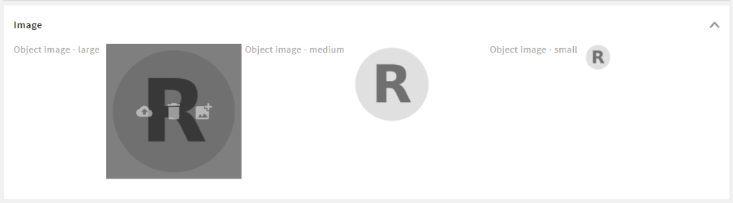
Example:
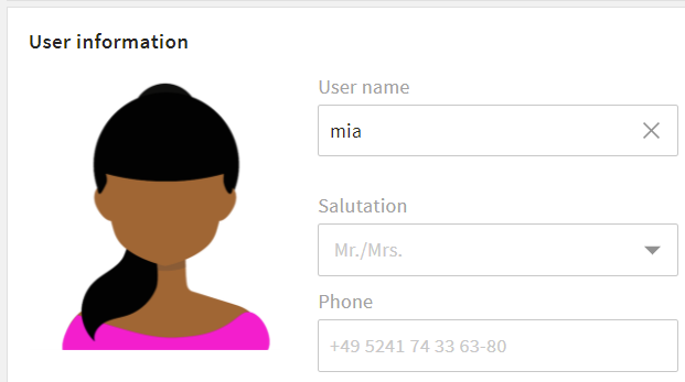
<group_renderer_list>
  <group_renderer>
    <type>flat</type>
    <label>L-USER-MAIN_GROUP_TITLE</label>
    <column_count>4</column_count>

    <field_renderer_list>

      <field_renderer>
        <read_only>false</read_only>
        <type>Image</type>
        <label/>
        <rowspan>6</rowspan>
        <height>auto</height>
        <width>auto</width>
        <field_renderer_attributes>
          <entry key="image_height" class="string">large</entry>
          <entry key="image_width" class="string">large</entry>
          <entry key="image_type" class="string">object_image</entry>
          <entry key="derivate" class="string">medium</entry>
        </field_renderer_attributes>
        <field>
          <name>id</name>
        </field>
      </field_renderer>
    </field_renderer_list>
  </group_renderer>
</group_renderer_list>
Result in the GUI:
# Image Type Options
object_image: Displays the image for an ID (and the module from config) or a CE object link.module_icon: Displays the image for a string, the module from config, or a CE object link.param_url: Replaces all occurrences of%param%in the configured URL with the value of the field and displays the corresponding image.plain_url: Takes the set value as the URL for the image.
# Link Renderer
With the link renderer, field values can be used as hyperlinks, links can be parameterized for dynamic URLs, and URLs can also be overwritten.
# Link Renderer Attributes
You may use the following options in element <field_renderer_attributes>:
| Name | Type and Values | Description and Requirements |
|---|---|---|
| new_tab | Type: boolean Default value: true | Defines whether the link should be opened in the same or a new browser tab. Requirements: |
| link_type | Type: string Possible values:
Default value: param_url | Requirements: |
| display_field | Type: string | Defines which field of module is displayed for link Requirements:
|
| module | Type: string | Defines a CE module whose link should be displayed. Requirements:
|
| url required | Type: string | Defines the base URL of the field. All %param% are replaced with the value of the field.Requirements:
|
| display_text | Type: string | Requirements:
|

Example:
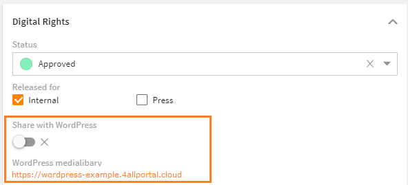
<field_renderer_list>
  <field_renderer>
    <type>OnOff</type>
    <read_only>false</read_only>
    <default_value>false</default_value>
    <read_only_type>single_line</read_only_type>
    <label>L-WORDPRESS_CONNECTOR_METADATA_FIELD</label>
    <field>
      <name>wordpress_enabled</name>
      <type>CEBoolean</type>
    </field>
  </field_renderer>

  <field_renderer>
    <type>Link</type>
    <label>L-FILE-LINK-WORDPRESS</label>
    <field_renderer_attributes>
      <entry key="link_type">param_url</entry>
      <entry key="url">https://wordpress-example.4allportal.cloud/wp-admin/upload.php?id=%param%</entry>
      <entry key="display_text">https://wordpress-example.4allportal.cloud</entry>
    </field_renderer_attributes>
    <field>
      <name>id</name>
    </field>
  </field_renderer>
</field_renderer_list>
Result in the GUI:
# Metric Renderer
The metric renderer displays numeric values together with a metric unit. Both the numeric value and the unit can be changed via this renderer.
The Metric Renderer can manage CE types CEMetric and CEMetricList as well as all other numerical CE types.
If CEMetric or CEMetricList are used, the unit can be selected using a combo-box in addition to the actual value.
# Metric Renderer Attributes
You may use the following options in element <field_renderer_attributes>:
| Name | Type and Values | Description and Requirements |
|---|---|---|
| metric required | Type: string | Requirements: |
| default_unit | Type: string | Requirements:
|
| forced_unit | Type: string | This attribute is used to convert a value to a specified fixed metric unit. Requirements:
|
| decimal_places | Type: number Default value: 2 | Defines the maximum number of decimal places. Requirements: |
| auto_compress | Type: boolean Default value: false | Requirements:
|
If metric or default_unit have not been configured in the renderer, the respective attribute is taken from the configured field. If this renderer is part of a search renderer, the first field of the field list is considered.
Example:
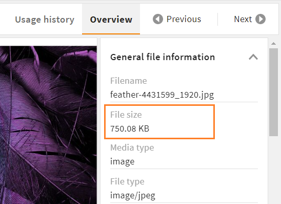
<field_renderer>
  <hide_if_empty>true</hide_if_empty>
  <type>Metric</type>
  <read_only>true</read_only>
  <field_renderer_attributes>
    <entry key="auto_compress" class="boolean">true</entry>
    <entry key="metric" class="string">data</entry>
    <entry key="default_unit" class="string">bytes</entry>
  </field_renderer_attributes>
  <field>
    <name>size</name>
  </field>
</field_renderer>
Result in the GUI:
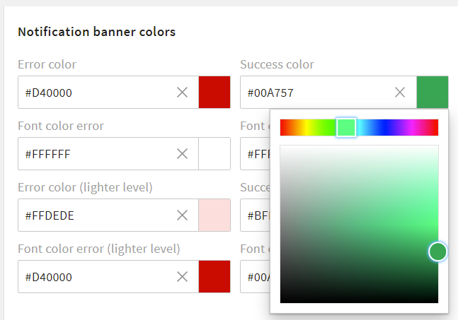
# Color Renderer
The color renderer offers the possibility to select a color value using the ColorPicker component. It is used for example in the admin area to select the theme colors.
A color value is always returned as a hexadecimal code.
Please note: Since there is no CEType for color values, all string types can be used to contain the hex code of a color.
# Color Renderer Attributes
There are no specific settings for this renderer type.
Example:
<field_renderer_list>
  <field_renderer>
    <type>Color</type>
    <label>L-A-THEME-ERROR_C</label>
    <info>L-A-THEME-ERROR_C-INFO</info>
    <field>
      <name>error_c</name>
      <type>String</type>
    </field>
  </field_renderer>
  <field_renderer>
    <type>Color</type>
    <label>L-A-THEME-SUCCESS_C</label>
    <info>L-A-THEME-SUCCESS_C-INFO</info>
    <field>
      <name>success_c</name>
      <type>String</type>
    </field>
  </field_renderer>
</field_renderer_list>
Result in the GUI:
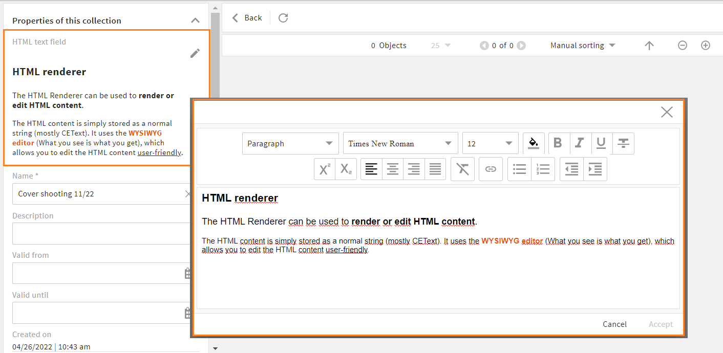
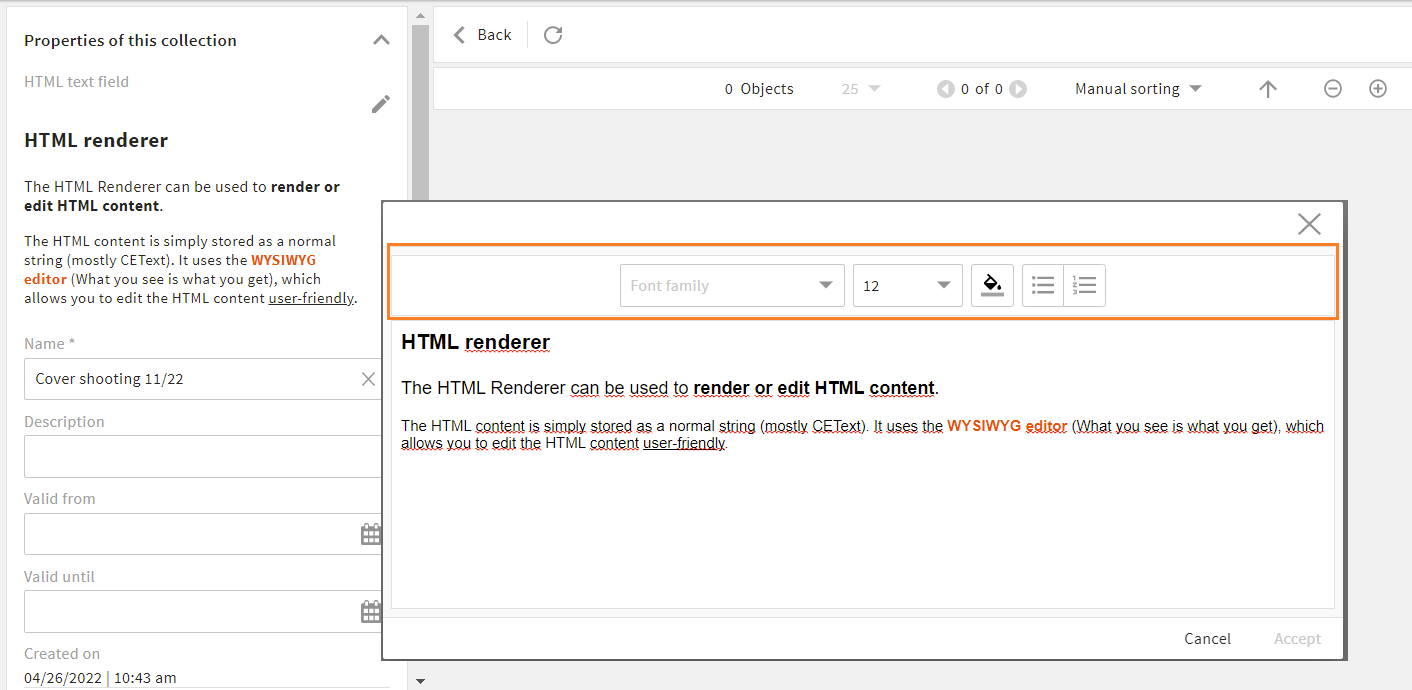
# HTML Renderer
The HTML Renderer can be used to render or edit HTML content. The HTML content is simply stored as a normal string (mostly CEText). It uses the WYSIWYG editor (What you see is what you get), which allows you to edit the HTML content user-friendly.
However, the top use-case is to show formatted content in a record context and ensuring a safe usage by stripping insecure content.
Dependency
Note that when working with Core Engine version 3.10, an additional installation of 4App HTML Renderer (opens new window) is required. From version 4.0 on, all features are included in the Core Engine.
# HTML Renderer Attributes
You may use the following options in element <field_renderer_attributes>:
| Name | Type and Values | Description and Requirements |
|---|---|---|
| allow_custom_elements | Type: boolean Default value: false | Requirements: |
| additional_allowed_tags | Type: array of string Default value: ```` | Requirements: |
| additional_allowed_attributes | Type: array of string Default value: ```` | Requirements: |
| editor_controls | Type: array of string Possible values:
| Requirements: |
| partial_edit | Type: boolean Default value: false | Requirements: |
Examples:
If you want to use the default editor (with all editor controls except "textblock"), you can keep it simple:
<field_renderer>
  <type>html</type>
  <label>HTML text field</label>
  <field>
    <name>html_field</name>
    <type>CEText</type>
  </field>
</field_renderer>
Result in the GUI:
If you want to alter the default (e.g., remove editor controls, or add control "textblock"), you need to specify:
<field_renderer>
  <type>html</type>
  <label>HTML text field</label>
  <field_renderer_attributes>
    <entry key="allow_custom_elements" class="boolean">true</entry>
    <entry key="additional_allowed_tags" class="array">
      <value>style</value>
      <value>iframe</value>
    </entry>
    <entry key="additional_allowed_attributes" class="array">
	  <value>custom_attribute</value>
    </entry>
    <entry key="editor_controls" class="array">
      <value class="array">
	  <value>fontFamily</value>
          <value class="map">
            <entry key="options">allowedFonts</entry>
          </value>
      </value>
      <value>fontSize</value>
      <value>fontColor</value>
    </entry>
  </field_renderer_attributes>
  <field>
    <name>html_field</name>
    <type>CEText</type>
  </field>
</field_renderer>
Result in the GUI:
Further documentation
# Dimension Renderer
For search renderers only.
With a dimension renderer, a user gets an additional search filter to choose from active dimensions and limit their search result.
A dimension renderer is added to an existing search renderer and will apply to all configured field renderers. It affects all search fields designed for dimensions and does not affect non-dimensional fields. A dimension renderer does not require a search field setting itself.
If no dimension is selected, all dimensions will be searched in.
# Dimension Renderer Attributes
You may use the following options in element <field_renderer_attributes>:
| Name | Type and Values | Description and Requirements |
|---|---|---|
| dimension_name required | Type: string | Enter a dimension whose values should be displayed. Requirements: |
Please note: The dimension renderer is derived from and supports all attributes of the selection renderer, e.g. its visual type or pop-up options.
Example:
<group_renderer_list>
  <group_renderer>
    <type>flat</type>
    <default_open>true</default_open>
    <label>L-FILE-DEFAULT_SEARCH</label>
    <field_renderer_list>

      <field_renderer>
        <type>Dimension</type>
        <label>L-D-LOCALE</label>
        <field_renderer_attributes>
          <entry key="dimension_name">locale</entry>
          <entry key="visual_type" class="string">radio</entry>
          <entry key="show_icon" class="boolean">true</entry>
        </field_renderer_attributes>
      </field_renderer>

      <field_renderer>
        <type>Dimension</type>
        <label>L-D-CHANNEL</label>
        <field_renderer_attributes>
          <entry key="dimension_name">channel</entry>
          <entry key="visual_type" class="string">radio</entry>
          <entry key="show_icon" class="boolean">true</entry>
        </field_renderer_attributes>
      </field_renderer>

      <field_renderer>
        <label>L-FILE-GLOBAL_FILE_SEARCH</label>
        <placeholder>L-FILE-GLOBAL_FILE_SIMPLE-SEARCH-PROMPT</placeholder>
        <typeahead>
          <enabled>true</enabled>
          <restrict_values>false</restrict_values>
          <index_name>global_search_user</index_name>
        </typeahead>
        <field_renderer_attributes>
          <entry key="visual_type">auto_complete</entry>
        </field_renderer_attributes>
        <comparator>LIKE</comparator>
        <wildcard_settings>
          <before>true</before>
          <after>true</after>
        </wildcard_settings>
        <operator>OR</operator>
        <search_fields>
          <search_field>
            <name>compr_search</name>
          </search_field>
        </search_fields>
      </field_renderer>
    </field_renderer_list>
  </group_renderer>
</group_renderer_list>
Result in the GUI: